About Simurg
Simurg environment represents a unique easily-deployable and operatable software platform that seamlessly merges novel model-based techniques and algorithms with existing well-established software and workflows in a convenient GUI in order to perform the broadest spectrum of model-based analyses relevant for quantitative pharmacology.
Objectives
- Data handling and processing.
- Exploratory data analysis and quality check.
- Solving the direct problem for mathematical models based on various types of differential equations.
- Parameter estimation procedures for non-linear and linear systems with or without random effects.
- Development of regression models for various types of data (binary, categorical, etc.).
- Meta-analysis and meta-regression.
- Model development in Bayesian paradigm.
- Generation of reports based on the results of the analyses.
Simurg environment modules
- Data management module - semi-automatic data processing, visualization and quality check.
- NLME module - mathematical modeling of dynamical data using hierarchical modeling with frequentist and Bayesian approach suitable for both empirical and mechanistic models.
- MultiReg module - expands the range of data types and associated mathematical methods a modeler can use within Simurg environment.
- Reporting module - compile and update modeling reports in various formats.
Access to Simurg - internal servers
Requesting access
- Create a request using this form
- Wait for an e-mail - contains a link to the server and credentials
Accessing the environment
- Follow the link to the relevant server (see the list below)
- Fill in the user name
- Fill in the password
- Press "Sign in"
- Select "Simurg"
- Select number of cores and RAM
List of servers:
Technical support
Use this form to provide feedback or report technical issues.
About Data management module
Background
Model-based analyses aim to establish quantitative relationships between different entities. These relationships are inherently data-driven, meaning they can only be as accurate and reliable as the underlying data allows. Consequently, a thorough evaluation of the data is essential before initiating any modeling efforts. Furthermore, data used in these analyses can come in various shapes and forms, following CDISC, software-specific or company-specific standards. Thus, a modeler should be equipped with a tool to perform convenient transitions from one type of data standard to another, visualize different types of data, and scan the data for potential errors and outliers.
Objectives
- CDISC-compliant semi-automatic data processing.
- Visualization of all types of data in different shapes and forms.
- Quality check of the data.
Sections of the module
Data
The Data section is the starting point for preparing your dataset for model-based analysis. It allows you to upload, explore, and structure your data by selecting key variables such as ID, time, and dependent values. You can also create or remove columns, filter the dataset, and classify covariates as continuous, categorical, or time-varying. These preparatory steps ensure your dataset is properly organized for further analysis and quality checks within the Data Management module.

To begin working with this module, load a dataset into the environment by clicking the  button. The environment supports datasets in
 .csv format. Once uploaded, the dataset will be displayed in the main panel on the right side of the screen:

Before proceeding, it is recommended to define the directory where you wish to save all outputs generated during this session. This can be done by clicking the  button. If this step is skipped, you will be prompted to select a directory the first time you attempt to save any results. Setting the directory at this stage ensures a smoother workflow throughout the module.
Column Specification
Once the dataset is visible in the main panel, the next step is to identify key structural columns. Use the following dropdown menus to specify:
-
ID Column - dentifies the subject or observational unit.
-
TIME Column - indicates the independent time variable.
-
DV Column - corresponds to the dependent variable (e.g., concentration, biomarker, etc.).
Each dropdown will list the available columns in your dataset, allowing for direct selection.
Data Modification
In this section, you may also perform various data manipulation tasks, including:
-
Adding a new column: Use the "Add Column" window to create a new variable using R syntax. For example:
- To create a character column from a numeric variable:
SEXC = as.character(SEX) - To calculate a summary value like the mean of a column:
BMI_mean = mean(BMI)
If the formula is incorrectly specified, a warning window will inform you of the syntax issue.
- To create a character column from a numeric variable:
-
Removing columns: Use the "Remove one or more columns" window to select and delete any variables that are no longer needed.
-
Filtering the dataset: A filtering option is also available to work with a subset of the original dataset if required.
Covariate Classification
To facilitate downstream tasks, especially quality checks and exploratory analyses, you may specify different types of covariates using the following windows:
-
Select all columns with continuous covariates
-
Select all columns with categorical covariates
-
Select all columns with time-varying covariates, here you specify which columns, previously selected as continuous or categorical covariate, are time-varying.
While specifying these is optional for general dataset work, they are required to activate functionalities in the Quality Check section of the Data Management module.
Dataset Initialization and Saving
Once all necessary specifications and transformations are complete:
-
Click the
 button to apply the selected column designations and any modifications. This step activates access to the subsequent sections of the module.
 -
If you've made changes and want to preserve this updated version of the dataset, click the
 button. The file will be saved in the defined directory as a
 .csvfile.
Once you have successfully initialized the dataset, you are ready to proceed to any of the other available sections within the Data Management module: Continuous Data, Covariates, Dosing Events, and Tables. These sections offer specific tools to further exploratory data analysis.
Please note that the Quality Check section will only be accessible if you have specified the covariates (continuous, categorical, or time-varying) in the current section. If no covariates have been defined, this section will remain disabled.
Data Quality Check
Before beginning any modeling or analysis, it is essential to ensure the integrity and consistency of the dataset. The Quality Check section of the Data Management module provides automated tools to detect common issues such as missing values, inconsistent dosing records, and irregular time patterns. Addressing these potential problems early in the workflow is critical for ensuring reliable model performance and avoiding biased or misleading results.

Once your dataset has been properly initialized in the Data section and covariate columns have been appropriately defined, the Quality Check section becomes active and available for use.
The data checks are organized into three dedicated tabs, each focusing on a specific type of data:
1. Covariates
Once the dataset has been initialized and continuous, categorical, and (if present) time-varying covariate columns have been declared in the Data section, the Covariates tab becomes active. It summarises seven automated checks, each accompanied by contextual messages and—when appropriate—tables that highlight the issues detected.
-
Declared continuous covariates
- Lists the continuous covariates provided by the user.
- If none were specified, the message “The user has not specified continuous covariates.” is shown.
-
Declared categorical covariates
- Analogous to point 1 but for categorical covariates.
- If none were specified, a corresponding message is displayed.
-
Missing-value scan
Searches the declared covariate columns for empty cells.
- If empties are found, the message "Empty cells were found in these columns and IDs:" appears, followed by a table listing the affected columns and IDs.
- Otherwise, "User-specified covariates contain no empty cells."
-
Time-varying columns change check
Verifies that each user-defined time-varying covariate truly varies within an ID.
-
Outcomes:
- "All user-defined time-varying columns change over time."
- "User-defined time-varying columns that don’t change over time:" (followed by offending column names).
- If no time-varying covariates were declared: "The user has not specified time-varying covariates."
-
-
Time-invariant stability check
Display a list of considered time invariant covariates and ensures that covariates expected to be constant within an ID do not drift over time.
- Outcomes:
- "All time invariant columns don't change over time."
- "Time invariant columns that change over time: " (followed by offending column names).
- Outcomes:
-
Invariant-covariate diagnostics Three complementary tests are run:
6.1 Balance of categorical covariates
Flags any categorical covariate where a level represents < 15 % of IDs.
- Shows "Uneven distribution of covariate levels in columns:" plus a table of covariate/level pairs.
- If no imbalance: "There is no significant imbalance detected in the distribution of levels among the categorical covariates."
6.2 Outlier detection in continuous covariates
Usual outliers: values outside \([Q1 - 1.5 × IQR\) ; \(Q3 + 1.5 × IQR]\) 1. Distant outliers: values outside \([Q1 - 2.5 × IQR\) ; \(Q3 + 2.5 × IQR]\) and beyond the 5th/95th percentiles.
- If found, the message "Possible outliers in continuous data:" appears with a three-column table: covariate, IDs with usual outliers, and IDs with distant outliers.
- Otherwise: "No possible outliers were detected."
6.3 Potential imputations in baseline covariates
For continuous covariates not marked as time-varying, the routine looks for values repeated in > 10 % of IDs—a sign of bulk imputation.
- If detected, the message "Potential imputation for baseline covariate > 10 %:" appears with a table of covariates and affected IDs.
- If none: "No imputations greater than 10 % were detected."
-
LOCF detection in time-varying covariates
Aims to identify possible Last Observation Carried Forward (LOCF) practices, where a value is repeated across successive time points.
- If any time-varying covariate shows > 3 consecutive identical values within an ID, those IDs and covariates are reported.
- Otherwise: "No LOCF were detected."

2. Dosing events
The Dosing events tab evaluates the internal consistency of all dose-related columns. For full functionality, the dataset should contain the following fields:
AMT– dose amountEVID– event identifier (0 = observation, > 0 = dose or other event)MDV– missing-DV flag (0 = DV present, 1 = DV missing)CMT– compartment number receiving the dose orADM– administration type (Simurg accepts either)DUR– infusion duration
If one or more of these columns are absent, any check that relies on that column is skipped and the message "The column required for this check is missing." is shown.
-
Presence of required columns
Confirms that all five dose-related columns are in the dataset.
- If any are missing: "The following required columns for Dosing-event checks are missing in the dataset:" followed by the list.
- If none are missing: "All expected Dosing-event columns "AMT", "EVID", "MDV", "CMT", "ADM", "DUR" are present in the dataset."
-
AMT vs EVID consistency
Detects rows that combine an observation flag with a non-zero dose amount (
EVID = 0 & AMT ≠ 0), i.e., dose information placed in observation rows.- Inconsistencies: "Inconsistencies have been found between the AMT and EVID columns. Rule: EVID = 0 & AMT ≠ 0" plus a table of
ID,TIME,AMT,EVID. - None: "No inconsistencies have been found between the AMT and EVID columns."
- Inconsistencies: "Inconsistencies have been found between the AMT and EVID columns. Rule: EVID = 0 & AMT ≠ 0" plus a table of
-
Zero-dose events
Flags dosing rows that declare a dose amount of zero (
AMT = 0 & EVID ≠ 0).- Issues found: "Dose amount 0 in dose event. Rule: AMT = 0 & EVID ≠ 0" plus a table of
ID,TIME,AMT,EVID. - None: "No zero-dose amount for dose event."
- Issues found: "Dose amount 0 in dose event. Rule: AMT = 0 & EVID ≠ 0" plus a table of
-
EVID vs MDV coherence
Looks for dose events that also claim a non-missing dependent value in the same row (
EVID ≠ 0 & MDV = 0).- If present: "Possible inconsistencies have been found between the EVID and MDV columns. Rule: EVID ≠ 0 & MDV = 0" plus a table of
ID,TIME,MDV,EVID. - None: "No inconsistencies have been found between the EVID and MDV columns."
- If present: "Possible inconsistencies have been found between the EVID and MDV columns. Rule: EVID ≠ 0 & MDV = 0" plus a table of
-
AMT supplied without CMT/ADM
Checks for non-zero doses that lack a target compartment or administration type (
AMT ≠ 0 & (CMT = 0 | ADM = 0)).- Inconsistencies: "Dose amount without compartment (CMT) or administration type (ADM)" plus a table of
ID,TIME,AMT,CMT/ADM. - None: "No inconsistencies have been found between columns AMT and CMT or AMT and ADM."
- Inconsistencies: "Dose amount without compartment (CMT) or administration type (ADM)" plus a table of
-
Infusion-duration logic
Verifies that dose rows belonging to a given CMT/ADM are either all bolus (
DUR = 0) or all infusions (DUR > 0). Mixed usage triggers the warningAMT ≠ 0 & (all DUR = 0 | all DUR ≠ 0)- If violated: "Infusion duration time zero were detected" plus table of
ID,TIME,AMT,CMT/ADM,DUR. - None: "No issues found with infusion duration time."
- If violated: "Infusion duration time zero were detected" plus table of
-
Duplicate dose records
Identifies duplicate dosing rows—same
ID, sameTIME, sameCMT/ADM, and non-zeroAMT*.- Duplicates: "Duplicates: same time, same CMT or ADM, and AMT ≠ 0 were detected." plus table of
ID,TIME,AMT,CMT/ADM - None: "No duplicate time for same dose amount."
- Duplicates: "Duplicates: same time, same CMT or ADM, and AMT ≠ 0 were detected." plus table of

The information returned by these checks helps correct dosing-record errors before advancing to modelling or simulation steps.
3. Time series
The Time Series tab contains 8 specific checks that assess the quality and consistency of longitudinal observations across time. These checks help ensure that observational data are well-structured, logically consistent, and reliable for analysis.
To enable all the checks in this tab, the dataset must include the following columns:
ID– subject identifierTIME– time of observation or eventDV– dependent variable (measurement)DVID/YTYPE– type of measurement (Simurg accepts either)MDV– missing dependent variable flag (1 = missing, 0 = present)EVID– event identifier (0 = observation, >0 = event such as dosing)
If any of these columns are missing, the checks relying on them will be skipped, and the message “The column required for this check is missing” will appear in place of the corresponding results.
-
Presence of required columns
Confirms that all six time series columns are in the dataset.
- If any are missing: "The following required columns for time series checks are missing in the dataset:" followed by the list.
- If all are present: "All required columns "ID", "TIME", "DV", "DVID/YTYPE", "MDV", and "EVID" for time series checks are present in the dataset."
-
Missing data percentage (MDV == 1) per DVID
This check calculates the proportion of measurements marked as missing (
MDV = 1) for eachDVIDlevel.- Output: Table with columns
DVIDandMDV %
- Output: Table with columns
-
Empty or zero DV when MDV ≠ 1 and DVID ≠ 0 This flags rows where the dependent variable is missing or zero despite being marked as valid observations. Rule:
DVis empty or zero whileMDV ≠ 1andDVID ≠ 0.- If found: "IDs with empty or zero DV when MDV ≠ 1 and DVID ≠ 0:" plus table of
ID - Otherwise: "No IDs found with empty DV value for observation event."
- If found: "IDs with empty or zero DV when MDV ≠ 1 and DVID ≠ 0:" plus table of
-
Non-empty DV with EVID ≠ 0
This check detects non-observation events that improperly contain DV values. Rule:
EVID ≠ 0 & MDV = 0with a non-empty or non-zeroDV.- If found: "IDs with non-empty and non-zero DV while EVID ≠ 0 and MDV = 0:" plus
IDlist - Otherwise: "No IDs found with DV values for non observation event."
- If found: "IDs with non-empty and non-zero DV while EVID ≠ 0 and MDV = 0:" plus
-
General measurement statistics
Presents summary statistics for each
DVID, showing the number of measurements and percentage of missing values.- Output: "General statistics of the measurements:" plus table with columns
DVID,Total measurements,Measurements with MDV = 1,Missing values %
- Output: "General statistics of the measurements:" plus table with columns
-
Check for positive/negative DV values
Ensures that all measurement values make sense and are consistent in sign (e.g., no negative concentrations if not expected). Exclude rows with
MDV = 1.- Output: "Check for positive/negative observation event:" plus table with columns
DVID,Positive measurements,Negative measurements
- Output: "Check for positive/negative observation event:" plus table with columns
-
Duplicate observations
Identifies duplicated time points per ID for the same
DVID(excluding rows withMDV = 1). Rule: Duplicate (ID,TIME,DVID) combinations withAMT = 0.- If found: "IDs with duplicate measurements:" and table with
ID,TIME,DVID,total measurements - Otherwise: "No IDs found with duplicate measurements."
- If found: "IDs with duplicate measurements:" and table with
-
Repeated DV values across consecutive time points
Flags sequences where the same
DVvalue is repeated in 2 or more consecutive rows, which may suggest imputation or logging errors. ExcludeMDV = 1; check is done perDVID.- If found: "Same value repeated in DV (for 2 or more sequential rows):" plus affected IDs
- If none: "No repeated values in DV (for 2 or more sequential rows)"

These checks serve as a vital step in confirming the consistency and integrity of observational data before modeling, simulation, or visual exploration.
Q1 = first quartile, Q3 = third quartile, IQR = inter-quartile range (Q3 – Q1).
Continuous data
The Continuous data section provides a flexible environment for exploring how the dependent variable (DV) evolves over time. Before any modeling or covariate analysis begins, this section allows users to visually examine patterns, assess variability across subjects or groups. The plots are fully customizable, enabling tailored visualization depending on the user’s objectives.

The section is organized into three distinct tabs depending on the desired visualization:
Certainly! Here's the revised Individual Plots section with the added instructions for generating and saving the plots, integrated seamlessly into the existing style:
1. Individual Plots
This tab is designed to generate spaghetti plots — individual DV(TIME) trajectories — for exploratory inspection at the subject level. The plot customization options are intended to give the user full control over the graphical output, both aesthetically and analytically.
Available configuration options include:
-
X-axis settings
x-min:Minimum value for the x-axis (TIME)x-max:Maximum value for the x-axisx name:Custom label for the x-axis
-
Y-axis settings
y-min:Minimum value for the y-axis (DV)y-max:Maximum value for the y-axisy name:Custom label for the y-axis
-
Axis transformations
log x:Apply logarithmic transformation to the x-axislog y:Apply logarithmic transformation to the y-axis
-
Additional plot controls
time as factor:Treat time values as categorical (discrete time)Filter:Apply conditional filters to display a data subsetfacet by:Create subplots based on any column in the datasetFree scales:Enable individual y-axis scaling for each facetcolor by:Assign line colors using any column (e.g., treatment group, gender)line type by:Assign line styles based on a selected column (max 5 levels recommended for clarity)
Once all desired configuration options have been selected, click the  button to generate the visualizations.
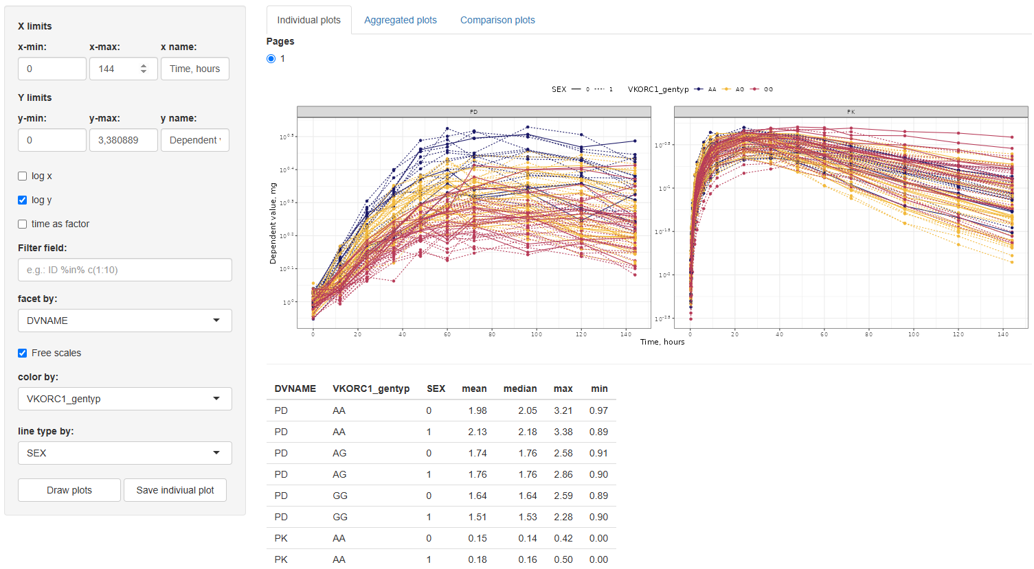
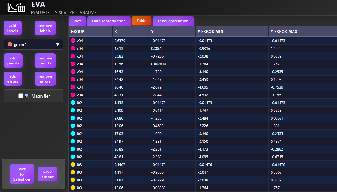
Along with the generated plot, a summary table of descriptive statistics — including mean, median, minimum, and maximum DV values — will automatically be displayed. These statistics are calculated for each group defined by the selected facet, color, and line type options (if any are selected), providing useful context for interpreting trends and patterns in the plotted data.
To save a specific individual plot, use the  button. The plot will be saved in the working directory defined earlier in the Data section of the Data Management module.
This section is particularly useful for identifying trends and subject-level behavior before proceeding to more structured or model-based analyses.
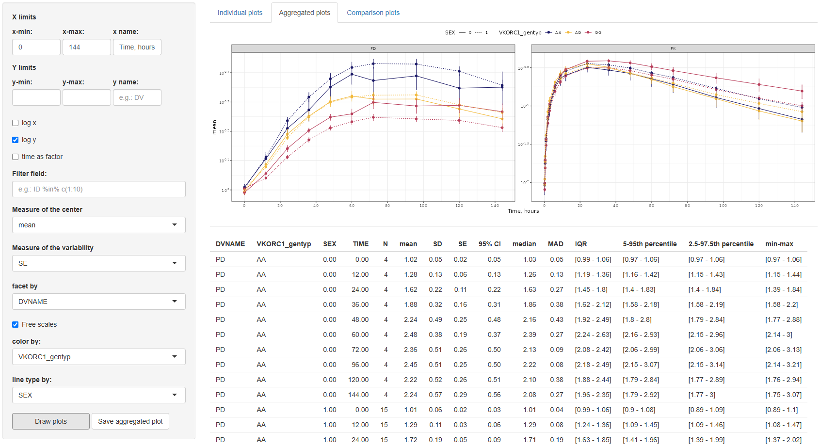
2. Aggregated plots
This tab provides tools for visualizing aggregated trends in the dependent variable (DV) over time, summarizing the data using statistical measures of central tendency and variability.
The configuration interface mirrors that of the Individual plots tab, allowing users to adjust x/y-axis limits and labels, choose log scaling, filter data, facet and color lines by any dataset column, and define line types (limited to variables with ≤5 levels).
Additionally, two new settings are provided:
Measure of the Center:Choose between mean and median.Measure of the Variability:Options depend on the selected center:- For mean: Standard Error (SE), Standard Deviation (SD), and 95% Confidence Interval (CI).
- For median: Median Absolute Deviation (MAD), Interquartile Range (IQR), 5th–95th percentile, and 2.5th–97.5th percentile.
By default, the graph displays the mean with SE as the variability measure.
After selecting the desired configuration, click the button to generate the plot. A  button is also available to export the figure to the working directory specified in the Data section.
In addition to the plot, a summary table of descriptive statistics is automatically generated. This table includes: TIME, N (number of observations), mean, SD, SE, 95% CI, median, MAD, IQR, 5th–95th percentile, 2.5th–97.5th percentile, min–max values. These statistics are reported by each combination of the selected facet, color, and linetype columns.
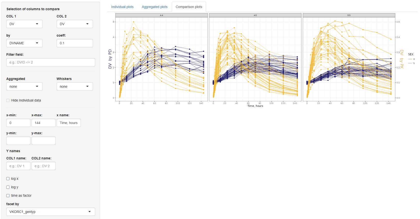
3. Comparison plots
The Comparison Plots tab offers functionality for directly comparing two sets of data in a single time-series plot. This is particularly useful when visualizing changes between groups, treatment arms, or transformations of the same variable. Both series are plotted as a function of time, allowing for clear temporal comparisons.
The configuration panel for this section is structured into three parts:
3.1. Data selection panel
This section defines the variables to be compared and includes the following settings:
COL 1andCOL 2:Selection of columns to compare.by: If the same column is selected in both COL 1 and COL 2, the by field becomes mandatory. This column must have exactly two levels and will be used to split the data for comparison.coefficient:A numeric multiplier applied to the data in COL 2 to enable scaling or adjustment for visualization.Filter field:An optional input to filter the dataset before plotting.
3.2. Aggregation settings
Here, you can specify whether to overlay aggregated trend lines and variability ranges:
Aggregated:Options are none, mean, or median.Whiskers(depending on the selected center):- If mean: none, SE (Standard Error), SD (Standard Deviation), or 95% Confidence Interval.
- If median: none, MAD (Median Absolute Deviation), IQR (Interquartile Range), 5th–95th percentile, or 2.5th–97.5th percentile.
- If none: No options available.
Hide individual data:If selected, only the aggregated lines and variability whiskers are shown, suppressing the underlying individual measurements.
3.3 Axis and layout customization
- COL 1 and COL 2: Independent x-min, x-max, x-name; y-min, y-max settings, and separate y-name for each column.
- Other options: Log-scale for x or y axes, "Time as factor", "Facet by" any dataset column, and "Line type by" for distinguishing groups (limited to variables with ≤5 categories).
Once the configuration is complete, click to visualize the data. The plot can be saved to the selected working directory using the  button.
The Continuous Data module provides a flexible framework for exploring and visualizing dependent variable (DV) values over time. Through its three tabs—Individual Plots, Aggregated plots, and Comparison plots—users can tailor plots to their specific analysis needs, from individual subject-level trajectories to population-level trends and comparative evaluations. With intuitive configuration tools, customizable aesthetics, and accompanying summary statistics, this module streamlines the process of data inspection and graphical analysis in pharmacometric and clinical datasets.
Covariates
The Covariates section of this module provides a comprehensive and flexible interface for exploring the general characteristics of covariates present in the dataset. Designed with ease of use in mind, this section enables automated visualization and statistical summary generation for both continuous and categorical variables, as well as covariate correlations. Through intuitive configuration tools, users can tailor plots and summaries to suit specific analytical needs and preferences.

The interface is divided into three main tabs based on the type of covariate visualization:
1. Continuous
The Continuous tab enables visualization of the distribution and summary statistics of continuous covariates. Users begin by selecting the desired covariates in the "Choose your continuous covariates:" selection window. After making a selection, clicking  activates the configuration panel.
The available plot configuration tools include:
Type of graph:Options are histogram, density, or both (default).Color by:Any column from the dataset or none (“-” by default).Manual bins:Specify the number of histogram bins (default is 30).Free scales:Allows individual scaling per facet.Log y:Enables logarithmic scaling of the y-axis.
Once the configuration is finalized, clicking  will generate the corresponding visualization in the main panel.
Accompanying the plot, a table of descriptive statistics is automatically generated. This includes: N, Missing values, Mean (± SD), Median (5th, 95th percentile). If a "color by" variable is selected, these statistics will be grouped accordingly by its levels.
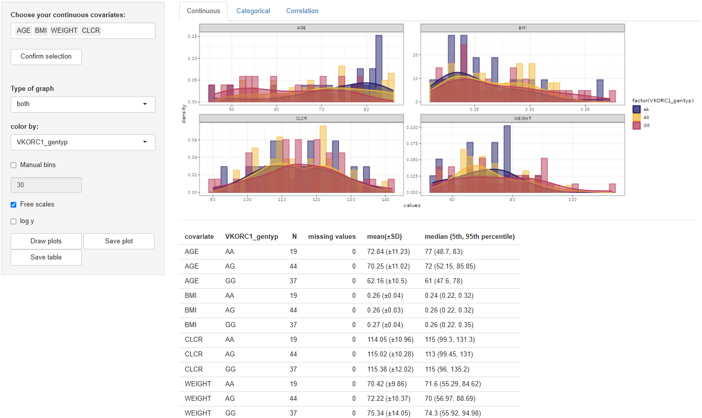
To export the results, use:
 to save the graph in the directory defined in the Data section.
 to export the statistics table to the same directory.
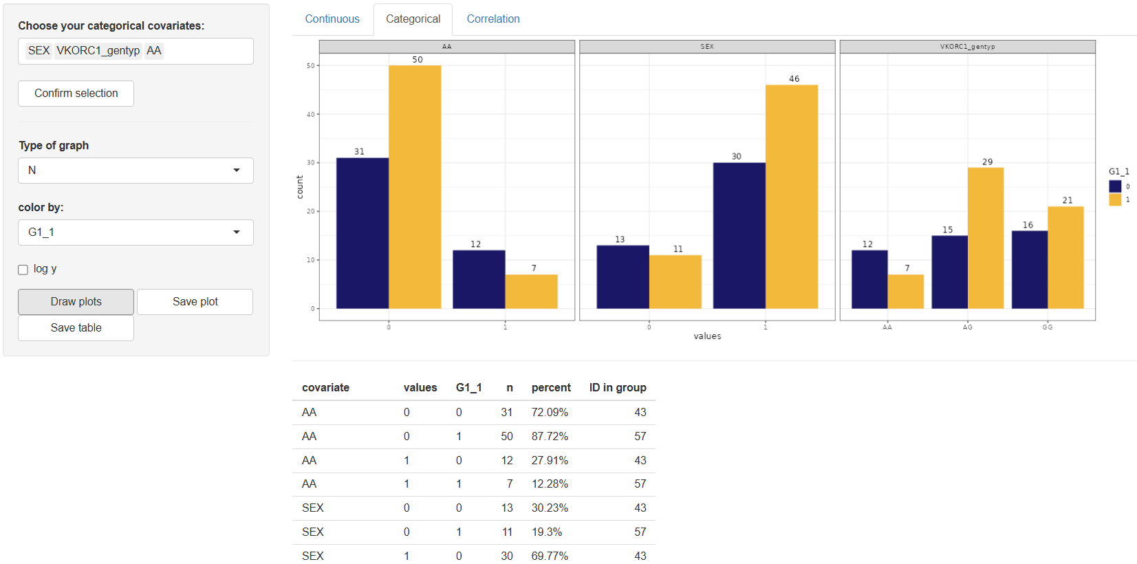
2. Categorical
The Categorical tab is dedicated to the visualization of categorical covariates and offers a user-friendly interface for generating summary plots and descriptive statistics. Work in this tab begins with selecting the desired categorical covariates from the “Choose your categorical covariates:” window. Once the variables are selected, click to proceed.
Upon confirmation, the configuration panel becomes available with the following customizable options:
Type of graph:Options include "N" (count) or "%" (percentage). The default setting is "N".Color by:Allows grouping by any column in the dataset. The default value is "–" (no grouping).Log y:Enables a logarithmic scale on the y-axis for better visualization of skewed distributions.
After adjusting the configuration to your needs, click the button. The resulting plot will be displayed in the main panel, accompanied by a descriptive table. The table includes the following columns for each category:
n– Number of observationspercent– Percentage of observationsID in group– Identifiers belonging to each category (if applicable)
If the color by option is used, statistics will be grouped accordingly.
To save your results, use the button to export the graph and the button to export the statistics table. Both files will be saved to the working directory specified in the Data section.
3. Correlation
The Correlation tab is designed to explore the relationships between continuous or categorical covariates. Work in this tab begins by selecting two or more covariates in the “Choose two or more covariates:” window. Once your selection is made, click to activate the configuration panel.
The available configuration tool is:
Color by:Enables grouping the correlation plot by any column in the dataset. The default value is “–” (no grouping applied).
Once the configuration is defined, click to generate the correlation matrix plot in the main panel. This plot visually presents the pairwise correlations between the selected covariates.
To save the output, use the button. The figure will be stored in the working directory defined in the Data section.
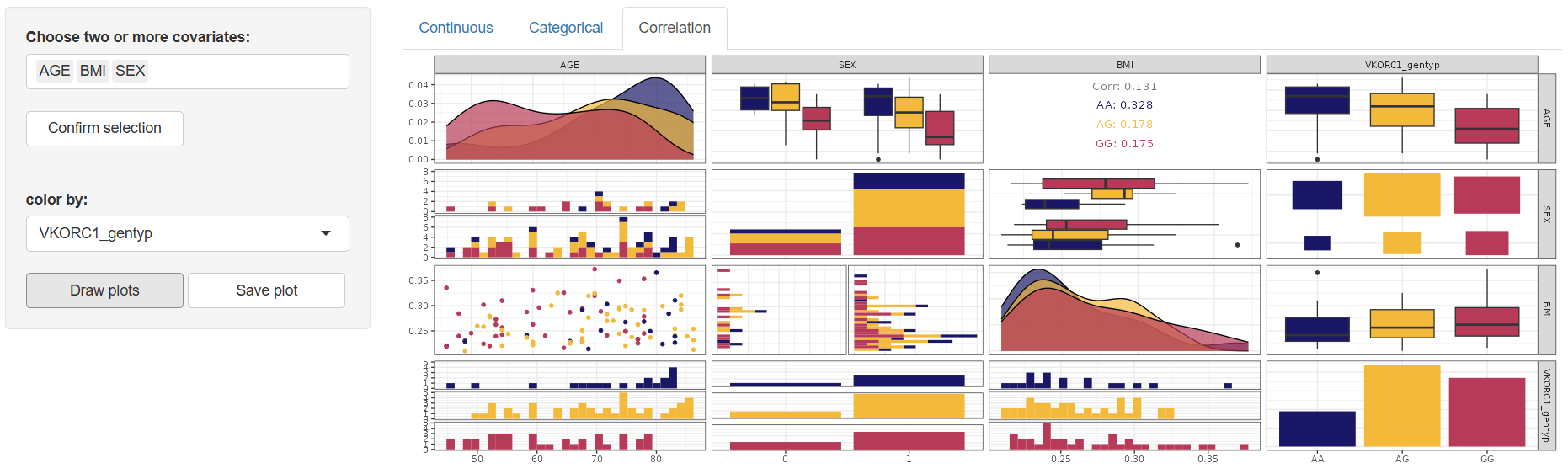
The Covariates section offers an intuitive and flexible environment for the graphical exploration and summary of both continuous and categorical variables in the dataset. Complemented by accompanying summary tables and export functions, this section ensures a comprehensive understanding of covariate behavior and structure—an essential step in data preparation and exploration.
Dosing events
Dosing Events
The Dosing Events section offers an interactive workspace for visualising dose administration patterns across subjects. Whether you need a quick overview of how many doses each participant received, a detailed look at infusion times, or a check on intervals between administrations, this section provides an array of pre-configured plots that can be customised to your needs.

Five tabs are available, each devoted to a specific view of twelve events:
- Number – total doses per subject
- Amount – dose amounts per subject
- Interval – spacing between doses
- Times – actual dosing timestamps
- Infusion – infusion-duration profiles
1. Number (Number of doses)
Select the dose-amount column (default AMT) in “Choose your Dose column:” and click  .
.
Configure the plot:
- Axis names (
x name,y name) Flip coordinates(optional)Filter:Apply conditional filters to display a data subset of subjectsfacet by:Create subplots based on any column in the datasetFree scales:Enable individual y-axis scaling for each facetcolor by:Assign line colors using any column (e.g., treatment group, gender)line type by:Assign line styles based on a selected column (max 5 levels recommended for clarity)
Click  . A bar chart appears showing each Subject ID against the number of doses received.
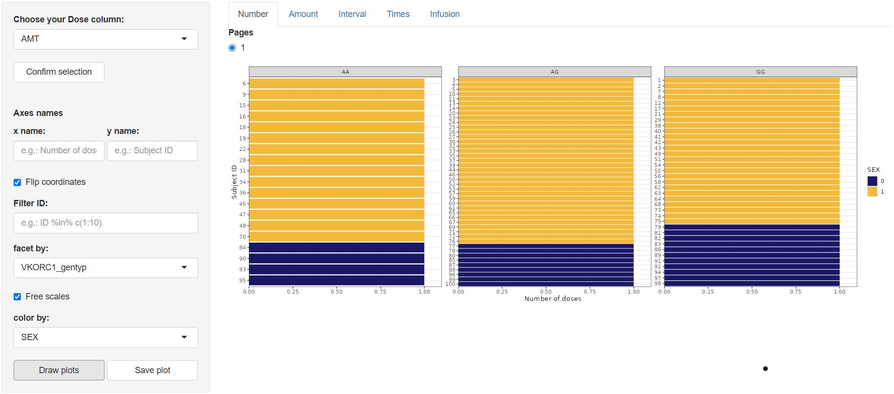
Use  to export the figure to the working directory set in Data section.
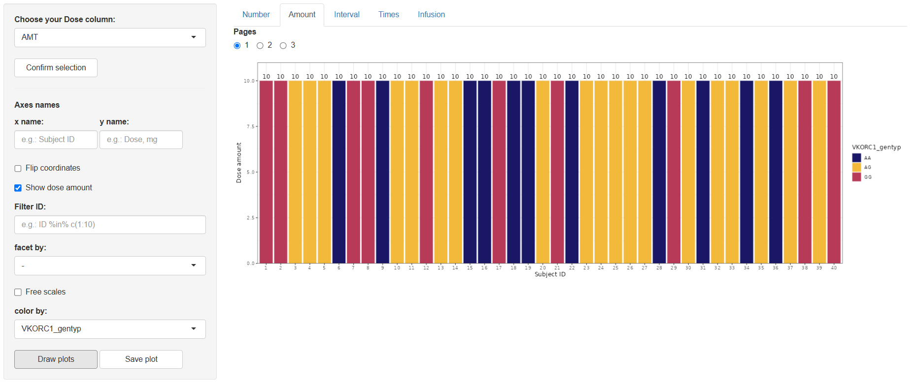
2 Amount (Dose amount)
Steps mirror the Number tab, with one extra toggle: Show dose amount.
The resulting plot displays dose amounts per subject (optionally overlaid as text if the toggle is on).
Save with .
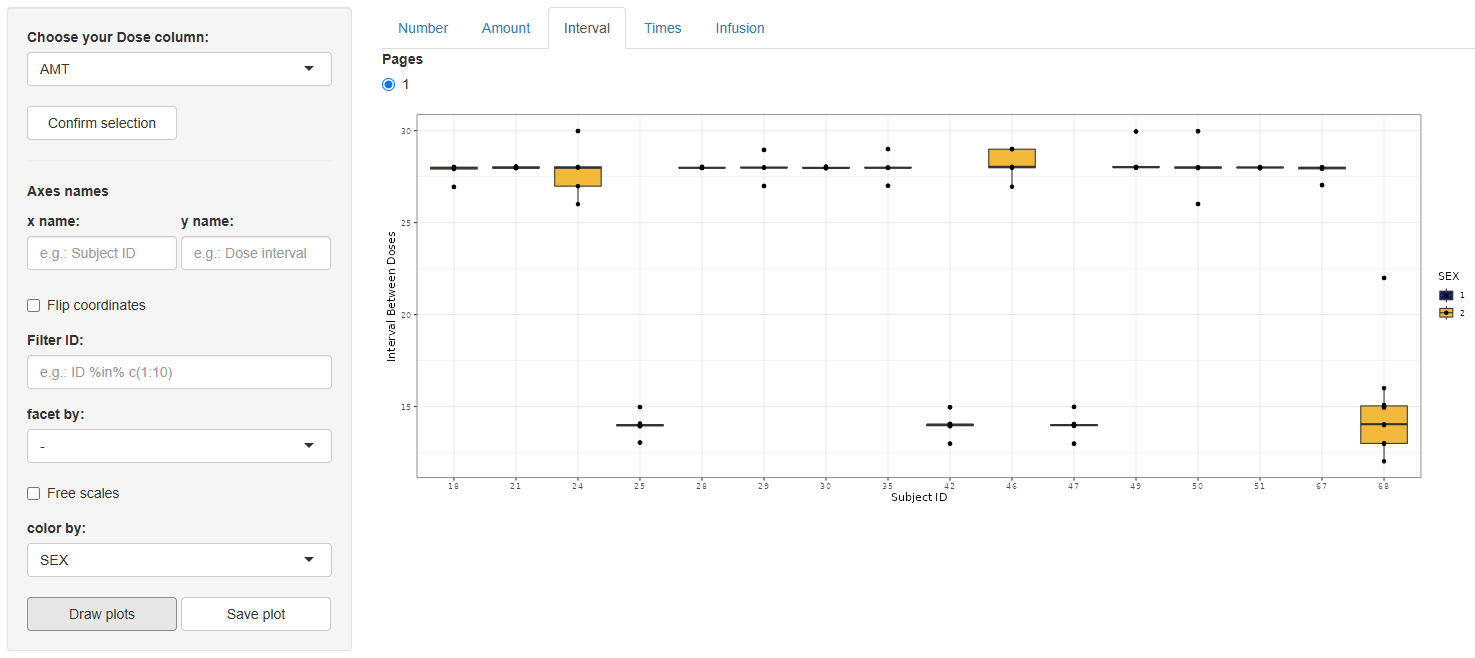
3 Interval (Interval between doses)
Again select the dose column, confirm, and configure using the same options as the Number tab. This graph is only available for treatments with more than one dose per Subject ID.
On , a box-and-whisker plot appears, illustrating the distribution of inter-dose intervals for every subject.
Save via .
4 Times (Time of doses)
After selecting and confirming the dose column, a streamlined set of options appears:
- Axis names,
Free scales,Filter ID,color by.
Press . The output is a faceted panel—one facet per Subject ID—containing vertical bars at every dosing time, making shifts in scheduling easy to spot.
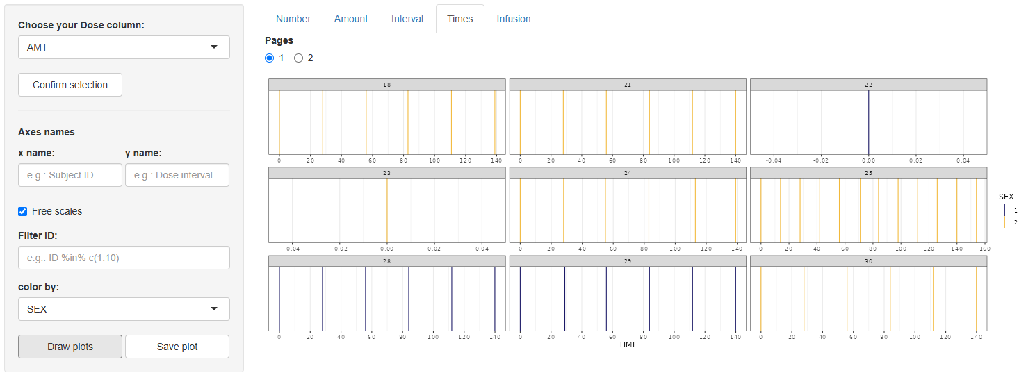
Save with .
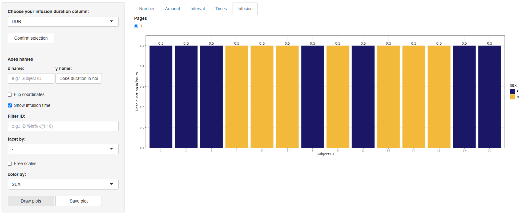
5 Infusion (Duration of dose)
Choose the infusion-duration column (default DUR) and click .
Configure the plot, identical controls to the Number tab, with one extra toggle: Show infusion time.
Click . A bar chart appears showing infusion durations per subject.
Save with .
The Dosing Events section delivers quick, visually rich insights into dosing schedules, quantities, and infusion characteristics—key information for understanding treatment exposure before modelling. After verifying dosing patterns here, you can proceed confidently to further exploratory analyses or pharmacometric modelling steps.
Tables
The Tables section is designed to facilitate the structured and semi-automated creation of statistical summary tables. It enables users to generate both Descriptive and Inferential statistical outputs using a highly configurable interface, tailored to the user’s specific dataset and analytical goals. Whether summarizing continuous variables, exploring distributions of categorical data, or comparing groups through hypothesis testing, this module provides a comprehensive yet flexible solution for table generation.

The section is divided into two main components, based on the type of statistics to be generated:
1. Descriptive Statistics
Work in this tab begins by specifying the type of data from which statistics will be extracted. This is done through the "Select data type:" window, where the user must choose between Continuous and Categorical. Once the data type is selected, the next window, "Select columns with continuous/categorical data:", allows the user to specify the variables of interest. Clicking the  button will then display the configuration panel relevant to the chosen data type.
1.1 Continuous
When Continuous is selected, the configuration panel displays a set of statistical options grouped by type. Users may select one or multiple measures to include in the output table:
-
Measures of central tendency:
MeanMedian
-
Measures of variability around the mean:
Standard Error (SE)Standard Deviation (SD)95% Confidence Interval (95% CI)
-
Measures of variability around the median:
RangeMedian Absolute Deviation (MAD)Interquartile Range (IQR)5th–95th Percentile2.5th–97.5th Percentile
Once the desired configuration is set, click  to generate the summary. The resulting table is displayed in the main panel and reflects the selected covariates and statistics.

An additional option in this tab is "Group By:" (default is none). If a grouping variable is selected from the dataset, two Orientation styles become available:
-
Horizontalorientation: Adds the grouping column as a new row-level variable. Each group appears as a separate row, alongside an additional "Overall" row summarizing the full dataset.
Figure 3. Descriptive statistics tab displaying the table configuration panel and the resulting table with continuous covariates AGE, WEIGHT, BMI, CLCR grouped by SEX using horizontal orientation.
-
Verticalorientation: Restructures the table with the following columns:Variable(selected covariates)Statistic(selected measures)One column per levelin the group-by variable, with an additionalOverallcolumn

Figure 4. Descriptive statistics tab displaying the table configuration panel and the resulting table with continuous covariates AGE, WEIGHT, BMI, CLCR grouped by SEX using vertical orientation.
1.2 Categorical
If Categorical is selected as the data type, the configuration menu will offer the following options for descriptive summary, which can be selected simultaneously:
-
Number (N)– the absolute count of observations in each category -
Percent (%)– the proportion of observations in each category
Once the desired statistics are selected, click to generate the output. The resulting table will be displayed in the main panel and will include the following columns:
-
Variable– the name of the selected covariate -
Categories– the levels within each covariate -
Number– if selected -
Percent– if selected

An additional feature in this tab is the "Group By:" option (none by default). If a grouping column is selected, the output table will expand to compare the distribution of each categorical variable across the levels of the grouping factor.
In this grouped output, the table retains the Variable and Categories columns. Each additional column corresponds to one of the levels in the selected grouping variable, annotated with the number of subjects in that group. A final column, Overall, provides a summary across all groups.

Use  to export the figure to the working directory set in Data section.
2. Inferential statistics
This tab provides the tools to perform correlation analyses between selected variables, offering a straightforward setup for generating inferential statistical tables.
Work in this tab begins by selecting the variables of interest from the available dataset columns. Two separate windows are provided:
- Select Y variable(s):
- Select X variable(s):
Once the variables have been chosen, click the button to display the configuration panel.
The configuration panel offers the following options for setting up the correlation analysis:
-
Correlation type:
PearsonSpearmanKendall
-
Additional outputs:
p-valueConfidence Interval
You may select one or more correlation types and include any combination of the additional outputs. Once the desired configuration is complete, click to generate the results.
If a correlation type other than Pearson is selected along with Confidence Interval, the following informational note will appear in the interface:
Note: Confidence intervals are only available for Pearson correlation.

Use to export the figure to the working directory set in Data section.
The Tables section provides a convenient and flexible way to generate descriptive and inferential statistical summaries. With customizable options and grouping features, it supports quick exploration and clear presentation of both continuous and categorical data—ideal for analysis, reporting, or quality control.
About NLME module
Background
Population PK/PD modeling and its variations are arguably one of the most used types of model-based analyses in MIDD. The development of such models follows a rigid workflow that includes such steps as structural model selection, statistical model selection, covariate search, and forward simulations. Mechanistic, or QSP models, utilize similar functionality, however, with a lot of nuances. For example, covariate search is not typically performed in QSP as relevant covariates ought to be included as a part of the structural model rather than a parameter. At the same time, the QSP approach demands additional set of tools, such as sensitivity analyses, likelihood profiling, or parameter estimation via virtual populations simulation.
Objectives
- Implementation and modification of structural, statistical and covariate models.
- Estimation of unknown parameters within the model using different algorithms and approaches.
- Extensive model diagnostics and evaluation.
- Automatic model development and assessment.
- Model-based simulations.
Sections of the module
- Data
- Model editor
- Model
- Initial estimates
- Task
- Results
- Goodness-of-fit plots
- Covariate search
- Simulations
Abbreviations
PK – Pharmacokinetics PD – Pharmacodynamics QSP – Quantitative Systems Pharmacology MIDD – Model-Informed Drug Development NLME – Nonlinear Mixed Effects
Data
One of the key functionalities of the NLME module is to estimate the parameter values of a model based on observed data, which is typically represented as time series measurements for each individual, study arm, animal, or other experimental setup. Additionally, the relevant data is often linked to drug administration and may include both time-varying and constant independent variables (covariates) that can be incorporated into the model.
Communication between the data and the model is facilitated by compiling a dataset with a predefined structure, which can be categorized into three types of elements: time series, dosing events, and covariates.
Standardized dataset structure
Standardized datasets in tabulated format accepted by Simurg software are inspired by CDISC guidelines [1] and are compatible with other conventional software, such as Monolix (Lixoft, France) and NONMEM (Icon, USA).
Each line of the dataset should correspond to one inidivudal and one time point. Single line can desribe a measurement, or a dosing event, or both.
Time series
Mandatory columns:
ID- unique identificator of an individual/animal/study arm/experimental setup, typically characterized by unique combination of observations, dosing events and covariates. Can be numeric or character.TIME- observation time. Numeric.DV- observed value of a dependent variable. Numeric.DVID- natural number corresponding to the identificator of a dependent variable.
The user can specify, via the interface, which columns in the dataset correspond to ID and TIME.
Optional columns:
DVNAME- character name of a dependent variable. Should have single value perDVID.MDV- missing dependent variable flag. Equals 0 by default. If equals 1 - observation in the corresponding line is ignored by the software.CENS- censoring flag, can be empty, 0, -1 (for right censoring) and 1 (for left censoring). Value inDVcolumn associated withCENSnot equal to 0 servesa as lower limit of quantification for left censoring or upper limit of quantification for right censoring (relevant for M3 censoring method).LIMIT- ifCENScolumn is present, numerical value inLIMITcolumn will define lower or upper limit of the censored observations (relevant for M4 censoring method).
Dosing events
EVID- identificator of a dosing event. By default equals 0 which corresponds to an observation without any associated events (AMT, etc. are ignored). Other possible values include:- 1 - dosing event.
- 2 - reset of the whole system to initial conditions, with or without dosing event.
- 3 - reset of the associated
DVIDto the value inDVcolumn, with or without dosing event.
CMT- dosing compartment - a natural number corresponding to the running number of a differential equation within a model.ADM- manually assigned administration ID. ReplacesCMTif present. Natural number.AMT- dosing amount. Numeric.II- time interval between the doses. Numeric.ADDL- number of additional doses. Natural number.TINForDUR- duration of infusion. Numeric.RATE- infusion rate. Numeric. ReplacesTINForDURif present.
Covariates
Any additional column in a dataset can be considered as continuous (if numeric) or categorical (if character) covariate, either constant (if covariate value does not change over time within a single ID), or time-varying. Interpolation for the latter is performed via last observation carried forward approach.
Initialization of the dataset
A dataset can be uploaded into the environment by pressing  button and selecting a file with the following extensions:
 .csv, .txt, .tsv, .xls, .xlsx, .sas7bdat, .xpt.
Once a dataset is uploaded, its content will appear in a form of a table on the main panel:

Modifications of the dataset are possible through the Simurg Data management module's Data tab.
Once uploaded, the dataset is recognized by the software and can be used for subsequent model development.
References
[1] https://www.cdisc.org/standards/foundational/adam/basic-data-structure-adam-poppk-implementation-guide-v1-0
Model editor
Model editor tab allows a user to write de novo or modify existing code of a structural model.
Simurg is capable of parsing of various syntaxes, including MLXTRAN and rxode2, in addition to having its own flexible modeling language.
Import of an existing model from an external .txt file can be done by pressing  button.
Created or updated model can be saved to a file using
button.
Created or updated model can be saved to a file using  button.
Essential strucutral elements of Simurg syntax
The only two mandatory sections that need to be present in a structural model file when using Simurg modeling syntax are # [INPUT] and # [MODEL], as shown on the figure:
![]()
# [INPUT] contains the names and initial values of parameters to be estimated.
# [MODEL] contains the rest of the code, including fixed parameters, explicit functions, initial conditions, differential equations, etc.
Comments are introduced using # symbol. Thus, sections like ### Explicit functions or ### Initial conditions do not affect parsing and used for sorting the code.
End of the line should be marked with ;.
Syntax for the functional elements
Initial conditions
X(0) = X0, where X is a dependent variable, and X0 can be a number, a parameter, or an explicit function.
Differential equations
d/dt(X) = RHS, where X is a dependent variable, and RHS is the right hand side of a differential equation.
Bioavailability
f(X) = Fbio, where X is a dependent variable, and Fbio can be a number, a parameter, or an explicit function.
Lag time
Tlag(X) = Tlag, where X is a dependent variable, and Tlag can be a number, a parameter, or an explicit function.
Handling of covariates
If an object exists within model structure, but is not designated in # [INPUT], as explicit function, dependent variable or fixed parameter, it will be automatically treated as a covariate. Thus, model parsing at the Model tab will not fail as long as the modeling dataset contains a column with the name matching that of the object.
Example: 2-compartment PK model with first-order absorption

After defining the model, proceed to load it into the Model section.
Model
Import of a structural model from .txt file should be preformed after a modeling dataset was uploaded at the Data tab by pressing  button.
Description of the modeling syntax is provided in Model editor tab.
button.
Description of the modeling syntax is provided in Model editor tab.
Once a model file is uploaded, the content - structural model - will be shown on the main panel and additional fields will pop up to assign variables per DVID (Dependent Variable Identificator):

The number of fields will correspond to the number of unique DVIDs in the dataset. The label for the fields is formed as
DVID#[DVID number from the dataset] ([respective DVNAME from the dataset]).
A user should assign variables to the DVIDs by typing variable name into the respective fields.
Then, the model should be initialized by pressing  button.
Initial estimates
The Initial estimates tab enables users to define and visually evaluate the starting values of fixed-effect model parameters. Providing well-informed initial estimates can significantly improve the speed and stability of the model fitting process.
📌 Note: Before using this tab, make sure both the Data and Model sections have been properly initialized.
Getting Started
To begin, navigate to the Initial estimates tab:

Click the  button to import the initial parameter estimates directly from the model file. The values retrieved depend on the modeling syntax used:
-
For models written in Simurg syntax, parameter values explicitly set in the model definition will be retrieved.
-
RxODE syntax, which shares structural similarities with Simurg's syntax, is also supported. If RxODE-style models are used, initial values are read in the same way.
-
For mlxtran syntax, initial values default to 1 unless manually modified.
💡 Simurg is compatible with multiple modeling languages and can interpret both RxODE and mlxtran syntaxes in addition to its own native syntax.
Adjusting and Evaluating Initial Values
Parameter values for fixed effects can be edited using the panel on the right side of the interface. This panel is divided into three functional sections:
1. Parameter Input Panel
In the first section, you can edit the initial values of the fixed-effect parameters as specified in the model. These editable fields allow you to fine-tune the starting estimates before fitting begins.

2. Output Selection Panel
If your model includes multiple outputs (DVIDs), the second section of the panel enables you to choose which output to visualize. This is particularly helpful for models that simulate multiple endpoints or compartments.

3. Plot Configuration Panel
In the third section, you can customize the plot appearance. Options include:
-
Enabling or disabling log scale for the x-axis (time) and y-axis (output)
-
Adjusting the minimum and maximum limits for both axes manually
These controls help ensure the resulting plot is tailored to your data's scale and characteristics.

After adjusting the configuration in these sections, click the  Show plots button. This will display a set of time-profile plots comparing model predictions (based on your current initial estimates) against observed data for each individual in the dataset.

This interactive evaluation step helps you visually assess whether your initial estimates are plausible before proceeding with model calibration.
Resetting and Proceeding
To revert changes and restore the original parameter values from the model file, simply click the button again.
Once you're satisfied with the initial estimates, proceed to the Task tab to configure statistical components. These initial values will be used as starting points for model fitting.
Task
The "Task" section provides tools to initialize and manage the statistical components used during the model calibration process.

Work in this tab begins by clicking the  button. This sets the path to a folder where the configuration of statistical components and the results of model fitting will be stored.

You may select either a new (empty folder) directory or one that contains results from a previous fitting session. If the directory already contains results, you can skip earlier steps (e.g., Data, Model, or Initial estimates) and move directly to task section.
After selecting the working directory, four main options become available:
-
 loads previously saved fitting results from the selected directory. Once loaded, you can proceed to tabs like Results, GoF plots, or Simulations to evaluate or utilize the fitted model.
 -
 loads a previously saved configuration of the statistical components. After loading, select the fitting algorithm (e.g., Simurg, Monolix, or nlmixr) and proceed to
  .
. -
 cleans the directory if it contains files and opens a list of options for configuring the statistical components. This option requires that the Data, Model (or Model editor), and Initial estimates tabs have already been properly initialized.
 -
 deletes all contents from the selected directory, allowing you to start fresh with a new statistical component configuration.
Creating statistical model
The process of creating a statistical model in the "Task" tab is divided into four key components:
1. Residual error model
In pharmacometric modeling, the residual error model captures the unexplained differences between observed data and model predictions — those not accounted for by the structural model or inter-individual variability.
Simurg offers several residual error model options for each specified DVID, including:
-
Constant error (independent of the predicted value): $$ y = f + \epsilon, \epsilon ∼ N(0, a^2)$$
-
Proportional error (increases proportionally with the predicted value): $$ y = f \cdot (1 + \epsilon), \epsilon ∼ N(0, b^2)$$
-
Combined1 error (constant + proportional): $$ y = f + \epsilon, \epsilon ∼ N(0, a^2 + (b·f)^2)$$
Here, \(f \) is the predicted value, and \( a \) and \( b \) are estimated error parameters.
The fields for selecting the residual error model and its parameters look like this:

Additionally, you can specify how BLOQ (Below Limit of Quantification) data are handled. Available methods include:
- M3: BLOQ data points are treated as left-censored values.
- M4: A hybrid method where:
- BLOQ values before the first quantifiable observation are treated as censored
- BLOQ values after are treated as missing (ignored)
These options are only available if your dataset (initialized in the Data tab) contains the required columns:
- For M3:
CENS - For M4:
CENSandLIMIT
If these columns are not present, the default handling method is "none".
2. Parameter definition
This section allows you to define the characteristics of model parameters during the fitting process (Figure 1(a)). Specifically, you can determine:
-
Whether a parameter is fixed or includes random effects
-
The distribution type used to model the random effects
📌 Note: The distribution settings apply to random effects, not the fixed effect estimates themselves.
Available distributions in Simurg include:
| Distribution | Formula |
|---|---|
| Normal | \( P_i=\theta +\eta_i, \space\space \eta ∼ N(0,\omega^2)\) |
| Lognormal | \( P_i=\theta + \exp(\eta_i), \space\space \eta ∼ N(0,\omega^2)\) |
| Logit-normal | \( P_i=\frac{1}{1+\exp(-(\theta+\eta_i))}, \space\space \eta ∼ N(0,\omega^2)\) |
where \(\theta\) is the typical value of a parameter, \(\eta_i\) the random effect for individual \(i\), and \(\omega\) is the standard deviation of \(\eta\).
In addition, you can specify initial values for random effects and their correlations using the matrix provided on the right-hand side of the interface (Figure 1(b)). This matrix allows for the configuration of:
- Variances – Initial guesses for \(\omega^2\), representing the variability of each random effect.
- Correlations – Initial values for the correlations between random effects (typically set to 0 unless prior knowledge suggests otherwise).
Matrix structure:
- Diagonal elements represent the initial values for the standard deviations of the random effects (i.e., \(\omega^2\)).
- Off-diagonal elements define the initial correlations between the corresponding random effects.
These initial values can influence the convergence behavior of the fitting algorithm, so it's recommended to use reasonable estimates when available.

3. Covariate model
This section allows you to introduce covariate effects into the model, enabling more personalized and accurate parameter estimation based on individual-specific characteristics from the dataset.
The interface looks like this:

To add a covariate effect:
1. Select the parameter you want the covariate to influence.
2. Choose the covariate from the list (the name must match a column in the initialized dataset).
3. Specify the covariate type:
-
Categorical: Define the reference category, which serves as the baseline level for comparison.
-
Continuous: Choose both a function to describe the covariate relationship and a central tendency transformation (mean or median) to normalize the covariate.
Functions for Continuous Covariates
Simurg provides several functional forms to model continuous covariate relationships:
- Linear (lin): $$\theta_i = \theta_{ref} \cdot (1+\beta \cdot (x_i-x_{ref}))$$ A direct linear relationship between the covariate and the parameter.
- Log-linear (loglin): $$\theta_i = \theta_{ref} \cdot \exp(\beta \cdot (x_i-x_{ref}))$$ A multiplicative effect, useful when the effect increases or decreases exponentially.
- Power model: $$\theta_i = \theta_{ref} \cdot \left( \frac{x_i}{x_{ref}} \right) ^\beta $$ A flexible model that can capture nonlinear proportional effects, often used in allometric scaling.
Where \(\theta_i\) is the individualized parameter estimate, \(\theta_{ref}\) is the parameter value at the reference covariate value \(x_{ref}\), \(\beta\) is the estimated covariate effect, \(x_{i}\) is the individual's covariate value.
You can choose whether \(x_{ref}\) is based on the mean or median value of the covariate in the dataset.
4. Specify the initial value for the parameter associated with the reference category (for categorical covariates) or the normalized value (for continuous covariates).
5. Click "Set" to apply the covariate effect to the selected parameter.
Once all configurations are complete, click the  button. This action saves the statistical model setup—defined in the previous sections to the selected working directory.
4. Optimization options
📌 Options in this section will become available only after the control object is created.
After the control object has been successfully created:
Select the fitting algorithm you wish to use (e.g., Simurg, Monolix, or nlmixr).
Click to begin the model fitting process.
When the fitting is complete, you can move on to the Results tab to analyze the output and evaluate the model's performance.
Results
Essential output of a model calibration procedure includes several numerical characteristics and scores, such as:
- point-estimates of population parameter values;
- standard deviation (SD) of random effects;
- eta-shrinkage;
- standard errors (SE) for all parameters;
- individual parameter values if random effects are present in the model;
- correlation between parameters;
- likelihood-based numerical criteria.
To extract this infromation from a modeling project, either a calibration procedure should be performed or the results of a calibration procedure should be loded following the instructions for the Task section. Once it is done, Results section in NLME can be accessed:

and relevant output can be generated by pressing  button.
Generated output is spread across four tabs:
After "View model results" button is pressed,  button will appear below it. By pressing this button all figures and tables from all four tabs will be saved to location of the current project within Simurg environment.
In addition,  button, available on the first 3 tabs, allows to export figures or tables from a tab to local computer.
1. Summary
Summary tab contains essential information in a form of a summary table on model parameters obtained after a calibration procedure:

Parameter names are shown exactly as specified in the structural model.
Covariate coefficients are named using the following principle:
[parameter name]_[covariate name]_[transformation flag]
Residual error model parameters are assigned as follows:
[variable name]_[a - for additive component; b - for proportional component]
\(SE\) of the parameters are calculated in three steps.
First, variance-covariance matrix is calculated for transformed normally distributed parameters from the Fisher Information Matrix (FIM) as follows:
$$ C(\theta)=I(\theta)^{-1} $$
Next, \( C(\theta) \) is forward-transformed to \( C^{tr}(\theta) \) using the formulas to compute the variance, dependent on the distribution of the parameters:
- For normally distributed parameter: no transformation applied.
- For log-normally distributed parameters: $$ SE(\theta_k)=\sqrt{( \exp(\sigma^2)−1) \cdot \exp(2\mu + \sigma^2)} \\ \mu = \ln(\theta_k) \\ \sigma^2 = \operatorname{var} (\ln (\theta_k)) $$
- For logit-normally distributed parameters: a Monte Carlo sampling approach is used. \(100000\) samples are drawn from the covariance matrix in gaussian domain. Then the samples are transformed from gaussian to non-gaussian domain. Then the empirical variance \( \sigma^2 \) over all transformed samples \( \theta_k \) is calculated.
Finally, \(SE\) of the estimated parameter values is calculated from the diagonal elements of the forward-transformed variance-covariance matrix: $$ SE(\theta_k) = \sqrt{C^{tr}_{kk}(\theta_k)} $$
Relative standard error (\(RSE\)) is calculated as \( \frac{SE}{Estimate} \cdot 100 \% \).
Cases with \(RSE > 50 \% \) are highlighted in red, as \(RSE > 50 \% ( \frac{1}{1.96} * 100 \% ) \) corresponds to the situation where \( 95 \% \) confidence interval of \( N(0, 1) \) includes zero, making respective parameter not statistically different from zero with \( \operatorname{p-value} = 0.05 \).
Random effects column contains \(SD\) of the estimated random effects \( (\omega) \).
\( \eta \)-shrinkage is calculated based on the following equation: $$ \eta \space shrinkage = 1 - \frac{SD(\eta_i)}{\omega} $$ \( \eta \)-shrinkage exceeding \( 30 \% \) is indicative of unreliable individual parameter estimates and warrants the revision of a statistical model [1].
2. Individual parameters
This tab contains a single table with individual parameter values defined as the mean of conditional distribution for parameters with random effects and as typical parameter values for the parameters without random effects.

3. Correlations
Correlation matrix is derived from the variance-covariance matrix as:
$$ \operatorname{corr}(\theta_i, \theta_j) = \frac{C^{tr}_{ij}}{(SE(\theta_i)*SE(\theta_j))} $$
and is represented visually in a form of a heatmap, where the value and color in each cell represents Pearson's correlation coefficient (blue - for negative values, red - for positive values).

4. Likelihood
This tab contains likelihood-based numerical scores used to benchmark models:

- \( -2 \cdot \log(\operatorname{Likelihood}): n \log(2\pi)+\sum(\log(\sigma_j^2 ) + \frac{(Y_j-Y^*_j (t,\Theta))^2}{\sigma_j^2}) \)
- Akaike information criterion: \( AIC = -2LL + 2 \cdot P \)
- Bayes information criterion: \( BIC = -2LL + P \cdot \log(N) \)
where \( P \) is the number of estimated parameters within the model; \(N \) is the number of data points.
N.B.: likelihood cannot be computed in a closed form if random effects are present in the model.
Model comparison
"Likelihood" tab allows to perform semi-automatic model comparison across multiple projects, located within the same folder of the currently active project by pressing  , selecting the subset of projects to include into the analysis (optional), and pressing
  button.
For example, running model comparison given the following folder structure:
parent-folderWarfarin_PKPD_1Warfarin_PKPD_2- current projectWarfarin_PKPD_3Warfarin_PKPD_4Warfarin_PKPD_5Warfarin_PKPD_6
where Warfarin_PKPD_1 ... Warfarin_PKPD_6 are successfully converged computational projects, will provide user with the following table:

By indicating character string in the  field, for example,
 project1, will leave only those projects in the table that contain this string within their names.
Goodness-of-fit (GoF plots)
The GoF plots tab provides a suite of graphical tools to assess how well the model fits the observed data. These diagnostic plots help visually evaluate model performance, detect systematic bias, identify outliers, and uncover potential model misspecification.
To use this section, the model must first be fitted or previously generated results must be loaded, following the steps outlined in the Task section. Once this is done, the GoF plots section in NLME becomes accessible:

Getting Started
To begin, click the  button. This action loads the model results stored in the Task section and activates the available plot menus. From there, you can create diagnostic plots based on your chosen configuration.
Once you’ve configured the desired settings, click the
button. This action loads the model results stored in the Task section and activates the available plot menus. From there, you can create diagnostic plots based on your chosen configuration.
Once you’ve configured the desired settings, click the  button to generate the plot.
The resulting plot can be downloaded by clicking the
button to generate the plot.
The resulting plot can be downloaded by clicking the  button for further analysis or reporting.
Available Plot Types
This section offers eight types of diagnostic plots, organized into the following tabs:
- Time Profiles
- Observed vs. Predicted
- Residuals
- Distribution of Random Effects (RE)
- Correlation between RE
- Individual parameters vs. covariates
- VPC (Visual Predictive Check)
- Prediction distribution
1. Time Profiles
The Time Profiles tab provides tools for visually evaluating how well the model fits the observed data over time, both at the population level and the individual level, for the selected output type.
The available output types are determined by the DVIDs (Dependent Variable Identifiers) specified in the Model section.
Plot Configuration Options
You can customize the plot using the following options:
-
Fit type to display: Choose whether to show the population predictions, individual predictions, or both on the plot
-
Axis settings:
- Manually adjust the x- and y-axis limits
- Enable or disable logarithmic scaling for either axis

2. Observed vs. Predicted
The Observed vs. Predicted tab allows you to assess how well the model predicts the observed data by comparing predicted values against actual observations. This comparison can be made at both the individual and population levels.
The available outputs correspond to the DVIDs selected in the Model section.
Plot Configuration Options
You can customize the plot using the following settings:
- Prediction Type: Choose to display Individual predictions, Population predictions, or both
- Log Axes: Enable logarithmic scaling on the x- and/or y-axes for better visualization of wide value ranges
- Spline Overlay: Optionally add a spline to the plot to highlight trends or deviations from the ideal fit line

3. Residuals
The Residuals tab provides diagnostic plots to evaluate the distribution and behavior of residuals, helping to detect model misspecification, bias, or heteroscedasticity.
The outputs available for plotting correspond to the DVIDs selected in the Model section. You can choose to visualize individual or population residuals.
Plot Types
This tab includes two types of plots:
3.1 Scatter Plot
This plot displays residuals versus time or predicted values to detect patterns or trends that may indicate issues with model fit.
Configuration options:
- Log scale for time axis – Apply logarithmic transformation to the time axis.
- Log scale for predicted values axis – Enable log scale for the x-axis when plotting residuals vs. predicted values
- Spline – Overlay a spline curve to visualize trends or systematic bias
- Axis limits – Manually define y-axis limits for better control over the plot view

3.2 Histogram
This plot shows the distribution of residuals to assess normality and variability.
Configuration options:
- Density curve – Overlay a smoothed density curve on the histogram
- Theoretical distribution – Compare the residuals to a theoretical normal distribution
- Information – Include a p-value from a statistical test (e.g., Shapiro-Wilk) to assess the normality of residuals

4. Distribution of Random Effects (RE)
The Distribution of Random Effects (RE) tab allows you to explore the variability captured by the model’s random effects and individual parameter estimates. This helps assess the assumption of normality and the behavior of random components in the model.
Begin by selecting the type of output you want to visualize:
4.1 Individual Parameters – Estimated parameter values for each individual.
4.2 Random Effects – Deviations from the population parameters (i.e., the modeled random components).
4.1 Individual Parameters
For Individual Parameters, only histograms are available.
Plot options:
- Select parameter names – This dropdown automatically lists all parameters associated with random effects. You can select all, or a subset, to include in the plot
- Density Curve – Overlay a smooth density curve on the histogram
- Information – Show the p-value from a normality test to assess the distribution

4.2 Random Effects
For Random Effects, you can choose between two plot types:
4.2.1 Histogram Visualizes the distribution of random effects for each selected parameter.
Options include:
- Select parameter names – A list of available omega terms (random effects) is automatically populated
- Density Curve – Add a smooth density overlay
- Theoretical distribution – Compare the empirical distribution with a standard normal distribution
- Information – Include p-value results of a normality test (e.g., Shapiro-Wilk)

4.2.2 Boxplot Displays the spread and central tendency of selected random effects using boxplots.

5. Correlation Between RE
The Correlation Between RE tab allows you to explore pairwise relationships between individual parameter estimates or random effects, helping to identify potential correlations or dependencies that might inform model refinement or covariate modeling.
Start by selecting the type of correlation plot you want to generate:
5.1 Individual Parameters – Scatter plots showing relationships between estimated parameters for each individual.
5.2 Random Effects – Scatter plots of the omega terms (random deviations from the population parameters).
5.1 Individual Parameters
Configuration options:
- Select parameter names – A list of model parameters associated with random effects is automatically populated. Select two or more to include in the plot
- Linear regression – Optionally overlay a regression line to visualize the trend
- Information – Display the Pearson correlation coefficient (r) to quantify the strength and direction of the relationship
5.2 Random Effects
Configuration options are the same as for Individual Parameters:
- Select parameter names – The dropdown provides a list of omega terms for parameters with random effects. Choose the ones you'd like to analyze
- Linear regression – Add a regression line to the scatter plot
- Information – Show the Pearson r value to assess correlation strength

6. Individual parameters vs. covariates
The Individual Parameters vs. Covariates tab enables exploration of potential relationships between individual parameter estimates or random effects and covariates in the dataset. This analysis is useful for identifying covariate effects that could be included in future model refinements.
Start by choosing the type of output to visualize:
Individual Parameters – Displays estimated parameter values per individual against selected covariates.
Random Effects – Shows the corresponding omega values plotted against covariates.
6.1 Individual Parameters
Configuration options:
- Select parameter names – Choose one or more individual parameters associated with random effects from the automatically populated list.
- Select covariates names – Choose the covariate (column from your dataset) to plot against the selected parameters.
- Linear regression – Optionally overlay a linear regression line to visualize potential trends.
- Information – Display the Pearson correlation coefficient (r) to quantify the relationship with continuous covariates or p-value in case of categorical covariates.
6.2 Random Effects
Configuration is identical to the Individual Parameters option, with one difference:
Select Parameter Names – This dropdown lists omega terms corresponding to the random effects.
You can still:
- Select a covariate,
- Add a linear regression line,
- And show the Pearson correlation coefficient or p-value.

7. VPC (Visual Predictive Check)
The Visual Predictive Check (VPC) tab provides powerful graphical diagnostics to evaluate how well the model predicts the distribution of observed data. It helps detect model misspecifications, assess variability, and ensure predictive performance across different covariate groups.
Getting Started
First, click the  button to load the prediction results from the fitted model.
Configuration Options
- Select Output Choose the output variable you wish to analyze. Available options depend on the DVIDs defined in the Model section.
Stratification Options
- Stratification Column
Select a dataset column for stratification:
- If a categorical column is chosen, separate facets will be created for each category level.
- If a continuous column is selected, you can specify:
- The number of facets (choose between 2 and 4)
- The ranges to define each facet
Binning Options
-
Binning Method – Choose how the data will be binned along the x-axis:
- kmeans – Data-driven binning that clusters points based on similarity
- ntile – Splits the data into equal-sized groups based on percentiles
- equal_x – Divides the x-axis into equally spaced intervals
-
Number of Bins – Select how many bins to display in the VPC plot
Prediction Options
-
Observed Percentiles – Choose which percentiles of observed data to display:
- 10%, 50%, 90%
- 5%, 50%, 95%
-
Confidence Interval (CI) – Select the confidence interval for the prediction bands:
- 50%, 90%, 95%, or 99%
-
Prediction Correction – Enable this option if needed to correct for time-dependent variability in predictions
Display Options
Customize which visual elements to include in the plot:
- Add Legend – Adds a description for all visual elements in the plot
- Add Observed Data – Overlay observed data points
- Theoretical Percentiles Median – Display the model's predicted median
- Theoretical Percentiles CI – Display the model's confidence intervals around the theoretical percentiles
- Empirical Percentiles – Show observed percentiles based on the data
- Interpolation – Smooths the lines connecting the points across bins
Plot Options
- Axis Labels – Customize the names of the x-axis and y-axis
- Log Scale for Y-axis – Optionally apply a logarithmic scale to the Y-axis for better visualization of wide-ranging values

8. Prediction distribution
The Prediction distribution tab allows you to visualize the distribution of model predictions and assess how well they reflect the observed data across the selected output. This helps evaluate the spread and central tendency of predictions, and can be especially useful when exploring variability or stratification.
Getting Started
To begin, click the button. This step loads the prediction results from the fitted model into the tab.
Configuration Options
-
Select Output – Choose the output variable you wish to analyze. The available options are determined by the DVIDs selected in the Model section
-
Stratification by Dose – If the dataset contains a
DOSEcolumn, you can enable this option to generate separate prediction distributions for each dose group
Display Options:
-
Prediction Interval – Select the confidence interval to display around the predictions. Available options include: 50%, 80%, 90%, 95%
-
Legend – Include a legend for clarity when comparing multiple groups or overlays
-
Data – Overlay the observed data on top of the prediction distribution
-
Axis Labels – You can customize the x-axis and y-axis names to better describe your data and outputs

After completing the graphical evaluation in the GoF plots section, if the diagnostic plots indicate a satisfactory model fit—without major bias, trends, or significant outliers—you can confidently proceed to the next steps. These include exploring covariate effects in the Covariate Search section or using the model for predictive purposes in the Simulations section.
Covariate search
The Covariate search section allows users to systematically test potential covariates for inclusion in their model, helping reduce unexplained variability and improving the model's interpretability and predictive performance.
📌 Note: Before working in this section, ensure that the project has already been fitted or that results from a previous fit have been loaded in the Task section.
Once this is done, the Covariate search section in NLME becomes available to be used:

Begin by selecting the parameters to which covariates will be applied. This is done in the Select parameters dropdown. Once selected, click the  button to proceed. You may add multiple covariates, repeating this process as needed.
1. Covariate specification
After clicking , specify the covariate details in the configuration panel:
-
Covariate: Choose the column from your dataset to test as a covariate.
-
Covariate type: Specify whether the covariate is Continuous or Categorical.
If Continuous
-
Select the Function to define how the covariate influences the parameter:
- Linear (lin): $$\theta_i = \theta_{ref} \cdot (1+\beta \cdot (x_i-x_{ref}))$$ A direct linear relationship between the covariate and the parameter.
- Log-linear (loglin): $$\theta_i = \theta_{ref} \cdot \exp(\beta \cdot (x_i-x_{ref}))$$ A multiplicative effect, useful when the effect increases or decreases exponentially.
- Power $$\theta_i = \theta_{ref} \cdot \left( \frac{x_i}{x_{ref}} \right) ^\beta $$ A flexible model that can capture nonlinear proportional effects, often used in allometric scaling.
-
Also select a Transformation (either median or mean), which sets the reference value used in the function.
If Categorical
- Define the Reference category, which acts as the baseline for comparison across levels.
-
Next, provide an Initial value — this is the starting estimate for the covariate effect and will be used during model fitting. You can also specify any Ignored parameters, which are parameters selected earlier but that should not be linked to this covariate.
When you're satisfied with the covariate setup, click  to confirm it. If adjustments are needed later, click
  , make the necessary changes, and click again. To remove a covariate entirely, use the
  button.

2. Covariate search options and results
Once the covariate specification is complete, the Covariate search options section allows you to configure how the covariate testing will be executed.
-
Methodology: Currently, the only available method is SCM (Stepwise Covariate Modeling). This methodology consists of two phases:
- Forward selection, where covariates are added one by one based on statistical significance (typically using a predefined p-value threshold).
- Backward elimination, where covariates already included are systematically removed if they no longer meet the criteria when combined with others.
SCM helps in building a parsimonious model by balancing fit improvement with complexity.
-
RSE penalization: If selected, this option activates a check for parameter identifiability by evaluating the Relative Standard Error (RSE) of estimated parameters. When this option is enabled, the RSE threshold (%) input appears.
- The threshold defines the maximum acceptable RSE for a parameter to be considered identifiable.
- By default, this threshold is set to 50%.
-
Forward selection p-value and Backward elimination p-value: These fields allow you to define separate p-value thresholds for each phase of the SCM process. These thresholds determine the statistical criteria for including or removing covariates during the search.

After all search options have been specified, click the  button to begin the process.
Once the covariate search is complete, two result tables are displayed: Forward Selection Table

and Backward Elimination Table

Each table includes the following columns:
- Scenario description: A summary of the covariate tested and the parameter(s) to which it was applied.
- Objective Function (-2LL): The -2 log-likelihood value of the model with the specified covariate scenario. Lower values indicate better model fit.
- AIC: Akaike Information Criterion. A model selection criterion that balances model fit with complexity. Lower AIC values are preferred.
- Identifiability: Indicates whether all parameters in the model meet the identifiability criteria based on the selected RSE threshold.
- Shrinkage < 30: A check for statistical shrinkage, indicating whether it remains below a 30% threshold—a common guideline for reliable random effect estimates.
If you've previously performed a covariate search and wish to revisit the results, simply click the  button. The forward and backward tables from the prior search will be reloaded and displayed in the same format.
After completing the Covariate search process and reviewing the resulting models from forward and backward selection, you can determine whether any covariate effects should be retained in your final model. From here, you may proceed to re-evaluate model diagnostics in the GoF plots section, or move forward to simulate different dosing or response scenarios using the refined model in the Simulations section.
Simulations
The Simulations section enables users to simulate model predictions under various scenarios using either an already-fitted model or a new model file. It provides the tools necessary to set up simulation conditions, incorporate stochastic variability, adjust parameters, and generate results for visual inspection.

The simulation interface is organized into two main tabs, each with a set of clearly defined sections:
- Simulation
1.1. Simulation scenarios
1.2. Stochastic components
1.3. Parameters
1.4. Execution - Visualization
1. Simulation
Before configuring a simulation, you must first select the Source model.

Two options are available:
-
Current project: Select this option if you want to simulate based on the model currently loaded and fitted in the project. Make sure that model fitting has been completed or previously saved results have been loaded, following the steps described in the Task section.
-
New model: Select this option if you wish to simulate using a different model not associated with the current project. In this case, the button
 will appear, allowing you to select a .txt file containing the model definition.
After selecting the source, choose the appropriate solver and click  to prepare the model for the simulation environment.
Once initialized, you can proceed to configure the remaining components of the simulation. These are divided into four sections:
1.1 Simulation scenarios
This section allows you to define the structure of your simulation by building or uploading an event table that outlines the dosing and observation scheme, along with any additional covariates. Simurg supports both Time profiles and Dose-response simulation types, offering flexibility for a wide range of simulation needs.
Simulation type
To begin, select the Simulation type to be performed:
-
Time profiles – to simulate concentration or response profiles over time.
-
Dose-response – to explore relationships between dose levels and outcomes.
You can either upload an existing event table, clicking  button, or manually create one using the built-in interface.
Creating an Event table manually
To manually create an event table, click the  button. This will generate a default event table with a new row corresponding to a unique ID (e.g., ID = 1, 2, 3…), representing each simulation scenario.
The default columns in the event table depend on the selected Simulation type:
-
For Time profiles:
ID: Identifier for each simulation scenario.TIME: Time points for dosing or observations.CMT: Compartment number.AMT: Administered dose amount.ADDL: Number of additional doses.II: Interdose interval (used with ADDL).
-
For Dose-response:
ID: Identifier for each scenario.TIME: Typically fixed or set to zero (if not time-based).CMT: Compartment number.MinDose/MaxDose: Minimum and maximum dose values for the simulated range.ADDLandII: Optional for repeated dose-response assessments.
You can click multiple times to define additional scenarios. Each click will append a new row to the table with the next available ID. To remove a scenario, use the  button.
Customizing columns The table can also be extended horizontally to include covariates or other input variables:
Enter a column name into the "New column name:" field.
Click  to add it to the table.
To remove the most recently added column, click  .
.
💡 Depending on your model, you may need to include additional columns beyond those added by default (e.g., covariates like WT, AGE, or SEX).
💡 When defining values directly in the event table, you can also assign fixed values to any system parameter used in the model. Once a variable is included in the event table, it will automatically be excluded from the "Parameters" section, and if the variable has an associated omega (random effect), it will not be included in the simulation. This allows you to override default parameter behavior with scenario-specific values when needed.
Editing the event table The event table is fully interactive: to modify a value, simply double-click on the desired cell and enter the new content. This makes it easy to adjust values on a scenario-by-scenario basis.

Time Grid and Output Settings
The final block in Simulation scenarios defines the temporal grid and the variables that will be returned by the solver.
| Setting | Purpose |
|---|---|
| Init. time | Start time of the simulation. |
| Min. time / Max. time | Left and right bounds of the time window forwarded to the Visualization tab. Any simulated points outside this interval are discarded. |
| Time step | Fixed increment between consecutive time points. |
| Vector length | Total number of nodes in the calculation grid. |
| Select output names | Choose the state variables or user-defined functions you wish to record. The items selected here populate Plotted outputs in the Visualization tab. If left blank, all available outputs are transferred automatically. |
📌 Note: You may define either the Vector length or the Time step, but not both. Setting Vector length to (0) (or leaving it blank) enables Time step input.
Additional Fields for Dose-Response Simulations When Simulation type is set to Dose-response, two additional configuration options become available in this section:
| Setting | Purpose |
|---|---|
| N of dosing steps | Specifies how many discrete doses will be evaluated between the defined MinDose and MaxDose values for each scenario. |
| Type of metrics | Determines the summary statistic to apply over the simulated time profile for each dose. Available options are:
|
1.2 Stochastic components
This subsection allows you to incorporate different levels of variability into the simulation, making it possible to generate more realistic outputs that reflect natural uncertainty in biological systems. Four building blocks are available; you may activate any combination, depending on the modeling objectives:
1.2.1. Use virtual populations
1.2.2. Add uncertainty
1.2.3. Add variability
1.2.4. Add residual error
1.2.1 Use virtual populations
Virtual populations (VPs) are computer-generated cohorts of virtual patients. Each virtual patient is a unique set of parameter and/or covariate values chosen to reflect realistic biological diversity. They allow you to run in silico trials without recruiting real volunteers.
After ticking Use virtual populations, several windows appear:
| Setting | Purpose |
|---|---|
| Number of virtual patients | Total VP size (10 by default). Each patient will be simulated once for every scenario in the event table. |
| Generate vs Upload VP | • Generate virtual population – create a fresh VP. • Upload virtual population – import a pre-built VP file ( .csv). Press “Choose file with VP” and the selected path is shown beneath the button. |
Generate virtual population
If Generate is chosen, two editable tables appear:
-
Select parameters or covariates
Tick the items you wish to vary. The chosen entries populate the Table of parameters distribution:
Distribution– choose LogNormal, Normal, or Uniform.Mean– central value (µ).SD– standard deviation (σ) for Normal / LogNormal.CV %– coefficient of variation (alternative to SD for LogNormal).Min/Max– bounds for Uniform (also used as hard limits for the other distributions).

All cells are editable via double-click.
-
Table of correlations between parameters
A symmetric matrix whose diagonal is fixed at 1. Edit the lower-triangle cells to specify pairwise correlations (between [-1;1]); the upper-triangle mirrors automatically. Setting correlations helps reproduce realistic multivariate relationships.

After adjusting distributions and correlations, click  .
The VP is stored in memory (and can be exported later) and the remaining stochastic-component options become available.
.
The VP is stored in memory (and can be exported later) and the remaining stochastic-component options become available.
1.2.2 Add uncertainty Enables simulation of parameter uncertainty by resampling fixed effects from their estimated uncertainty distributions.
- Number of populations: Defines how many virtual populations will be generated by drawing parameter sets from the uncertainty distribution. Recommended: Start with at least 100 populations for stable results.
1.2.3 Add variability Introduces inter-individual variability by sampling random effects for each subject within each population.
- Number of subjects: Defines how many individuals will be simulated per population. Recommended: Use at least 20–50 subjects to capture population-level spread.
1.2.4 Add residual error Adds residual unexplained variability, typically representing measurement error or unmodeled intra-individual fluctuations.
- Number of replicates: Determines how many repeated observations will be simulated per individual at each time point. Recommended: Use 5–10 replicates for exploring variability bands around predicted profiles.
Each of these components adds a layer of realism to the simulation by mimicking the kinds of uncertainty and variability typically observed in PK/PD or QSP models. You can enable them individually or in combination to suit your analysis needs.
1.3 Parameters
This section is automatically populated once the model has been initialized for simulation, based on the selected source: Current project or New model.
-
If Current project is selected and the model has already been fitted or previously loaded with results, the values for fixed effects, omegas (inter-individual variability), and residual error models will be retrieved from the current modeling context.
-
If New model is selected, the values for the fixed parameters will be extracted directly from the
.txtmodel file provided by the user. This includes any fixed effect values explicitly defined within the file.
Once loaded, all parameter values shown in this section are fully editable. You can adjust them as needed to explore alternative simulation scenarios or hypothetical conditions.
📌 Note: If a variable is already specified in the event table, it will be excluded from this section and treated as a fixed scenario input for the simulation.
1.4 Execution
This short subsection allows you to launch the simulation based on the full configuration defined in the previous sections. Once all simulation settings—including scenarios, stochastic components, and parameter values—are finalized, click the  button to initialize the simulation process.
Only after the simulation has been successfully executed using the button will the results become available for viewing in the Visualization tab.
2. Visualization
The Visualization tab lets you explore simulation results interactively or load results from a previous run. All plotting and export tools are accessed from the left-hand settings panel.
Work in this tab begins by choosing a Simulation type:
- Current simulation – Displays the results produced by the configuration set in the Simulation tab.
- New simulation – Uploads a
.csvfile containing results from an earlier simulation for standalone visualization.- CSV requirements (New simulation): The file must contain the following columns:
ID– scenario or subject identifiersim.id– replicate index (e.g., population, subject, or residual-error draw)TIME– simulation time pointsVAR– name of the simulated variables or metricVALUE– simulated value at each time point
- CSV requirements (New simulation): The file must contain the following columns:
After selecting the desired source, click  .
The rest of the control panel becomes active.
.
The rest of the control panel becomes active.
Core Actions
-
 generates the plot using the current settings. The first time you press Create, a default configuration is applied automatically..
 -
 exports the current plot to the working directory defined in the Task section.
 -
 writes the underlying numerical results to a
 .csvfile in the same working directory.
Configuration Blocks
After clicking , the configuration panel appears on the left side of the interface. It is divided into three main blocks: Stratification options, Display options, and Plot options. Each block contains specific tools for customizing how simulation results are visualized.
1. Stratification Options
Use this section to organize and differentiate the data shown in the plot:
-
Column for color – Select a variable that determines the color of the plot lines.
-
Column for facet – Splits the output into multiple subplots, each for a different value of the selected variable.
-
Grouping columns – Specify one or more variables to group simulation results for summarization or visual distinction.
-
Column for linetype – Assigns different line styles based on the values of the selected variable.
-
Plotted scenarios (ID) – Choose which scenario IDs (as defined in the Simulation tab) to include in the plot.
-
Plotted outputs – Select which outputs to visualize. If no outputs were chosen during simulation setup, all available outputs will be listed.
-
Aggregate by ID – When enabled, displays the aggregated output across selected IDs. Currently, only mean aggregation is available.
2. Display Options
This section provides options to enhance the visual information shown in the plot:
-
Add legend – Includes a legend for interpreting colors, line types, and groups.
-
Measure of central tendency – Choose between mean and median as the primary statistic. If mean is selected, you can also show prediction intervals of:
- 50%, 90%, 95%, or 99%
-
Add validation data – Enables comparison with observed or reference data. Two options appear when enabled:
-
Validation data source – Choose between:
- Event table data (based on simulation input),
- New data (upload a file).
-
Add error bars – Show error bars on the validation data points, if available.
-
3. Plot Options
Use these tools to customize the appearance and add analytical features to the plot:
-
Axis labels – Set custom labels for the X and Y axes.
-
Log scale – Apply logarithmic scaling to the X and/or Y axes.
-
Axis limits – Manually adjust the range for each axis.
-
Add vertical line – Insert a vertical reference line at specified time points.
-
Add horizontal line – Insert a horizontal reference line (e.g., threshold levels).
The result of your configured settings is the simulation plot displayed in the main panel. It reflects all the selected parameters and visual preferences defined in configuration blocks.
Tables Generation
Below the plot, several tools are available for generating detailed tables based on your simulation results. Each tool complements the graphical output with structured data for deeper analysis.
Responders table
Clicking the  button generates the Responders Table, which provides insights into how simulated outputs perform relative to a defined threshold (set in the "Add horizontal line" option under Plot Options).
This table displays:
- Results grouped by
ID- scenario ID andVAR- output variable . - The percentage of values below and above the threshold.
This is especially useful for quantifying responder rates or evaluating cutoff-based metrics.
Summary Table
Clicking the  button produces the Summary Table, which summarizes key statistics for each simulated output and scenario.
Included in the table:
- Results grouped by
ID- scenario ID andVAR- output variable . PARcolumn reflects the levels associated with the selected measure of central tendency and interval defined in the Display options configuration block.MIN- minimum andMAX- maximumAUC(Area Under the Curve)
This table is helpful for assessing distributional properties and comparative analysis across scenarios.
Dosing Table
Clicking the  button displays the Dosing Table, which outlines the dosing structure defined in each simulation scenario.
It reflects the dosing inputs as set in the Simulation Scenarios subsection of the Simulation tab and includes columns such as:
ID,TIME,CMT,ADDL,IIand depending on simulaty type:AMTfor Time profilesMinDose / MaxDosefor Dose-response
- Plus any additional columns defined by the user
This table is useful for reviewing or exporting the dosing schedule associated with each scenario.
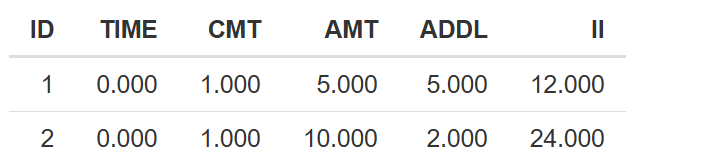
Sensitivity analysis
This section provides the tools necessary to perform Sensitivity analysis of the parameters in the selected model. Sensitivity analysis is a fundamental component in model evaluation, helping to identify which parameters most influence model outputs. By understanding how small or large changes in parameters affect predictions, users can prioritize efforts in data collection, model calibration, or hypothesis testing, ultimately improving model robustness and decision-making.

The section is divided into two main parts: the Configuration Panel on the left side and the Main Panel on the right side, where results are displayed.
The Configuration Panel is organized into two tabs:
- Sensitivity Analysis
- Visualization
To guide users through this section, we use the following structure:
- Sensitivity analysis
1.1 Local
1.2 PRCC
1.3 eFAST - Visualization
1. Sensitivity analysis
Source selection
Begin by selecting the source of the model:
- Current Project: Uses the model fitted or loaded in the current session (see Task for setup instructions).
- New Model: Load an external model file via the
 button.
Once selected, click  . This action loads the model and displays a list of parameters available for sensitivity analysis.

Parameter
After selection of parameters to include in sensitivity analysis, the Parameter table becomes active. Users can select parameters for analysis and review their current values:
- Parameter: Name of the model parameter
- Value: Current value defined in the model
- LL (Lower Limit) / UL (Upper Limit): Limits used for analysis
- Percent: The range of variation (±%) to compute LL and UL (50 by default)
This table is interactive:
- Double-click any cell to edit its value.
- Editing the Percent will auto-update LL and UL.
- Manually entering LL/UL overrides the Percent value.

Event table configuration
By default, the event table includes a single simulation scenario (ID = 1) with the following columns:
ID: Scenario identifierTIME: Time points for dosesCMT: Compartment numberAMT: Administered dose amountADDL: Additional dosesII: Interdose intervalEVID: Event identifier
You can expand this table as needed:
 - Adds a new row with a unique ID
- "New column name" (+)
 - Adds custom columns (e.g., covariates like
 AGE,SEX,WT)  /
/  : Deletes the last added row or column

Options
Define the simulation window:
- Select output names: Choose the state variables or user-defined functions you wish to record
- Min. time / Max. time: Start and end times for simulation results to be forwarded to the Visualization tab
- Time step: The interval between consecutive time points in the simulation

1.1 Local Sensitivity Analysis
When selecting the Local sensitivity analysis option, simulations are executed using Simurg’s internal calculation engine, with parameters systematically varied across defined ranges. This type of analysis helps identify the impact of individual parameter changes on model outcomes, while keeping other parameters constant.
Once Local is selected, the following configuration options appear:
- Number of curves: Specifies how many simulation curves will be generated for each parameter (default = 10). Each curve represents a simulation where the selected parameter is varied linearly between its Lower Limit (LL) and Upper Limit (UL) values as specified in the parameter table.
- Select static component: Choose statistical summaries to include in the plot — mean, minimum (min), and maximum (max) — across time for each simulation output.

After configuring these options, click the  button. The resulting plot will be displayed in the Main Panel.
Plot structure
The resulting plot is organized as follows:
-
Horizontally, the graph displays the selected output variables. For each output, sub-panels represent the simulation scenarios defined in the Event table.
-
Vertically, the graph displays the parameters selected for the sensitivity analysis.
-
The y-axis is scaled from 0 to 1, as all values are normalized to facilitate comparison across outputs and parameters. This normalization is done by scaling each simulation result within the selected time window relative to its maximum observed value, allowing for interpretation of parameter influence independent of the units or magnitude of the model outputs.
-
The x-axis
- Without statistical components, the selected number of curves are displayed as a function of time.

- With selected statistical component (e.g., max, mean, min), represents the statistical components and under each component, a group of bars is displayed corresponding to the number of simulation curves.

This visualization allows users to quickly assess which parameters have a strong or minimal impact on specific outputs under defined scenarios and statistical summaries.
1.2 PRCC Sensitivity Analysis
Partial Rank Correlation Coefficient (PRCC) is a global sensitivity analysis method that quantifies the relationship between model parameters and outputs while accounting for the influence of other parameters. Unlike local sensitivity, which explores variations one parameter at a time, PRCC provides a rank-based correlation across many samples, helping identify parameters with strong monotonic influence on outcomes across the entire parameter space.
After selecting the PRCC analysis type, the following configuration options are displayed:
- Sample size: Defines the number of samples generated for analysis (default = 500). A higher sample size increases precision but may take longer to compute.
- Select static components: Choose one or more summary statistics to compute for each output (mean, max, min).
- Select PRCC type plot: Choose between two visual formats — Histogram or Heatmap.
Plot pptions
-
Histogram
- X-axis: Displays the selected parameters.
- Y-axis: Shows the PRCC values ranging from -1 to 1. A value close to 1 indicates a strong positive correlation (as the parameter increases, the output increases), while a value close to -1 indicates a strong negative correlation. A value near 0 suggests no correlation.
- Color coding: Each bar is colored based on the combination of output variable and statistical component selected, helping distinguish multiple relationships at a glance.

-
Heatmap
- X-axis: Displays the selected parameters.
- Y-axis: Shows the combinations of selected outputs and statistical components.
- Color intensity: Each cell is colored to reflect the PRCC value, on a scale from -1 (blue, strong negative) to 1 (red, strong positive), with 0 represented in a neutral color. This format offers a compact overview of parameter impact across all outputs and statistics.

This method is particularly useful when exploring nonlinear or complex models, as it helps prioritize which parameters most influence the model's behavior globally.
1.3 eFAST Sensitivity Analysis
Extended Fourier Amplitude Sensitivity Test (eFAST) is a variance-based global sensitivity analysis method that quantifies how uncertainty in model outputs can be attributed to different sources of uncertainty in the model inputs. Unlike correlation-based methods, eFAST decomposes output variance across the input parameters using frequency domain techniques, making it effective for nonlinear and non-monotonic models.
After selecting the eFAST analysis type, the following configuration options are available:
- Number of simulations: Specifies how many independent sampling sets are generated for the sensitivity analysis (default = 10). Each simulation contributes to a more robust estimation of the sensitivity indices. A higher number of simulations increases result stability but also computational time.
- Select static component: Choose one or more summary statistics to apply to the outputs (mean, max, min), which will be used to calculate the sensitivity indices.
Once the desired configuration is set, clicking the  button runs the analysis and displays the results in the main panel using a faceted layout:
- Horizontal panels: Represent the selected output variables.
- Vertical panels: Correspond to the selected statistical components (e.g., mean, max, min).
- X-axis: Displays the selected parameters.
- Y-axis: Shows the eFAST sensitivity index for the selected response summary, typically ranging from 0 to 1, where higher values indicate stronger influence of the parameter on the output variability.
- Two types of sensitivity indices are plotted:
- First-order index (yellow): Measures the direct effect of a parameter on the output, assuming all other parameters are fixed.
- Total-order index (blue): Captures the total effect, including both direct effects and all interactions with other parameters.

💡 The difference between these two values reveals the extent of interactions: a large gap between total and first-order indices suggests that the parameter plays a significant role through interactions, not just in isolation.
This analysis helps modelers identify which parameters are most influential in driving model variability and which may be safely fixed or simplified in further simulations.
2. Visualization
The Visualization tab provides tools to customize the appearance of the resulting plots without needing to re-run the sensitivity analysis. This allows for a more efficient workflow when adjusting visual elements or focusing on specific components of the results.
- In the "Select parameters" window, you can add or remove parameters from the plot. The list shown includes only the parameters selected in the Sensitivity analysis tab.
- Similarly, the "Select variables" window displays the list of output variables originally chosen for the analysis.
- The "Select statistical components" window allows you to toggle between the summary statistics (mean, max, min) that were previously included in the sensitivity configuration.
Additionally, you can customize the axis labels by entering text in the "X-axis name" and "Y-axis name" fields.
Once all adjustments are made, click the  button to apply the new configuration. The updated plot will be displayed in the main panel, reflecting the selected elements and labeling preferences. This streamlined interface allows for clear presentation and quick exploration of different visualization angles.
The Sensitivity Analysis section offers a comprehensive and flexible framework for exploring how model parameters influence simulation outcomes. By providing three distinct analysis methods—Local, PRCC, and eFAST—along with customizable visualization tools, users can efficiently identify key parameters, assess model robustness, and gain deeper insights into system behavior. This functionality is essential for informed decision-making in model development and evaluation.
About MultiReg module
Background
Quantitative pharmacology analyses are represented by a wide range of mathematical methods, closely tied to the source data being analyzed. Among the most common data types we can distinguish time-to-event (TTE) data (e.g., overall survival data), as well as nominal data, which can be either binary (e.g., response to therapy, occurrence of adverse events), multinomial (e.g., tumor response by RECIST) or ordinal (e.g., severity of adverse events), and count data (e.g., frequency of certain adverse event). Implementation of associated mathematical methods in a user-friendly GUI is critical for performing efficient and timely model-based analyses.
Objectives
- Extend Simurg syntax to support various types of regression modeling.
- Provide functionality for model development, diagnostics, covariate search.
- Allow to apply joint modeling techniques.
Sections of the module
Creating a dataset for exposure-response analysis
On this page, you can create your own dataset for ER analysis.
1: Upload PK and Response data
First, navigate to the "Upload PK and Response data" tab.
1.1: Select the Working Directory
Here, you need to select the working directory by pressing  button. Working directory containing your project, which should include:
- The PK model (ModFile.txt)
- The dataset used for parameter fitting (DataTrans.csv)
- The Results folder with individual parameter values (Results/indiv_parameters.csv)
Your dataset should include the following columns:
ID- subject ID, numericAMT- dosage of the drug, numeric
Once you select the working directory, the dataset will appear in the right panel, figure 1.
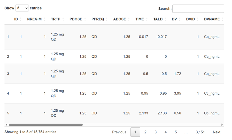
Initialize your PK data by pressing
 button.
After press button, if there are no necessary files or directors, you will see a notification in the lower right corner clarifying which file was not found.
1.2: Select the Exposure Data File
Next, select the file containing exposure data by pressing  button..
Once selected, the dataset will appear in the right panel, figure 2.
button..
Once selected, the dataset will appear in the right panel, figure 2.
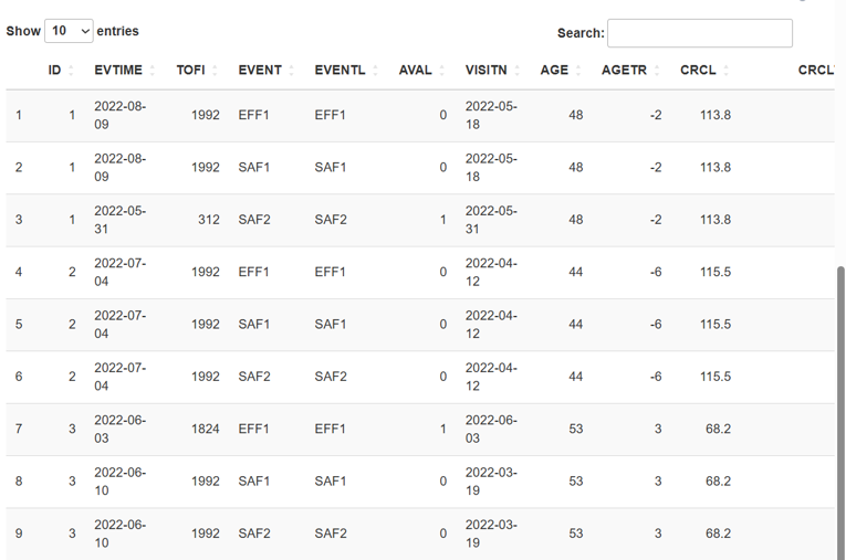
You should then specify which columns in your file represent:
Name of ID column- subject ID, numericName of TOFI column- the period of time from the moment of the first dosage to the first event, numericName of endpoint column- any type of dataName of response analise value column- for binary - 0 ot 1, numericName of nominal dosing column- for example: QD, QW, BID etc, any type of dataName of nominal frequency column- any type of data.Select covariate columns- сhoose the covarians with whom you will work further, any type of data
All of the above stakes, except for the covariat, will appear to be a recreational part of Response dataset.
We also recommend adding the EFFFL and SAFFL columns to your dataset. These columns should contain 1 for records corresponding to the respective endpoint type (efficacy or safety), and 0 otherwise. While these columns are not required, they allow you to save exposure–response datasets separately for each endpoint type.
After completing, initialize your response data by pressing  button.
2: Exposure-response dataset generation
Now that all required data is loaded, go to the ER dataset generation tab.
2.1: Choose the time intervals for simulation
In this section, you can run simulations over different time intervals to calculate exposure parameters. Select one or more time intervals for your ER dataset using the dropdown list Choose variables:.
Multiple simulations can be selected simultaneously.
Time intervals explained:
First cycle- the time interval from the first dosing event to the end of the first cycle, based on the nominal dosing regimen.Single dose- the time interval from the first dosing event to the end of the first cycle, assuming only a single dose is administered.Scaled steady-state- the time interval equal to the length of one treatment cycle, starting from the time point at which the PK profile reaches steady-state. The dose used in the simulation is the average dose calculated over the period from the first dose up to the time of first incidence (TOFI).Steady-state- the time interval equal to the length of one treatment cycle, starting from the time point at which the PK profile reaches steady-state. The simulation uses the nominal dosing regimen.
For all simulations, you need to define Cycle duration, which should be entered in the Enter a Cycle duration field.
For Scaled steady-state and Steady-state simulations, you also need to define "Steady state cycle", which should be entered in the Enter a Steady state cycle field.
You also need to choose a variable of the model from the dropdown list Simulation output, for which you will make the simulations. In the dropdown list you will see all model variables that were taken from the control file.
Once all fields are filled and the simulation types are selected, start the simulations by pressing  button.
After completion, the simulation results will be visualized in the right panel.
button.
After completion, the simulation results will be visualized in the right panel.
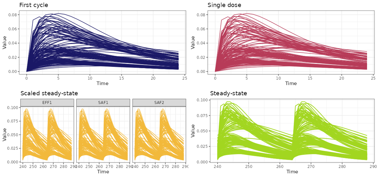
You can save the generated plots to the Results folder in your working directory by pressing  button. The file will be saved as
 Results/exposure_simulation.png.
2.2: Select Exposure parameters
Now we can calculate Exposure-Response based on data obtained after simulations for this you should select the exposure parameters needed for further analysis.
Metrics can be selected from the dropdown list Choose exposure metrics:, with the option to choose multiple metrics at once.
Exposure parameters Explained:
- Cmax - the maximum concentration of the drug
- Cmin - the minimum concentration of the drug
- Cavr - the average concentration of the drug
- AUC - the square under the drug pharmacokinetics curve
After chosed exposure metrics, start the estimation by pressing  button.
The final table, exposure data will appear in the right panel.
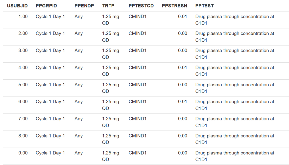
2.3: Save results
To save the SIMPC and SIMPP datasets, click the  button. The files will be saved in the same folder as your exposure dataset, as
 simpc.csv and simpp.csv, respectively.
To generate and save the exposure–response dataset, select which endpoints you want to include from the dropdown menu ADER dataset type: all Efficacy or all Safety endpoints. Then click the  button. The data will be saved in the same folder as your exposure dataset, as
 adereff.csv or adersaf.csv, respectively.
If your exposure dataset does not contain the EFFFL and SAFFL flags, the exposure–response dataset will include all endpoints and be saved as adereff.csv in the same folder.
After the exposure–response file is generated, a notification will appear in the bottom-right corner indicating which endpoints were included (Figure 5).
Figure 5. Expample of notification. In adereff.csv saved exposure–response data for "INR", "VT", "TEAE" endpoints.
Data initialization
On this tab, the dataset is uploaded for subsequent Exposure-response analysis (ER analysis).
ER analysis evaluates the relationship between drug exposure (e.g., AUC, Cmax) and clinical response (e.g., efficacy or safety outcomes). It helps determine whether higher or lower drug exposures lead to different probabilities of a desired effect or adverse event.
Exposure-response dataset (ER dataset) structure should correspond CDISC standards [1].
The dataset must include two types of variables used for analysis: independent variables (predictors) such as exposure metrics and covariates, and dependent variables — response metrics (endpoints).
A single dataset can contain multiple types of responses. The response type is identified in the PARAMCD column, while the values of the dependent variable are stored in the AVAL column.
Exposure metrics and covariates are stored in separate columns with appropriate names (e.g. CAVESS, CMINFC, AGE).
Work on the Data initialization tab begins with selecting a dataset for exposure-response analysis. To do this, click button  .
.
In the opened window, select a csv file from the directory on the server. It can be a file with a dataset generated when working on the Dataset generation tab, or another dataset.
After the file with dataset is loaded, it appears in the preview on the right side of the screen.
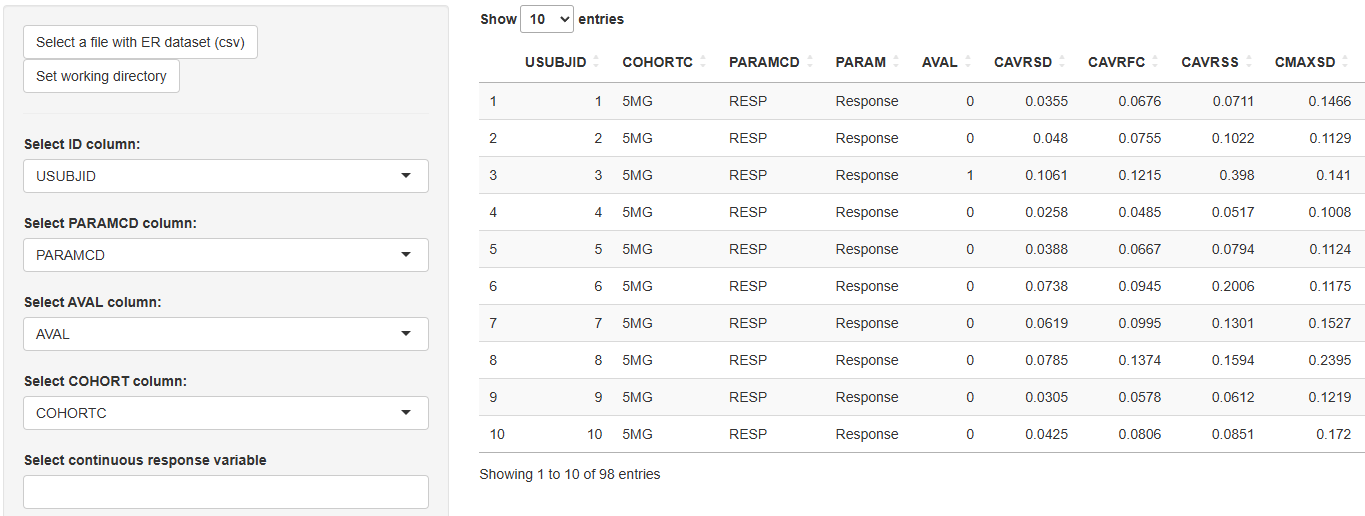
Then one should select names of four mandatory columns from dropout lists:
- Select ID column– the name of the column with the Subject Identificator (e.g.
ID,USUBJID). - Select PARAMCD column – the name of the column with the Parameter Code (
PARAMCD). - Select AVAL column – the name of the column with the Analysis Value (
AVAL). - Select COHORT column – the name of the column with the Cohort values (e.g.
DOSE,TRTP).
In the next block of drop-down lists, one can select the names of the response metric, exposure metrics and covariates that will be included in the analysis:
-
Select continuous response variables - the names of the variables from the
PARAMCDcolumn (for further work in the Continuous section). -
Select binary response variables - the names of the variables from the
PARAMCDcolumn (for further work in the Binary section). -
Select exposure variables - the names of all ER dataset columns.
-
Select continuous covariates - the names of all ER dataset columns.
-
Select categorical covariates - the names of all ER dataset columns.
 button - select a working directory - a folder on the server in which the results of the further analysis will be saved. It could be existing folder or one can create a new one. Selecting a directory is mandatory.
After all the required fields are filled in, click  . If the working directory and required fields are selected, the message “Dataset successfully initialized” will appear.
If the working directory or some required fields are not selected, a warning will appear.
After successful initialization of the dataset, one can proceed to analysis in the Binary or Continuous sections.
References
[1] https://www.cdisc.org/standards/foundational/adam
Binary
Exposure–response analysis for binary endpoints (e.g., response vs. no response) aims to evaluate how drug exposure affects the probability of a clinical outcome. This process includes several key steps:
-
Exploratory Data Analysis (EDA): Understanding the distribution of exposure and response across subgroups.
-
Base Model Development: Building a model that describes the probability of response as a function of exposure.
-
Covariate Search: Identifying patient factors that influence response probability.
-
Model Diagnostics: Assessing the fit and predictive performance of the model including visual predictive check and sensitivity analysis (evaluating the robustness of model predictions to changes in covariates).
-
Forward Simulations: Simulating response probabilities under various dosing or covariate scenarios.
This structured approach supports informed decision-making in dose selection and patient subgroup evaluation.
Exploratory data analysis (EDA)
Exploratory data analysis (EDA) is the process of examining and summarizing datasets to understand their main characteristics before applying formal modeling or hypothesis testing. EDA helps identify patterns, trends, outliers, missing values, and potential relationships within the data.
Navigation
- 1. Exposure by Cohort
- 2. Exposure by Endpoint
- 3. Empirical logistic plots
- 4. E-R quantile plots
- 5. Number of occurences
- 6. Table Exposure by Quartile
- 7. Table Exposure by Cohort
Before you start working on the EDA tab, make sure that exposure and response metrics are selected in the Data initialization tab. If this is not done, a warning will appear: "Please select exposure and/or response variables in Data Initialization section".
If the metrics are selected, the page will look like this:

The EDA section includes several types of exploratory analysis, each implemented on a separate tab:
- "Exposure by Cohort" - contains Boxplots of exposure metrics stratified by cohort
- "Exposure by Endpoint" - contains Boxplots of exposure metrics stratified by dichotomous (binary) endpoint
- "Empirical logistic plots" – contains Empirical logistic plots
- "E-R quantile plots" - contains Exposure-response quantile plots
- "Number of occurences" - contains Table of distribution of exposure by response
- "Table Exposure by Quartile" – contains Table of distribution of exposure by quartile
- "Table Exposure by Cohort" - contains Table of distribution of exposure by cohort.
At the top of the EDA tab, there is a  button and fields for selecting exposure and respons metrics for exploratory analysis:


If the fields are empty, then all exposure and response metrics will be included in the analysis.
To include only specific metrics in the analysis, select them in the Select exposure metrics, Select response metrics fields:

Click to start the analysis.
The results of the exploratory analysis can be seen on the individual tabs.
After the results are generated, you can adjust the number of metrics for which plots are displayed on the current tab using the  or
or  buttons. Choose specific metrics in dropdown lists Select exposure variables and Select response variables at the top of the tab, click or and plots (tables) will change only on the current tab.
1. Exposure by Cohort
Boxplots of exposure metrics stratified by cohort visually compare the distribution of drug exposure (e.g., Cmax, AUC, Css) across different cohorts in a clinical study. These boxplots provide insights into the spread, central tendency, and variability of exposure within each cohort. These plots allows to compare exposure levels across cohorts (e.g., different treatment groups, age categories, renal function groups), assess variability in drug exposure , identify potential outliers that might need further investigation and check for dose proportionality or differences in drug metabolism between groups.
To compare the means of exposure metrics across different cohorts ANOVA method is used. It helps to determine whether the differences in exposure distributions across dose levels are statistically significant.
Order of operations on the tab
Each page displays up to six graphs. If there are more graphs, they are spread across multiple pages. Use the radio buttons to switch between pages. The response and exposure metrics corresponding to each boxplot is indicated in the graph header. The panel of plots appears as follows:

By default, boxplots are colored by cohort, individual points are overlaid, and p-values from the ANOVA method are displayed on the plots. You can customize these visualization parameters using the checkboxes in the left panel.

Click to redraw the plot after changing the visualization settings.
Saving Results
 – saves the panel of plots from the current page to the "EDA" folder in the working directory as a PNG file.
 – saves all generated panels of plots to the "EDA" folder in the working directory as multiple PNG files.
2. Exposure by Endpoint
Boxplots of exposure metrics stratified by a dichotomous (binary) endpoint visually compare the distribution of drug exposure between two outcome groups, such as, responder vs. non-responder (e.g., efficacy endpoint) or adverse event present vs. absent (e.g., safety endpoint).
To compare the means of exposure metrics corresponding to different types of endpoints T-test method is used. It helps to determine whether the differences in exposure distributions across binary endpoints are statistically significant.
Order of operations on the tab
Each page displays up to six graphs. If there are more graphs, they are spread across multiple pages. Use the radio buttons to switch between pages. The exposure metric corresponding to each boxplot is indicated in the graph header. The panel of plots appears as follows:

By default, boxplots are colored by cohort, individual points are overlaid, and p-values from the T-test are displayed on the plots. The display of individual data points and p-values can be configured from the side panel.

Click to redraw the plot after changing the visualization settings.
Saving Results
– saves the panel of plots from the current page to the "EDA" folder in the working directory as a PNG file.
– saves all generated panels of plots to the "EDA" folder in the working directory as multiple PNG files.
3. Empirical logistic plots
Empirical logistic plots are graphical tools used in binary logistic regression to visualize the relationship between a continuous predictor and the probability of an outcome event. They are particularly useful for assessing the functional form of the predictor before fitting a formal logistic regression model. Helps to determine whether the relationship between the predictor and the outcome follows a linear logit scale (which is an assumption of logistic regression).
Each page displays up to six graphs. If there are more graphs, they are spread across multiple pages. Use the radio buttons to switch between pages. The response and exposure metrics corresponding to each boxplot is indicated in the graph header. The panel of plots appears as follows:

Saving Results
– saves the panel of plots from the current page to the "EDA" folder in the working directory as a PNG file.
– saves all generated panels of plots to the "EDA" folder in the working directory as multiple PNG files.
4. E-R quantile plots
Exposure-response quantile plots are graphical tools used to explore the relationship between a continuous exposure variable and a response variable. These plots help assess trends in exposure-response relationships without assuming a specific parametric model. The continuous exposure metric is divided into quantiles. For each quantile, the number of responders is calculated. The data is presented as bar plots, indicating the percentage and proportion of responders in the quartile. The x-axis shows the boundaries of the Quartile Groups for the given metric.
Each page displays up to six graphs. If there are more graphs, they are spread across multiple pages. Use the radio buttons to switch between pages. The response and exposure metrics corresponding to each boxplot is indicated in the graph header. The panel of plots appears as follows:

Saving Results
– saves the panel of plots from the current page to the "EDA" folder in the working directory as a PNG file.
– saves all generated panels of plots to the "EDA" folder in the working directory as multiple PNG files.
5. Number of occurences
This analysis examines whether drug exposure is associated with treatment outcomes. Table indicates persentage of responders and non-responders for each endpoint.
Example of a table:

Saving Results
 – saves table as a CSV file.
6. Table Exposure by Quartile
A table of distribution of exposure by quartile summarizes how a continuous exposure metric is distributed across quartiles of the population. This table contains information about Quartile Groups (Q1–Q4). The dataset is divided into four equal-sized groups based on exposure levels.
Each table contains data for a single endpoint and all selected exposure metrics. Tables for different endpoints are displayed on separate pages.
Example of a table:

You can choose only some metrics in dropdown lists Select exposure variables and Select response variables, click and the output will change only on the current tab.
Saving Results
 – saves current table as a DOCX file.
 – saves all generated tables into a single DOCX file.
7. Table Exposure by Cohort
A table of distribution of exposure by cohort summarizes the distribution of a drug exposure metric across different cohorts in a clinical study. Cohorts are predefined groups of subjects, often based on characteristics such as treatment regimen, age group, disease severity, or other stratification criteria. Main purposes of this table are comparison of exposure levels between different study groups and assessing variability in drug exposure across patient populations.
Key Components:
- Cohort Groups: Subjects are grouped by predefined study cohorts (e.g., treatment groups, age categories).
- Sample Size (N): The number of subjects in each cohort.
- Exposure Range: The minimum and maximum exposure values in each cohort.
- Median and Mean Exposure: Measures of central tendency for exposure in each cohort.
- Standart Deviation (SD).
Each table contains data for a single endpoint and all selected exposure metrics. Tables for different endpoints are displayed on separate pages.
Example of a table:

Saving Results
– saves current table as a DOCX file.
– saves all generated tables into a single DOCX file.
Base Model
Logistic Model
On this tab you can build a logistic regression model to explore the relationship between exposure metrics and the probability of a response event — a key component in Exposure–Response (ER) analysis.
The logistic model is calculated using the following equation [1]:
$$ \log\left(\frac{p}{1 - p}\right) = aX + b $$
Where:
- a – the intercept of the model
- b – the slope (effect size of exposure)
- X – the value of the exposure metric
- p – the probability of the response event occurring
To directly calculate the probability p(x) based on the exposure level, use [1]:
$$ p(x) = \frac{1}{1 + e^{-(aX + b)}} = \frac{e^{aX + b}}{1 + e^{aX + b}} $$
This function returns values between 0 and 1, representing the likelihood of the event at a given exposure level.
Running the Model
To begin the modeling process, simply click the Run button. This will automatically initiate optimization of logistic models for all combinations of exposure metrics and response variables, that you have chosen on the Data Initialization tab.
Once the computation is finished, you'll be presented with a detailed summary of the results in the table on the right side o tab.
Output Table
After optimization is complete, a summary table will appear on the right panel of the screen.
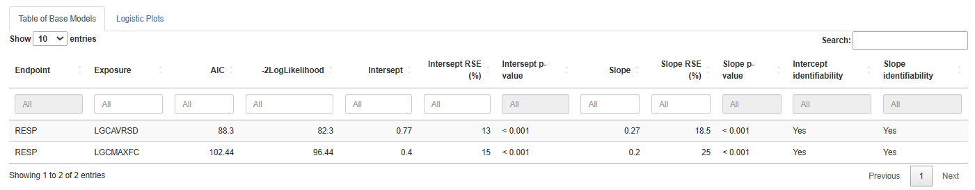
The table includes the following columns:
- Endpoint – name of the response variable
- Exposure – exposure metric used in the model
- AIC – Akaike Information Criterion (lower is better)
- -2LogLikelihood – negative log-likelihood value
- Intercept – estimated intercept
- Intercept RSE (%) – relative standard error of the intercept
- Intercept p-value – significance level of the intercept
- Slope – estimated slope
- Slope RSE (%) – relative standard error of the slope
- Slope p-value – significance level of the slope
- Intercept identifiability – whether the intercept can be reliably estimated
- Slope identifiability – whether the slope can be reliably estimated
Saving Results
You have flexible options for exporting model results:
Save table .csv– download the full summary table in CSV formatSave list of all models .Rdata– save all model objects for further analysis in RSave list of best model .Rdata– save only the model with the lowest AIC (i.e., best fit)
Logistic Plots
The Logistic Plots tab provides interactive visualizations to help interpret model predictions.
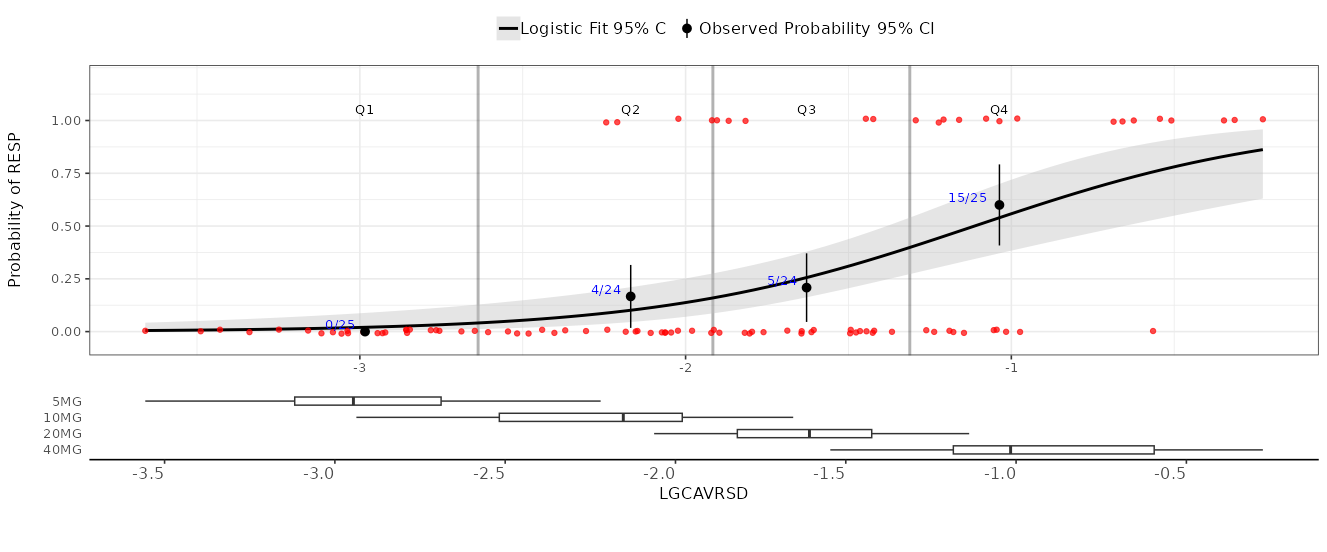
Plot Content
Use the right-hand panel to select the specific exposure metric and response variable you want to visualize.
The plot includes the following components:
- Y-axis: probability of the response event
- X-axis: exposure metric value
- Black curve: model-predicted probability across exposure values
- Gray area: 95% confidence interval around the prediction
- Red points: observed individual data points
- Black dots with whiskers: observed proportions of events in exposure bins (with 95% CI)
- Blue text: numerical proportions shown directly on the graph
At the bottom, you’ll find boxplots showing how exposure values are distributed across different treatment groups.
Plot Settings
In the left-hand panel, you can fully customize your plots:
- Set axis titles and numeric limits
- Toggle logarithmic scale on the axes
- Display the model's AIC value on the plot
- Adjust the colors and sizes of curves and points for better visibility
Once your settings are configured, click the Update Plot button to apply changes.
Saving Plots
Export your plots in PNG format with ease:
Save current .png– download the currently displayed plotSave all .png– download plots for all exposure–response combinations in batch mode
References
[1] McCullagh, P. (1989). Generalized Linear Models (2nd ed.). Routledge. https://doi.org/10.1201/9780203753736
Covariate search
At this stage of model development, the covariate structure of the model is reconstructed in an automated way. This is the last step of the binary exposure-response model development.
There are two panels on this page:
Generalpanel contains inputs for the necessary information for the covariate searchOptionspanel contains inputs with options of the covariate search algorithm
General panel
On General panel the way to the working directory should be provided to the interface. It is done by the Source input. This input has two options. The first one is  . If this option is chosen, the working directory will be equal to the one chosen on the Data Initialization panel. Another option is
  . After choosing this option the user can specify any project folder by pressing on
  .
.
For the proper work of the algorithm, the chosen folder should contain the file LogitModelsList.RData with the list of base models for each response variable. The path to the chosen directory is printed in the interface. Also, response variables, exposure metrics and covariates should be specified on the Data Initialization panel.
After inputting all necessary information, the user can press button to start the covariate search algorithm. After the search is finished, the table with best models for each of the provided base models will be printed in the interface. The table will contain the following information:
-
Final Model Structure:
-
ResponseThe endpoint variable described by the model. -
ExposureThe exposure metric that best characterizes the response variable. -
CovariatesStatistically significant covariates included in the model.
-
-
Information Criteria Values:
-
LLThe log-likelihood of the fitted model. -
AICAkaike Information Criterion values.
-
-
Change in Information Criteria:
The difference in LL and AIC values compared to the corresponding base model.
The user can save this table to the working directory by pressing  button. Also, the user can save the list of final models to the working directory by pressing the
  button.
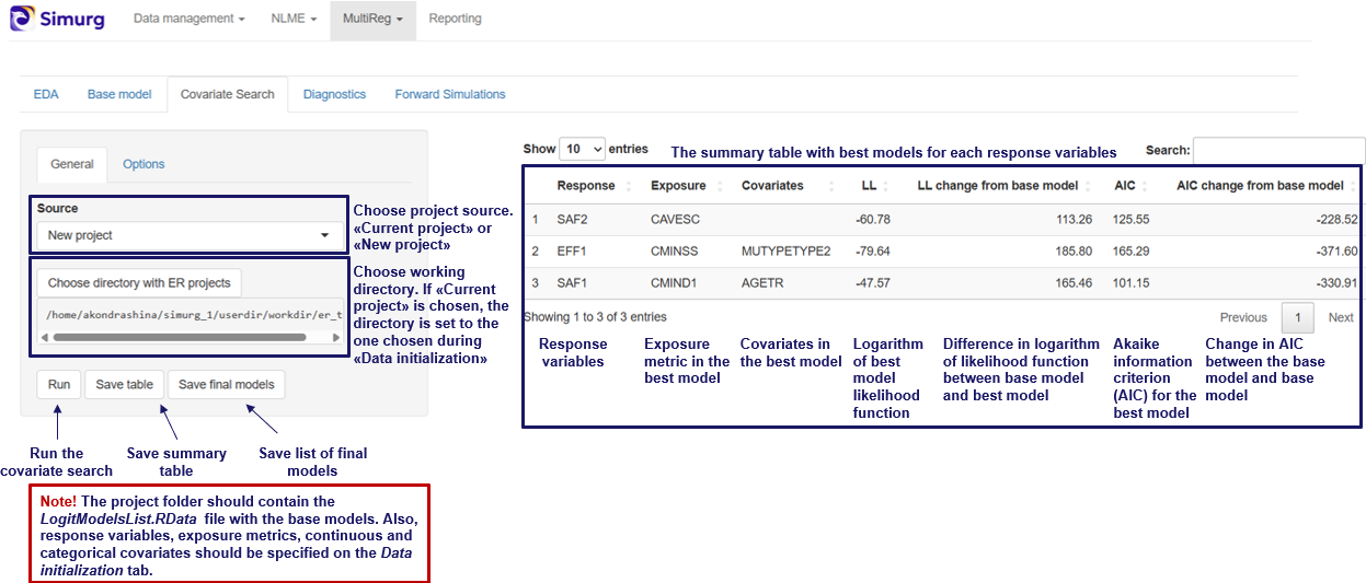
Options panel
The covariate search is performed using stepwise procedure. It consists of two parts: forward selection and backward elimination. On the options tab the parameters of the algorithm can be adjusted. The user can change the metric used for model comparison by Covariate evaluation method input. There are two options: model comparison with log rank test ( option) and Akaike information criterion (
 option). In accordance with the chosen evaluation metric, thresholds for forward selection and backward elimination can be changed.
Model diagnostics
The purpose of this section is to diagnose the model with VPC plot (Visual Predictive Check plot), Covariate sensitivity plot and Table of model odds ratios.
Navigation
1 Model selection
The Model selection tab is used to choose the model for diagnostics and to add information about the covariates.
By clicking the  button, a file with the final models is loaded from the working directory. This file is generated in the Covariate search section. Make sure that the file with models has been saved on that tab, otherwise notification “Project folder is empty” will appear.
Now, a model should be selected by response from the drop-down list  . Each response corresponds to one model.
Next, click  .
.
Before running diagnostics, additional information about covariates can be added, such as user-friendly names for plot labels or rescaling of model parameters. This information can be entered into the tables. To edit a cell, double-click it with the left mouse button.
1.1. Table of continuous covariates

Note that in the model transformed covariates can be used. Two types of transformed covariates are available:
-
Log-transformed
-
Median-centered
A median-centered covariate is a continuous covariate that has been transformed by subtracting its median value from each individual value. This results in a covariate whose median is zero, while the distribution and range of values remain the same (only shifted).
The Table of continuous covariates contains the following columns:
-
COV (“Covariate”) – automatically filled in from the model file. The first row corresponds to the exposure metric. The following rows contain the names of model continuous covariates.
-
BTR (“Back Transformed”) – contain the name of the corresponding untransformed covariate from the dataset, if the covariate listed in the COV column is transformed. Only filled in for transformed covariates. Example: If the COV column contains
LOGCAVG, which is obtained by log-transforming the values in theCAVGcolumn, then BTR should be set toCAVG. If the COV column containsMEDBWT("Median-centered Body Weight"), which is theBWT("Body Weight") covariate transformed by subtracting its median value from each observation, then BTR should be set toBWT. -
TRTYPE (“Transformation Type”) – two options are available:
LOG– for log-transformed covariates andMED– for median-centered covariates. Only filled in for transformed covariates. -
STEP – fill in to change the scale of odds-ratio. Odds-ratio will be calculated per STEP units of continuous covariate. By default odds-ratio is calculated per one unit of continuous covariate.
-
NICENAME – add a user-friendly name for covariate that will appear in plot labels and table
1.2. Table of categorical covariates

The Table of categorical covariates contains the following columns:
-
COV (“Covariate”) – contains the names of model categorical covariates. Automatically filled in from the model file.
-
VAL (“Value”) - contains numeric codes of categories from the dataset. Filled in automatically.
-
NICENAME - one can add a user-friendly name for the category that will appear in plot labels and table.
-
REFFL ("Reference Flag") - value
1indicates the reference category, while0corresponds to the other categories. Filled in automatically.
2. VPC plot
VPC plot is used to evaluate the fit and predictive performance of a logistic regression model relating drug exposure to the probability of response. It visualizes the model-predicted curve alongside empirical summaries of observed responses.
2.1. VPC plot description
A VPC plot example is shown in Figure 1.

- X-axis: Exposure
- Y-axis: Predicted probability of response (in percent)
- Line: Median predicted probability curve from the model
- Shaded Area: Confidence Interval
- Points: Median observed response probability within each quantile of exposure
2.2. Visualization options

On the sidebar panel the following parameters can be changed:
Number of replicas - number of simulated datasets generated using the model to estimate prediction intervals and assess the model's predictive performance.
Number of tiles - number of quartiles of exposure.
log x - add log-transformation of x-scale.
2.3. Running diagnostics
Click button to start the analysis.
Click  to save the VPC plot. The results will be saved to the folder “Model diagnostics” in the working directory.
3. Sensitivity plot/Odds ratios table
3.1 Covariate sensitivity plot
The Covariate sensitivity plot is used to explore how covariates (both continuous and categorical) impact the odds of response across the range of drug exposure. Main purposes of this plot are to assess the sensitivity of predicted odds to changes in key covariates across the exposure range and to visualize whether covariate effects are constant, increasing, or decreasing with exposure.
A covariate sensitivity plot example is shown in Figure 2.

Plot description
- X-axis: Odds ratios — representing the effect of each covariate on the probability of response
- Y-axis: continuous and categorical covariates.
- Points: Estimated odds ratios for each covariate at different exposure levels
- Error Bars: Confidence intervals for the odds ratios
3.2. Visualization options

On the sidebar panel the some parameters can be changed:
Select CI of parameters - select confidence interval for odds ratio values (e.g. value \(0.95\) means \(95 \% \) confidence interval).
The following fields refer to Predictor distribution:
Central tendency – used for transformed continuous covariates. Specify median for covariates centered on the median, and mean for those centered on the mean.
Sensitivity analysis for continuous covariates is performed using the extreme quantiles of the covariate (e.g., \(0.05\) and \(0.95\) by default). On the plot, two points are shown for each continuous covariate, corresponding to the left quantile and right quantile.
Left quantile - left quantile value of continuous predictor.
Right quantile - right quantile value of continuous predictor.
log y - log-transformation of y-scale
add reference group
3.3. Table of odds ratios
Table of odds ratios presents the results of a logistic regression analysis, showing the estimated effects of exposure and covariates on the outcome, including regression coefficients, p-values, and odds ratios with confidence intervals for both unit-based and user-defined changes.

Table represents numerical values of odds ratios and contains the following columns:
Term - names of the model terms (predictors). This includes the intercept, continuous covariates (e.g., age, weight), and categorical variables (e.g. sex, race) with their reference categories.
Estimate (CI) - estimated regression coefficient and its confidence interval (CI) from the logistic regression model. This value represents the change in the log-odds of the response per unit increase in the predictor.
p-value - statistical significance of the predictor. A small p-value (typically \( < 0.05\)) suggests that the predictor has a statistically significant effect on the response.
Odds ratio (CI) (per unit of measurement) - odds ratio and its CI for a one-unit increase in the predictor (e.g., 1 year for age, 1 kg for weight). For categorical variables, it represents the odds ratio relative to the reference category.
Odds ratio (CI) (per user-defined change) - odds ratio and its CI based on a user-specified change in the predictor value. For example, this might be a 10-year change in age or a defined change in drug concentration. This column allows users to interpret effect sizes more meaningfully in the context of practical changes.
3.4. Running diagnostics
Click button to start the analysis.
Click  to save the plot and table. The results will be saved to the folder “Model diagnostics” in the working directory.
Forward Simulations
In this tab, users can perform and visualize simulations using one of the fitted models
There are two panels at this tab:
Simulation optionsallows users to configure simulation settingsVisualization optionsenables customization of the simulation visualization
Simulation options
Forward simulations represent the final step in the exposure-response (ER) analysis workflow. By this stage, it is assumed that the users have already completed all prior steps and have obtained a list of final models—one fitted model per clinical endpoint. This list is typically created during the covariate search step and saved as FinalModelsList.RData. Alternatively, the users may generate the list manually. In that case, the file must be named FinalModelsList.RData and formatted as a list of generalized linear models.
Selecting a Model for Simulations
To perform simulation, the users must first select the model they wish to use. This is done in two main steps within the interface:
-
Specify the Model Directory
The users must indicate the directory containing the model list. This is configured using the
Sourceinput, which provides two options:-
Uses the working directory selected in the Data Initialization panel.
-
Allows users to specify a different folder by clicking button
The path to the selected directory is displayed below the
Sourceinput, allowing the users to confirm the correct directory before proceeding.
-
-
Load and Select the Model
Once the working directory is set, the users should clicks the  button to load the models from the
 FinalModelsList.RData into the interface.
After loading, the users select a specific model from the list by choosing its serial number via the  input. Once selected, the users can adjust covariate values within the interface and proceed to run simulations using the chosen model.
Adjusting Covariate Values for Simulations
This section explains how to change covariate values in the interface for simulations.
Continuous covariates
There are several ways to specify continuous covariates values to simulate with.
-
Define a range using
MinimumandMaximuminputs. Then, either:- Specify the number of points within this range using the
Lengthinput. - Define the interval between points using the
Byinput.
If
Lengthvalue is specified in the interface, theByvalue will be ignored. To useByvalue, clear theLengthinput. - Specify the number of points within this range using the
-
Enter a list of comma-separated covariate values into the
Random Sequenceinput. These values will be used for simulations. Note that this option works in the absence of theLengthandByvalues.

Categorical Covariates
Users can select specific values for categorical covariates to include in the simulation.
Selecting Output Type
Users can specify the Output Type for calculations, choosing between:
Response- the simulation results will be in response scales. For example, for binomial model the probability of response will be returned with this optionLink- the simulation results will be on the scale of linear predictors, without applying the link function. Currently this option is not available on the interfaceTerms- calculate a matrix giving fitted values in the model formula on the linear predictor scale. Currently it is not available on the interface
Confidence Intervals for Predictions
Users can toggle the inclusion of confidence intervals in model predictions using the  checkbox.
Running simulations
After configuring all simulation options, users must click the  button to start the process. The resulting plot can then be customized using the
 Visualization Options panel.
Visualization Options
In this panel, the user can customize how simulation results are displayed.
Main visualization options
The Select plot type input allows users to choose the type of plot. The available plot types are:
Scatterdisplays the simulated response versus the exposure metric as individual points. If standard errors (SE) were calculated on the Simulations panel, they will be shown as a ribbonPointrangesimilar to theScatterplot, but the SE is displayed as an interval around each point.Boxplotrepresents the simulated response using boxplots
Additional settings include:
Select X-axis variabledefines the variable to be used on the X-axisSelect color variablespecifies the variable used to color different data groupsSelect shape variableassigns different point shapes based on groupings defined by this variableSelect line type variabledetermines the line styles used for different groupsSelect group variabledefines the grouping variableSelect facet variablesets the variable used to split the data into facets (subplots)
Aggregation Options
To perform aggregation of simulation results, the users should specify the central tendency measure via the Select central tendency measure input. This input has three options:
Noneaggregation of the data will be doneMeanaggregation will be done by averaging the dataMedianmetric will be used for aggregation
Similarly, the variability can be selected by the Select variance measure with options:
SDstandard deviationRangemin-max rangeIQRinterquartile range80% CI80% confidence interval90% CI90% confidence interval95% CI95% confidence interval99% CI99% confidence interval
Plot Properties
If a Facet variable is defined, you can set the facet scaling using the Select facet scales input. Options include:
Free: both axes can vary across facetsFree_x: X-axis varies across facets; Y-axis remains fixedFree_y: Y-axis varies across facets; X-axis remains fixedFixed: Both axes remain the same across all facets
Other options:
Round X-values: specify the number of decimal places for X-axis ticks' labelsX as factor: check this box to treat X-axis values as categorical factorsAdd points: when enabled. observed data points will be added to boxplots
Cosmetics Settings
The title of the x axis can be customized by the X axis label input
Saving and Rendering Results
-
 button: click to render the plot using the current settings
 -
 button: saves the generated plot to the project directory. The name used to save the plot can be specified by
 Plot nameinput -
 button: saves the simulation results as a data table. The name used to save the simulation results can be specified by
 Table nameinput
About Reporting module
Background
Results of mathematical modeling analyses ought to be communicated to various audiences: fellow modelers, diverse teams of experts (clinical pharmacologists, biologists, etc.), to the regulatory authorities, in the industry or academia, etc. Communication might happen through various means and is typically associated with the compilation of HTML, PDF, MS PowerPoint or MS Word files containing said results. Arrangement of these files takes a significant portion of project time and human resources, with the primary challenge residing in the continuous adjustments of the content (often involving a large volume of tables, images, and cross-references) as the project progresses. As such, a tool that is able to enhance automatization and reproducibility of reports is expected to decrease the timelines and facilitate the quality of modeling analyses.
Objectives
- GUI for automatic report generation.
- Provide a library of MS Word and MS PowerPoint report templates.
- Parsing of the MS Word xml structure.
- Generate quick reports from active Simurg sessions.
Sections of the module
Report generation
The Report generation tab offers a user-friendly interface for managing objects within .docx or similar files. It is also equipped with a library of templates tailored for various types of modeling analyses, such as population PK and PK/PD reports, exposure-response reports, compiled in accordance with FDA guidelines and current best practices within the industry.
Report initialization
Report generation can be started by one of two options:
- Choosing a pre-made report template file from the
 drop-down list
 - Uploading an existing
.docxfile via button
Once the file is chosen or uploaded into the interface, it is parsed to determine the hierarchy of headers along with the corresponding objects located in each section. The file structure is then represented on the right panel.
Reporting of Simurg project
Generate quick reports from active Simurg sessions using  button. After defining project directory path, default directories for the report objects would be determined based on standartized structure of Simurg project directories.
Managing file objects
Each file object is labeled with a caption and is automatically assigned a running number, facilitating easy cross-referencing of figures and tables throughout the text. An object can be added or removed by, respectively, clicking  and
and  buttons associated with headers and individual objects. An object type (figure or table) can be specified using option buttons.
An object can be linked with a source file (.jpg, .png, .tiff – for figures; .csv, .xls, .xlsx – for tables) via  button. Path of the source file will then be displayed in red below the button. The reporting module stores relative paths in a
 .xml Control File, which can be visually reviewed and manually adjusted if needed. Upon the report generation, objects will be uploaded under the appropriate caption from the defined source file paths.
Updating of the report
If the Control File for the current report document exists at the source directory, source file paths which are defined there can be assigned to the file objects. If an object has information about its source file path in the Control File, the checkbox will appear to the right of the buttons associated with the object. If the checkbox is checked, the corresponding object will then be uploaded from the path defined in the Control File.

Export
The generated report can be exported by clicking  button on the left panel. The window will then appear which allow choosing directory and the name of the
 .docx report file. Along with the report, the .xml Control File created during report completion will be uploaded to the same directory. Successful document saving is accompanied by the  message
EVA module
EVA application alows automatic or manual chart data extraction from PDF files.
Working principle
Currently implemented EVA algorithms are based on parsing of vector graphics from pdf. In contrast to raster graphics, where all objects are represented as pixel intensities, in vector graphics all objects are coded as geometrical objects:

In case of vector graphics we can parse information about different objects (e.g. points, lines, figures) as well as text elements directly from the PDF files using specific python-based packages and then classify these objects to categories (e.g. axes, labels, experimental points, errorbars) based on their properties.
In case of raster graphics we have to use neuronal networks to detect and classify objects on image. We also need to use optical character recognition (OCR) tools to extract text from the image.
Currently introduced features:
- PDF files support
- Automatic extraction of points/errorbars from scatterplots
- Possibility of manual correction of the result
- Possibility of manual digitization for raster images
Will be implemented/fixed
- Rotated images
- Raster images
- Other plot types (boxplots/barplots, survival curves)
Navigation
Selection and navigation
File uploading
You can upload the pdf file using drag and drop option or select the file from the folder by clicking the "Select File" button.
File navigation
After the uploading a pdf navigation view will appear at the center. Left bar will contain a loaded file name and current page information as well as buttons for page zoom and rotation. Select "Detect Labels" and "Detect Points" checkboxes to enable automatic label and point detection.
Image selection
Image selection is initiated by clicking at the upper left corner of the image area. Then drag the mouse diagonally to create a selection rectangle and release it to finish selection. The selected area is marked with purple color.
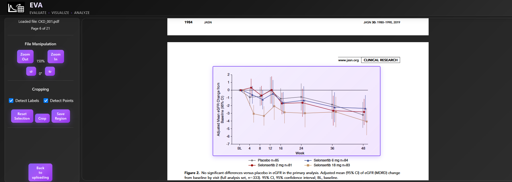
If you need to change the selection, click "Reset Selection" and start over. You can go back to uploading page ("Back to uploading" button), proceed with digitization ("Crop" button) or save the selected pdf fragment ("Save Region" button).
Automatic digitization
After the clicking of "Crop" button a processed figure with detected axes labels, points and errorbars will appear in a "Plot" tab. The x and y labels will be marked with the red and green boxes respectively and the detected label values will be displayed. The respective gridlines will be added on the top of the image.
Detected points and errorbars will be shown in different colors, reflecting their group belonging. Upon pointing mouse cursor on a specific point,values of the point itself and a corresponding errorbar will be displayed as a tooltip. All point values will be available in a "Table" tab. If no y errorbars are detected the min and max errorbar values will be set to the y point coordinate.
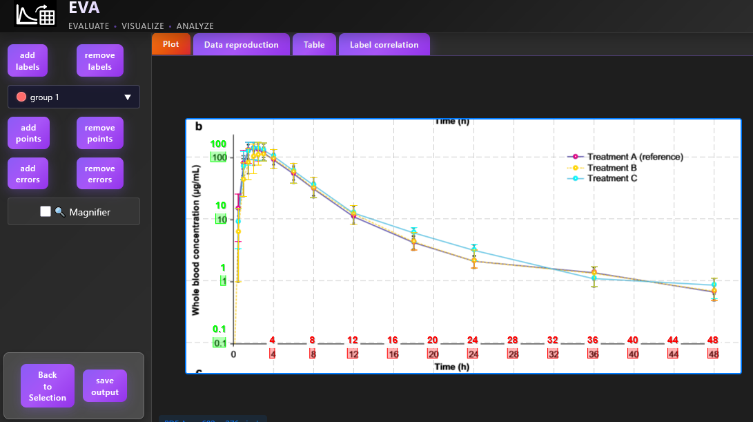
In case of raster image no detected elements will be displayed.
Label detection check and correction
In case of linear scale a linear correlation between label positions and label values is assumed, the user can check this correlation for both x and y axes in "Label correlation" tab to identify outliers. In case of log scale a linear correlation between decimal logarithm of label positions and label values is assumed:
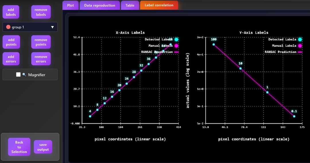
In case if the image text element is misclassified as a label it can be removed on the plot tab after the clicking on the "remove labels" button and clicking on the respective label with a mouse. The label correlation plot will be updated respectively.
The user can also manually add labels by clicking on the "add labels" button and selecting the label region. After it a new window will pop up where the user can specify the label type (x or y) and a label value.
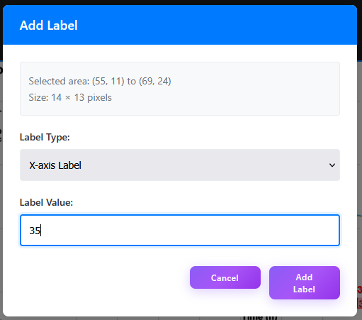
Point and errorbar correction
Digitized data are displayed in a "Data reproduction" tab:
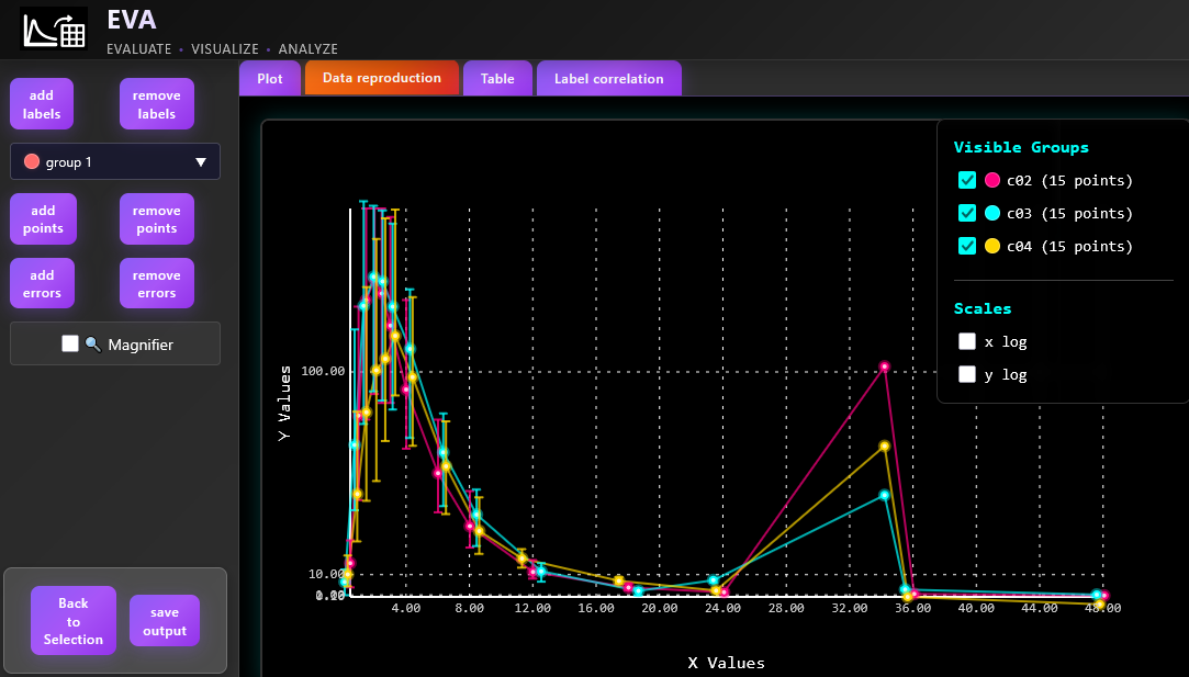
The user can also remove the points or errorbars on the "Plot" tab. To remove the point or errorbar the user can press "remove points" button and click on the point, no group selection is required. In contrast to the point removal, errorbar removal requires group selection as errorbars are oftenly overlapped.
To add a point or errobar the user should first select point group from the dropdown menu on the left side bar. Th dropdown menu contains names of the detected groups as well as default group names (group 1, group 2 etc.), which are used in case when the whole point group was not detected by the algorithm. The user then should switch to the add point/ add errorbar mode and click on the point/ upper or lower errobar cap to digitize it.
To facilitate manual point and errorbar processing the user can activate magnifier by selecting "Magnifier" checkbox. The "Table" tab will be updated after each label or point/errorbar addition or removal to display actual dataset.
Manual digitization
If no elements have been detected the user can manually add them. The user should select at least two x or y labels for linear scale to enable coordinate conversion process for digitized points and the proceed with the point digitization. The user can add points or errobars by the algorithm, described in the previous section.
Result analysis and saving
Digitized data are available in a tabular form in a "Table" tab: