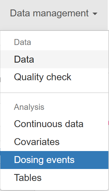
Dosing events
Dosing Events
The Dosing Events section offers an interactive workspace for visualising dose administration patterns across subjects. Whether you need a quick overview of how many doses each participant received, a detailed look at infusion times, or a check on intervals between administrations, this section provides an array of pre-configured plots that can be customised to your needs.
Five tabs are available, each devoted to a specific view of twelve events:
- Number – total doses per subject
- Amount – dose amounts per subject
- Interval – spacing between doses
- Times – actual dosing timestamps
- Infusion – infusion-duration profiles
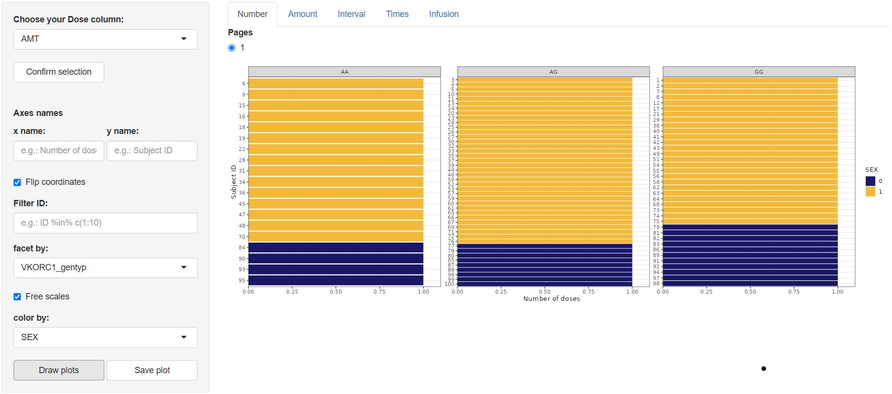
1. Number (Number of doses)
Select the dose-amount column (default AMT) in “Choose your Dose column:” and click  .
.
Configure the plot:
- Axis names (
x name,y name) Flip coordinates(optional)Filter:Apply conditional filters to display a data subset of subjectsfacet by:Create subplots based on any column in the datasetFree scales:Enable individual y-axis scaling for each facetcolor by:Assign line colors using any column (e.g., treatment group, gender)line type by:Assign line styles based on a selected column (max 5 levels recommended for clarity)
Click  . A bar chart appears showing each Subject ID against the number of doses received.
Use  to export the figure to the working directory set in Data section.
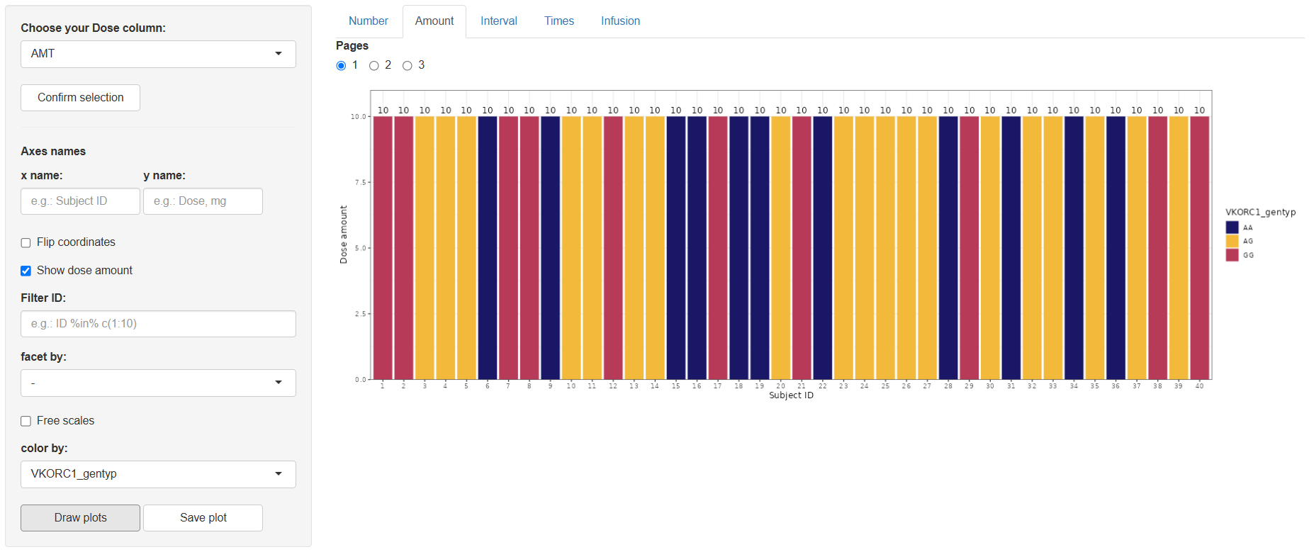
2 Amount (Dose amount)
Steps mirror the Number tab, with one extra toggle: Show dose amount.
The resulting plot displays dose amounts per subject (optionally overlaid as text if the toggle is on).
Save with .
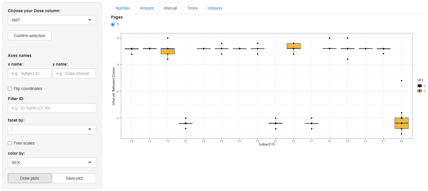
3 Interval (Interval between doses)
Again select the dose column, confirm, and configure using the same options as the Number tab. This graph is only available for treatments with more than one dose per Subject ID.
On , a box-and-whisker plot appears, illustrating the distribution of inter-dose intervals for every subject.
Save via .
4 Times (Time of doses)
After selecting and confirming the dose column, a streamlined set of options appears:
- Axis names,
Free scales,Filter ID,color by.
Press . The output is a faceted panel—one facet per Subject ID—containing vertical bars at every dosing time, making shifts in scheduling easy to spot.
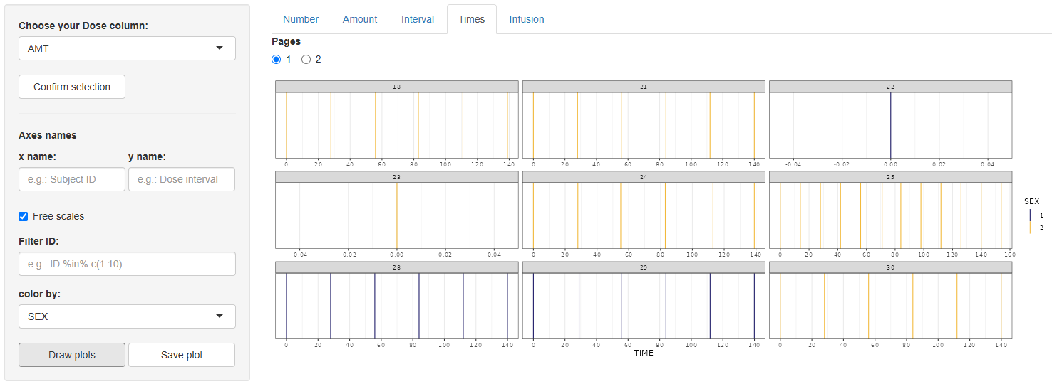
Save with .
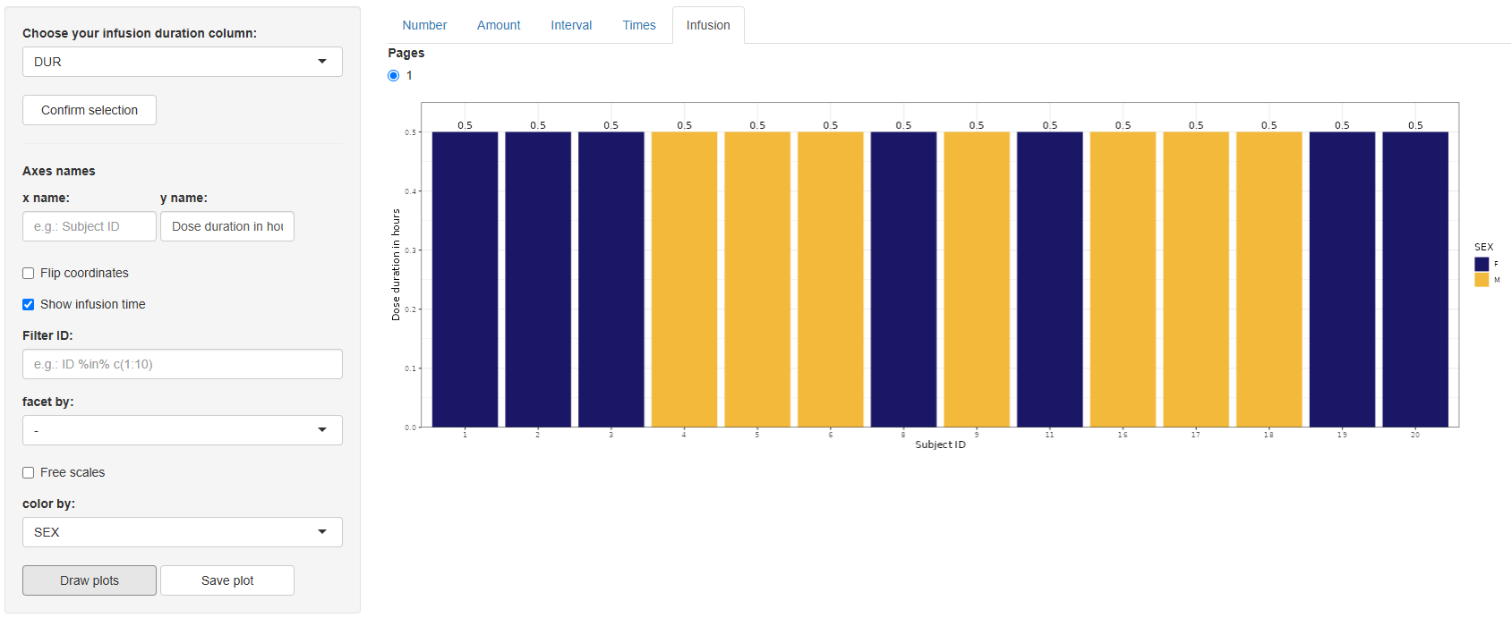
5 Infusion (Duration of dose)
Choose the infusion-duration column (default DUR) and click .
Configure the plot, identical controls to the Number tab, with one extra toggle: Show infusion time.
Click . A bar chart appears showing infusion durations per subject.
Save with .
The Dosing Events section delivers quick, visually rich insights into dosing schedules, quantities, and infusion characteristics—key information for understanding treatment exposure before modelling. After verifying dosing patterns here, you can proceed confidently to further exploratory analyses or pharmacometric modelling steps.