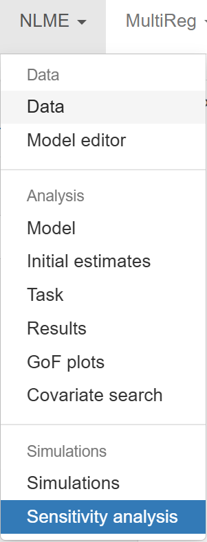
Sensitivity analysis
This section provides the tools necessary to perform Sensitivity analysis of the parameters in the selected model. Sensitivity analysis is a fundamental component in model evaluation, helping to identify which parameters most influence model outputs. By understanding how small or large changes in parameters affect predictions, users can prioritize efforts in data collection, model calibration, or hypothesis testing, ultimately improving model robustness and decision-making.
The section is divided into two main parts: the Configuration Panel on the left side and the Main Panel on the right side, where results are displayed.
The Configuration Panel is organized into two tabs:
- Sensitivity Analysis
- Visualization
To guide users through this section, we use the following structure:
- Sensitivity analysis
1.1 Local
1.2 PRCC
1.3 eFAST - Visualization
1. Sensitivity analysis
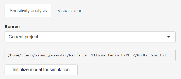
Source selection
Begin by selecting the source of the model:
- Current Project: Uses the model fitted or loaded in the current session (see Task for setup instructions).
- New Model: Load an external model file via the
 button.
Once selected, click  . This action loads the model and displays a list of parameters available for sensitivity analysis.
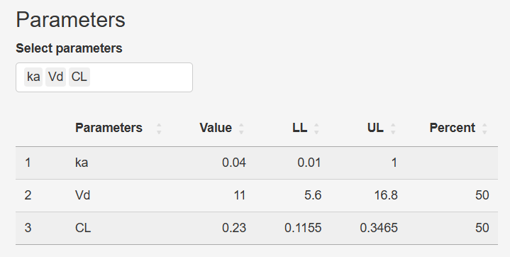
Parameter
After selection of parameters to include in sensitivity analysis, the Parameter table becomes active. Users can select parameters for analysis and review their current values:
- Parameter: Name of the model parameter
- Value: Current value defined in the model
- LL (Lower Limit) / UL (Upper Limit): Limits used for analysis
- Percent: The range of variation (±%) to compute LL and UL (50 by default)
This table is interactive:
- Double-click any cell to edit its value.
- Editing the Percent will auto-update LL and UL.
- Manually entering LL/UL overrides the Percent value.
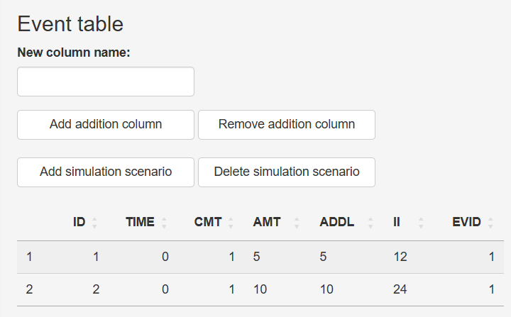
Event table configuration
By default, the event table includes a single simulation scenario (ID = 1) with the following columns:
ID: Scenario identifierTIME: Time points for dosesCMT: Compartment numberAMT: Administered dose amountADDL: Additional dosesII: Interdose intervalEVID: Event identifier
You can expand this table as needed:
 - Adds a new row with a unique ID
- "New column name" (+)
 - Adds custom columns (e.g., covariates like
 AGE,SEX,WT)  /
/  : Deletes the last added row or column
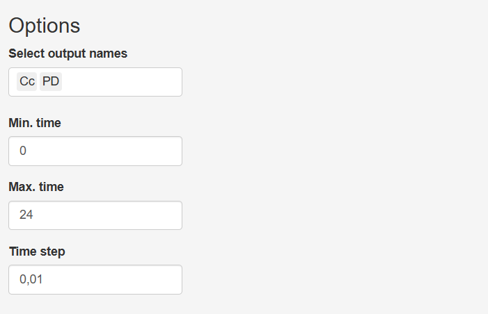
Options
Define the simulation window:
- Select output names: Choose the state variables or user-defined functions you wish to record
- Min. time / Max. time: Start and end times for simulation results to be forwarded to the Visualization tab
- Time step: The interval between consecutive time points in the simulation
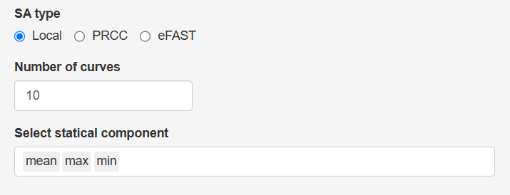
1.1 Local Sensitivity Analysis
When selecting the Local sensitivity analysis option, simulations are executed using Simurg’s internal calculation engine, with parameters systematically varied across defined ranges. This type of analysis helps identify the impact of individual parameter changes on model outcomes, while keeping other parameters constant.
Once Local is selected, the following configuration options appear:
- Number of curves: Specifies how many simulation curves will be generated for each parameter (default = 10). Each curve represents a simulation where the selected parameter is varied linearly between its Lower Limit (LL) and Upper Limit (UL) values as specified in the parameter table.
- Select static component: Choose statistical summaries to include in the plot — mean, minimum (min), and maximum (max) — across time for each simulation output.
After configuring these options, click the  button. The resulting plot will be displayed in the Main Panel.
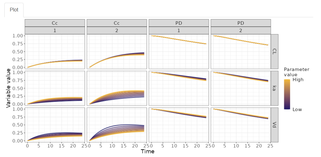
Plot structure
The resulting plot is organized as follows:
-
Horizontally, the graph displays the selected output variables. For each output, sub-panels represent the simulation scenarios defined in the Event table.
-
Vertically, the graph displays the parameters selected for the sensitivity analysis.
-
The y-axis is scaled from 0 to 1, as all values are normalized to facilitate comparison across outputs and parameters. This normalization is done by scaling each simulation result within the selected time window relative to its maximum observed value, allowing for interpretation of parameter influence independent of the units or magnitude of the model outputs.
-
The x-axis
- Without statistical components, the selected number of curves are displayed as a function of time.
- With selected statistical component (e.g., max, mean, min), represents the statistical components and under each component, a group of bars is displayed corresponding to the number of simulation curves.
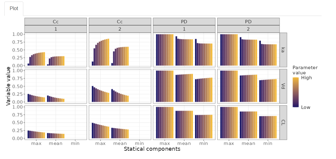
This visualization allows users to quickly assess which parameters have a strong or minimal impact on specific outputs under defined scenarios and statistical summaries.
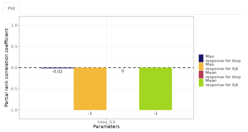
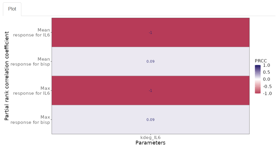
1.2 PRCC Sensitivity Analysis
Partial Rank Correlation Coefficient (PRCC) is a global sensitivity analysis method that quantifies the relationship between model parameters and outputs while accounting for the influence of other parameters. Unlike local sensitivity, which explores variations one parameter at a time, PRCC provides a rank-based correlation across many samples, helping identify parameters with strong monotonic influence on outcomes across the entire parameter space.
After selecting the PRCC analysis type, the following configuration options are displayed:
- Sample size: Defines the number of samples generated for analysis (default = 500). A higher sample size increases precision but may take longer to compute.
- Select static components: Choose one or more summary statistics to compute for each output (mean, max, min).
- Select PRCC type plot: Choose between two visual formats — Histogram or Heatmap.
Plot pptions
-
Histogram
- X-axis: Displays the selected parameters.
- Y-axis: Shows the PRCC values ranging from -1 to 1. A value close to 1 indicates a strong positive correlation (as the parameter increases, the output increases), while a value close to -1 indicates a strong negative correlation. A value near 0 suggests no correlation.
- Color coding: Each bar is colored based on the combination of output variable and statistical component selected, helping distinguish multiple relationships at a glance.
-
Heatmap
- X-axis: Displays the selected parameters.
- Y-axis: Shows the combinations of selected outputs and statistical components.
- Color intensity: Each cell is colored to reflect the PRCC value, on a scale from -1 (blue, strong negative) to 1 (red, strong positive), with 0 represented in a neutral color. This format offers a compact overview of parameter impact across all outputs and statistics.
This method is particularly useful when exploring nonlinear or complex models, as it helps prioritize which parameters most influence the model's behavior globally.
1.3 eFAST Sensitivity Analysis
Extended Fourier Amplitude Sensitivity Test (eFAST) is a variance-based global sensitivity analysis method that quantifies how uncertainty in model outputs can be attributed to different sources of uncertainty in the model inputs. Unlike correlation-based methods, eFAST decomposes output variance across the input parameters using frequency domain techniques, making it effective for nonlinear and non-monotonic models.
After selecting the eFAST analysis type, the following configuration options are available:
- Number of simulations: Specifies how many independent sampling sets are generated for the sensitivity analysis (default = 10). Each simulation contributes to a more robust estimation of the sensitivity indices. A higher number of simulations increases result stability but also computational time.
- Select static component: Choose one or more summary statistics to apply to the outputs (mean, max, min), which will be used to calculate the sensitivity indices.
Once the desired configuration is set, clicking the  button runs the analysis and displays the results in the main panel using a faceted layout:
- Horizontal panels: Represent the selected output variables.
- Vertical panels: Correspond to the selected statistical components (e.g., mean, max, min).
- X-axis: Displays the selected parameters.
- Y-axis: Shows the eFAST sensitivity index for the selected response summary, typically ranging from 0 to 1, where higher values indicate stronger influence of the parameter on the output variability.
- Two types of sensitivity indices are plotted:
- First-order index (yellow): Measures the direct effect of a parameter on the output, assuming all other parameters are fixed.
- Total-order index (blue): Captures the total effect, including both direct effects and all interactions with other parameters.
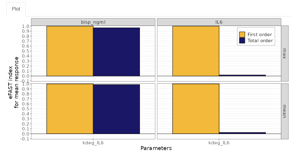
💡 The difference between these two values reveals the extent of interactions: a large gap between total and first-order indices suggests that the parameter plays a significant role through interactions, not just in isolation.
This analysis helps modelers identify which parameters are most influential in driving model variability and which may be safely fixed or simplified in further simulations.
2. Visualization
The Visualization tab provides tools to customize the appearance of the resulting plots without needing to re-run the sensitivity analysis. This allows for a more efficient workflow when adjusting visual elements or focusing on specific components of the results.
- In the "Select parameters" window, you can add or remove parameters from the plot. The list shown includes only the parameters selected in the Sensitivity analysis tab.
- Similarly, the "Select variables" window displays the list of output variables originally chosen for the analysis.
- The "Select statistical components" window allows you to toggle between the summary statistics (mean, max, min) that were previously included in the sensitivity configuration.
Additionally, you can customize the axis labels by entering text in the "X-axis name" and "Y-axis name" fields.
Once all adjustments are made, click the  button to apply the new configuration. The updated plot will be displayed in the main panel, reflecting the selected elements and labeling preferences. This streamlined interface allows for clear presentation and quick exploration of different visualization angles.
The Sensitivity Analysis section offers a comprehensive and flexible framework for exploring how model parameters influence simulation outcomes. By providing three distinct analysis methods—Local, PRCC, and eFAST—along with customizable visualization tools, users can efficiently identify key parameters, assess model robustness, and gain deeper insights into system behavior. This functionality is essential for informed decision-making in model development and evaluation.