Continuous data
The Continuous data section provides a flexible environment for exploring how the dependent variable (DV) evolves over time. Before any modeling or covariate analysis begins, this section allows users to visually examine patterns, assess variability across subjects or groups. The plots are fully customizable, enabling tailored visualization depending on the user’s objectives.
The section is organized into three distinct tabs depending on the desired visualization:
Certainly! Here's the revised Individual Plots section with the added instructions for generating and saving the plots, integrated seamlessly into the existing style:
1. Individual Plots
This tab is designed to generate spaghetti plots — individual DV(TIME) trajectories — for exploratory inspection at the subject level. The plot customization options are intended to give the user full control over the graphical output, both aesthetically and analytically.
Available configuration options include:
-
X-axis settings
x-min:Minimum value for the x-axis (TIME)x-max:Maximum value for the x-axisx name:Custom label for the x-axis
-
Y-axis settings
y-min:Minimum value for the y-axis (DV)y-max:Maximum value for the y-axisy name:Custom label for the y-axis
-
Axis transformations
log x:Apply logarithmic transformation to the x-axislog y:Apply logarithmic transformation to the y-axis
-
Additional plot controls
time as factor:Treat time values as categorical (discrete time)Filter:Apply conditional filters to display a data subsetfacet by:Create subplots based on any column in the datasetFree scales:Enable individual y-axis scaling for each facetcolor by:Assign line colors using any column (e.g., treatment group, gender)line type by:Assign line styles based on a selected column (max 5 levels recommended for clarity)
Once all desired configuration options have been selected, click the  button to generate the visualizations.
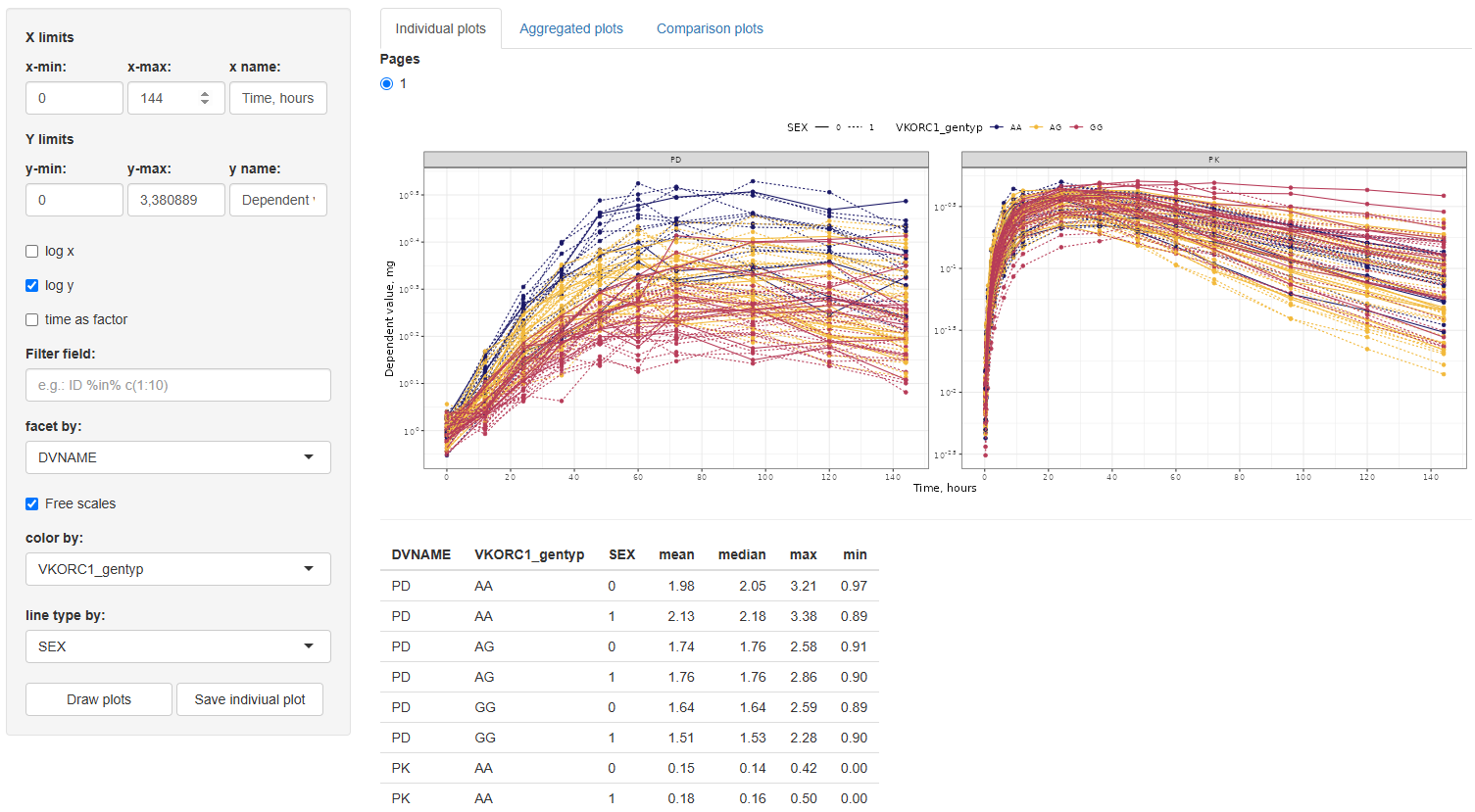
Along with the generated plot, a summary table of descriptive statistics — including mean, median, minimum, and maximum DV values — will automatically be displayed. These statistics are calculated for each group defined by the selected facet, color, and line type options (if any are selected), providing useful context for interpreting trends and patterns in the plotted data.
To save a specific individual plot, use the  button. The plot will be saved in the working directory defined earlier in the Data section of the Data Management module.
This section is particularly useful for identifying trends and subject-level behavior before proceeding to more structured or model-based analyses.
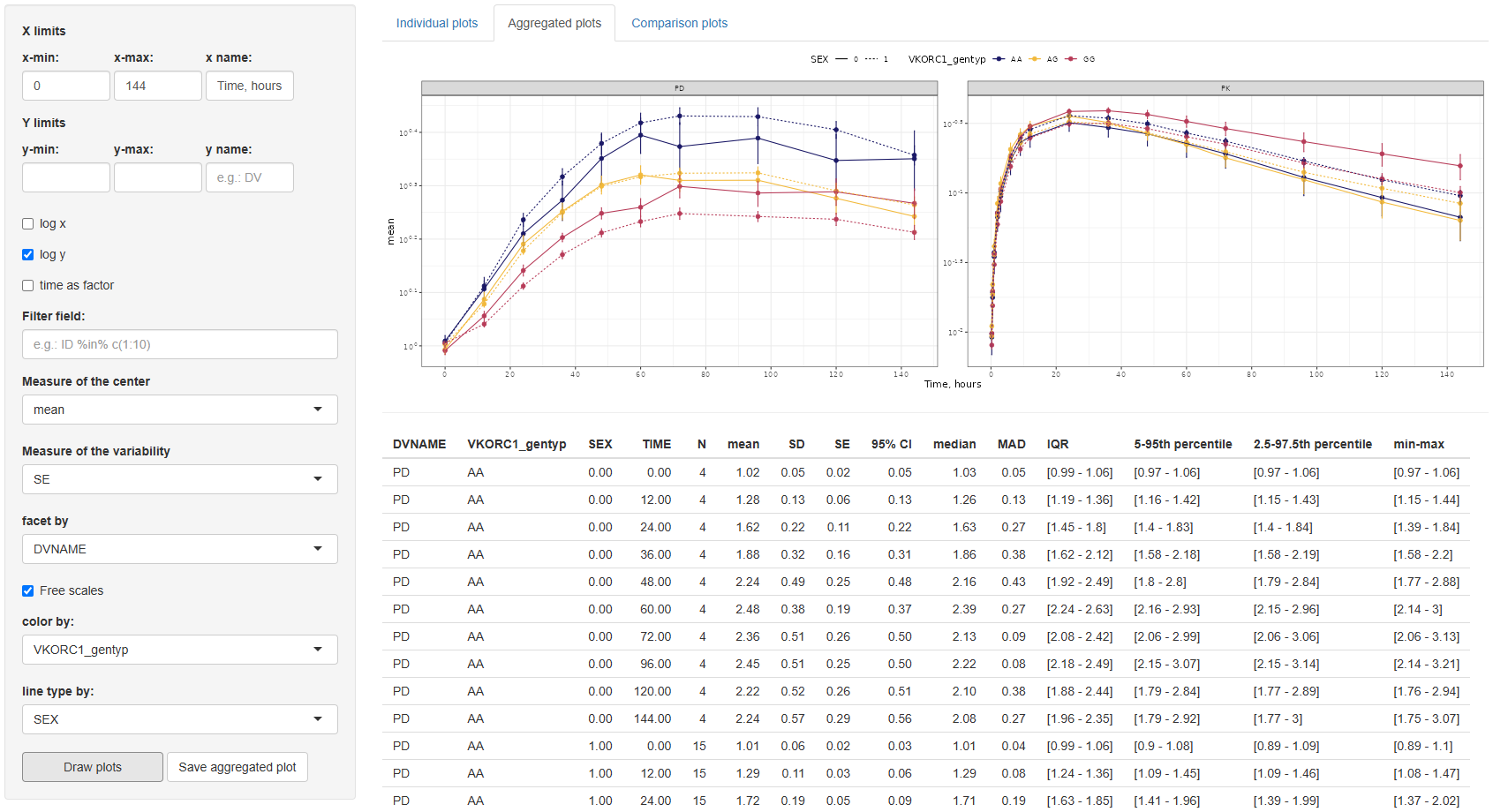
2. Aggregated plots
This tab provides tools for visualizing aggregated trends in the dependent variable (DV) over time, summarizing the data using statistical measures of central tendency and variability.
The configuration interface mirrors that of the Individual plots tab, allowing users to adjust x/y-axis limits and labels, choose log scaling, filter data, facet and color lines by any dataset column, and define line types (limited to variables with ≤5 levels).
Additionally, two new settings are provided:
Measure of the Center:Choose between mean and median.Measure of the Variability:Options depend on the selected center:- For mean: Standard Error (SE), Standard Deviation (SD), and 95% Confidence Interval (CI).
- For median: Median Absolute Deviation (MAD), Interquartile Range (IQR), 5th–95th percentile, and 2.5th–97.5th percentile.
By default, the graph displays the mean with SE as the variability measure.
After selecting the desired configuration, click the button to generate the plot. A  button is also available to export the figure to the working directory specified in the Data section.
In addition to the plot, a summary table of descriptive statistics is automatically generated. This table includes: TIME, N (number of observations), mean, SD, SE, 95% CI, median, MAD, IQR, 5th–95th percentile, 2.5th–97.5th percentile, min–max values. These statistics are reported by each combination of the selected facet, color, and linetype columns.
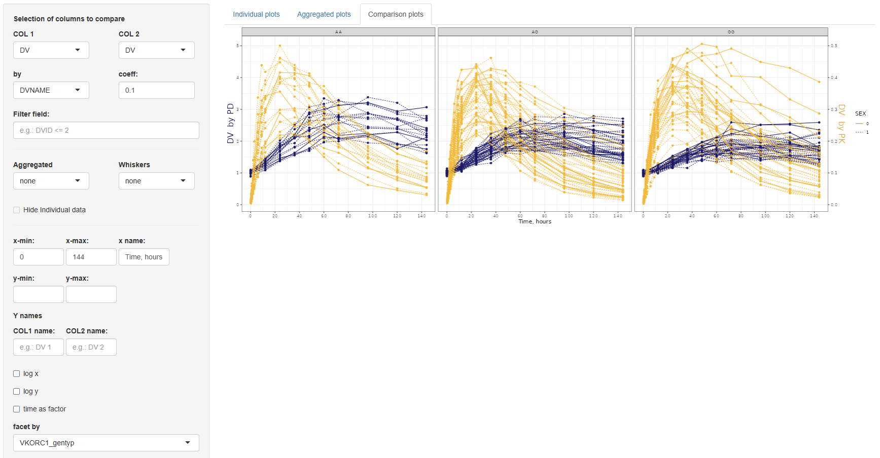
3. Comparison plots
The Comparison Plots tab offers functionality for directly comparing two sets of data in a single time-series plot. This is particularly useful when visualizing changes between groups, treatment arms, or transformations of the same variable. Both series are plotted as a function of time, allowing for clear temporal comparisons.
The configuration panel for this section is structured into three parts:
3.1. Data selection panel
This section defines the variables to be compared and includes the following settings:
COL 1andCOL 2:Selection of columns to compare.by: If the same column is selected in both COL 1 and COL 2, the by field becomes mandatory. This column must have exactly two levels and will be used to split the data for comparison.coefficient:A numeric multiplier applied to the data in COL 2 to enable scaling or adjustment for visualization.Filter field:An optional input to filter the dataset before plotting.
3.2. Aggregation settings
Here, you can specify whether to overlay aggregated trend lines and variability ranges:
Aggregated:Options are none, mean, or median.Whiskers(depending on the selected center):- If mean: none, SE (Standard Error), SD (Standard Deviation), or 95% Confidence Interval.
- If median: none, MAD (Median Absolute Deviation), IQR (Interquartile Range), 5th–95th percentile, or 2.5th–97.5th percentile.
- If none: No options available.
Hide individual data:If selected, only the aggregated lines and variability whiskers are shown, suppressing the underlying individual measurements.
3.3 Axis and layout customization
- COL 1 and COL 2: Independent x-min, x-max, x-name; y-min, y-max settings, and separate y-name for each column.
- Other options: Log-scale for x or y axes, "Time as factor", "Facet by" any dataset column, and "Line type by" for distinguishing groups (limited to variables with ≤5 categories).
Once the configuration is complete, click to visualize the data. The plot can be saved to the selected working directory using the  button.
The Continuous Data module provides a flexible framework for exploring and visualizing dependent variable (DV) values over time. Through its three tabs—Individual Plots, Aggregated plots, and Comparison plots—users can tailor plots to their specific analysis needs, from individual subject-level trajectories to population-level trends and comparative evaluations. With intuitive configuration tools, customizable aesthetics, and accompanying summary statistics, this module streamlines the process of data inspection and graphical analysis in pharmacometric and clinical datasets.