Exploratory data analysis (EDA)
Exploratory data analysis (EDA) is the process of examining and summarizing datasets to understand their main characteristics before applying formal modeling or hypothesis testing. EDA helps identify patterns, trends, outliers, missing values, and potential relationships within the data.
Navigation
- 1. Exposure by Cohort
- 2. Exposure by Endpoint
- 3. Empirical logistic plots
- 4. E-R quantile plots
- 5. Number of occurences
- 6. Table Exposure by Quartile
- 7. Table Exposure by Cohort
Before you start working on the EDA tab, make sure that exposure and response metrics are selected in the Data initialization tab. If this is not done, a warning will appear: "Please select exposure and/or response variables in Data Initialization section".
If the metrics are selected, the page will look like this:
The EDA section includes several types of exploratory analysis, each implemented on a separate tab:
- "Exposure by Cohort" - contains Boxplots of exposure metrics stratified by cohort
- "Exposure by Endpoint" - contains Boxplots of exposure metrics stratified by dichotomous (binary) endpoint
- "Empirical logistic plots" – contains Empirical logistic plots
- "E-R quantile plots" - contains Exposure-response quantile plots
- "Number of occurences" - contains Table of distribution of exposure by response
- "Table Exposure by Quartile" – contains Table of distribution of exposure by quartile
- "Table Exposure by Cohort" - contains Table of distribution of exposure by cohort.
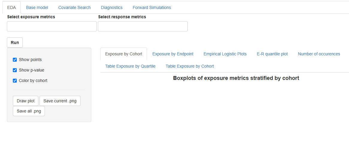
At the top of the EDA tab, there is a  button and fields for selecting exposure and respons metrics for exploratory analysis:


If the fields are empty, then all exposure and response metrics will be included in the analysis.
To include only specific metrics in the analysis, select them in the Select exposure metrics, Select response metrics fields:

Click to start the analysis.
The results of the exploratory analysis can be seen on the individual tabs.
After the results are generated, you can adjust the number of metrics for which plots are displayed on the current tab using the  or
or  buttons. Choose specific metrics in dropdown lists Select exposure variables and Select response variables at the top of the tab, click or and plots (tables) will change only on the current tab.
1. Exposure by Cohort
Boxplots of exposure metrics stratified by cohort visually compare the distribution of drug exposure (e.g., Cmax, AUC, Css) across different cohorts in a clinical study. These boxplots provide insights into the spread, central tendency, and variability of exposure within each cohort. These plots allows to compare exposure levels across cohorts (e.g., different treatment groups, age categories, renal function groups), assess variability in drug exposure , identify potential outliers that might need further investigation and check for dose proportionality or differences in drug metabolism between groups.
To compare the means of exposure metrics across different cohorts ANOVA method is used. It helps to determine whether the differences in exposure distributions across dose levels are statistically significant.
Order of operations on the tab
Each page displays up to six graphs. If there are more graphs, they are spread across multiple pages. Use the radio buttons to switch between pages. The response and exposure metrics corresponding to each boxplot is indicated in the graph header. The panel of plots appears as follows:
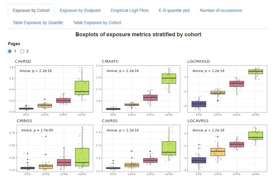
By default, boxplots are colored by cohort, individual points are overlaid, and p-values from the ANOVA method are displayed on the plots. You can customize these visualization parameters using the checkboxes in the left panel.
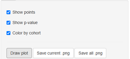
Click to redraw the plot after changing the visualization settings.
Saving Results
 – saves the panel of plots from the current page to the "EDA" folder in the working directory as a PNG file.
 – saves all generated panels of plots to the "EDA" folder in the working directory as multiple PNG files.
2. Exposure by Endpoint
Boxplots of exposure metrics stratified by a dichotomous (binary) endpoint visually compare the distribution of drug exposure between two outcome groups, such as, responder vs. non-responder (e.g., efficacy endpoint) or adverse event present vs. absent (e.g., safety endpoint).
To compare the means of exposure metrics corresponding to different types of endpoints T-test method is used. It helps to determine whether the differences in exposure distributions across binary endpoints are statistically significant.
Order of operations on the tab
Each page displays up to six graphs. If there are more graphs, they are spread across multiple pages. Use the radio buttons to switch between pages. The exposure metric corresponding to each boxplot is indicated in the graph header. The panel of plots appears as follows:
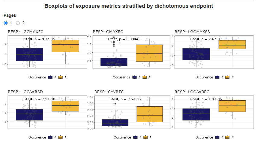
By default, boxplots are colored by cohort, individual points are overlaid, and p-values from the T-test are displayed on the plots. The display of individual data points and p-values can be configured from the side panel.
Click to redraw the plot after changing the visualization settings.
Saving Results
– saves the panel of plots from the current page to the "EDA" folder in the working directory as a PNG file.
– saves all generated panels of plots to the "EDA" folder in the working directory as multiple PNG files.
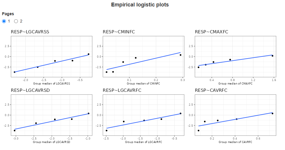
3. Empirical logistic plots
Empirical logistic plots are graphical tools used in binary logistic regression to visualize the relationship between a continuous predictor and the probability of an outcome event. They are particularly useful for assessing the functional form of the predictor before fitting a formal logistic regression model. Helps to determine whether the relationship between the predictor and the outcome follows a linear logit scale (which is an assumption of logistic regression).
Each page displays up to six graphs. If there are more graphs, they are spread across multiple pages. Use the radio buttons to switch between pages. The response and exposure metrics corresponding to each boxplot is indicated in the graph header. The panel of plots appears as follows:
Saving Results
– saves the panel of plots from the current page to the "EDA" folder in the working directory as a PNG file.
– saves all generated panels of plots to the "EDA" folder in the working directory as multiple PNG files.
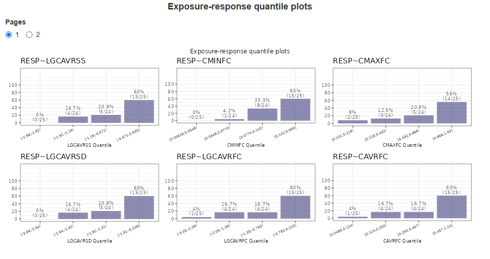
4. E-R quantile plots
Exposure-response quantile plots are graphical tools used to explore the relationship between a continuous exposure variable and a response variable. These plots help assess trends in exposure-response relationships without assuming a specific parametric model. The continuous exposure metric is divided into quantiles. For each quantile, the number of responders is calculated. The data is presented as bar plots, indicating the percentage and proportion of responders in the quartile. The x-axis shows the boundaries of the Quartile Groups for the given metric.
Each page displays up to six graphs. If there are more graphs, they are spread across multiple pages. Use the radio buttons to switch between pages. The response and exposure metrics corresponding to each boxplot is indicated in the graph header. The panel of plots appears as follows:
Saving Results
– saves the panel of plots from the current page to the "EDA" folder in the working directory as a PNG file.
– saves all generated panels of plots to the "EDA" folder in the working directory as multiple PNG files.
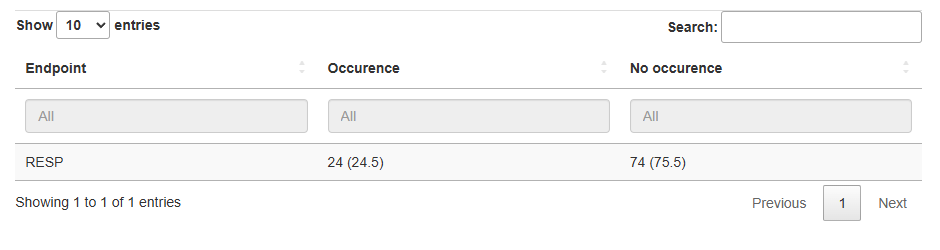
5. Number of occurences
This analysis examines whether drug exposure is associated with treatment outcomes. Table indicates persentage of responders and non-responders for each endpoint.
Example of a table:
Saving Results
 – saves table as a CSV file.
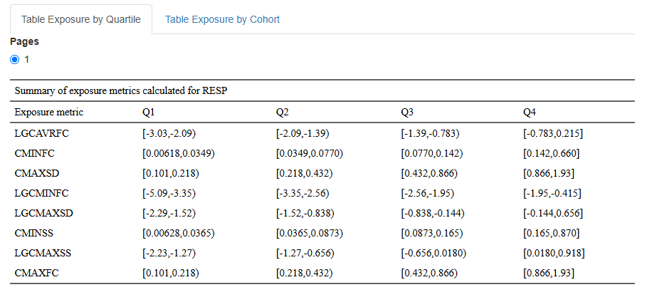
6. Table Exposure by Quartile
A table of distribution of exposure by quartile summarizes how a continuous exposure metric is distributed across quartiles of the population. This table contains information about Quartile Groups (Q1–Q4). The dataset is divided into four equal-sized groups based on exposure levels.
Each table contains data for a single endpoint and all selected exposure metrics. Tables for different endpoints are displayed on separate pages.
Example of a table:
You can choose only some metrics in dropdown lists Select exposure variables and Select response variables, click and the output will change only on the current tab.
Saving Results
 – saves current table as a DOCX file.
 – saves all generated tables into a single DOCX file.
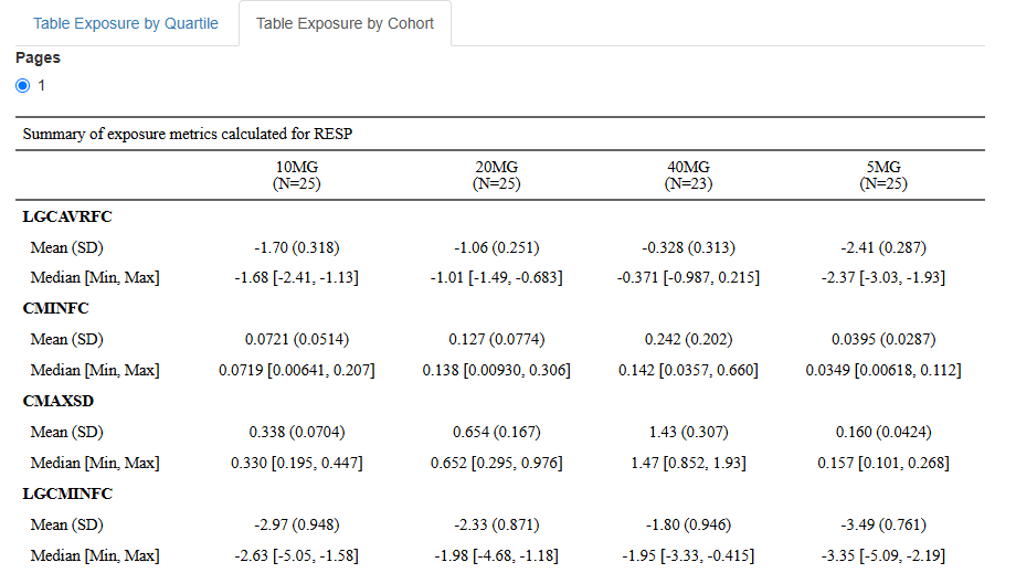
7. Table Exposure by Cohort
A table of distribution of exposure by cohort summarizes the distribution of a drug exposure metric across different cohorts in a clinical study. Cohorts are predefined groups of subjects, often based on characteristics such as treatment regimen, age group, disease severity, or other stratification criteria. Main purposes of this table are comparison of exposure levels between different study groups and assessing variability in drug exposure across patient populations.
Key Components:
- Cohort Groups: Subjects are grouped by predefined study cohorts (e.g., treatment groups, age categories).
- Sample Size (N): The number of subjects in each cohort.
- Exposure Range: The minimum and maximum exposure values in each cohort.
- Median and Mean Exposure: Measures of central tendency for exposure in each cohort.
- Standart Deviation (SD).
Each table contains data for a single endpoint and all selected exposure metrics. Tables for different endpoints are displayed on separate pages.
Example of a table:
Saving Results
– saves current table as a DOCX file.
– saves all generated tables into a single DOCX file.