Base Model
Logistic Model
On this tab you can build a logistic regression model to explore the relationship between exposure metrics and the probability of a response event — a key component in Exposure–Response (ER) analysis.
The logistic model is calculated using the following equation [1]:
$$ \log\left(\frac{p}{1 - p}\right) = aX + b $$
Where:
- a – the intercept of the model
- b – the slope (effect size of exposure)
- X – the value of the exposure metric
- p – the probability of the response event occurring
To directly calculate the probability p(x) based on the exposure level, use [1]:
$$ p(x) = \frac{1}{1 + e^{-(aX + b)}} = \frac{e^{aX + b}}{1 + e^{aX + b}} $$
This function returns values between 0 and 1, representing the likelihood of the event at a given exposure level.
Running the Model
To begin the modeling process, simply click the Run button. This will automatically initiate optimization of logistic models for all combinations of exposure metrics and response variables, that you have chosen on the Data Initialization tab.
Once the computation is finished, you'll be presented with a detailed summary of the results in the table on the right side o tab.
Output Table
After optimization is complete, a summary table will appear on the right panel of the screen.
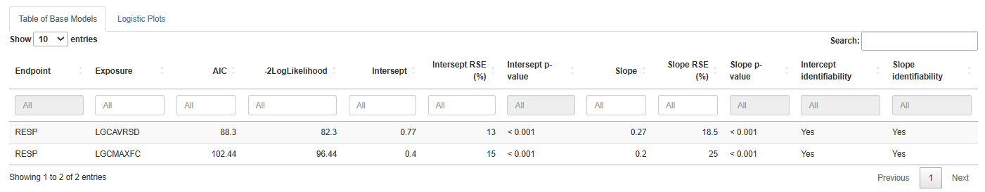
The table includes the following columns:
- Endpoint – name of the response variable
- Exposure – exposure metric used in the model
- AIC – Akaike Information Criterion (lower is better)
- -2LogLikelihood – negative log-likelihood value
- Intercept – estimated intercept
- Intercept RSE (%) – relative standard error of the intercept
- Intercept p-value – significance level of the intercept
- Slope – estimated slope
- Slope RSE (%) – relative standard error of the slope
- Slope p-value – significance level of the slope
- Intercept identifiability – whether the intercept can be reliably estimated
- Slope identifiability – whether the slope can be reliably estimated
Saving Results
You have flexible options for exporting model results:
Save table .csv– download the full summary table in CSV formatSave list of all models .Rdata– save all model objects for further analysis in RSave list of best model .Rdata– save only the model with the lowest AIC (i.e., best fit)
Logistic Plots
The Logistic Plots tab provides interactive visualizations to help interpret model predictions.
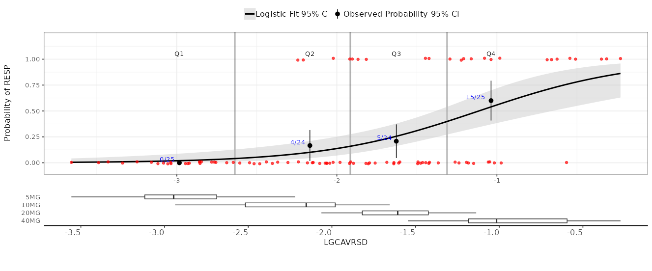
Plot Content
Use the right-hand panel to select the specific exposure metric and response variable you want to visualize.
The plot includes the following components:
- Y-axis: probability of the response event
- X-axis: exposure metric value
- Black curve: model-predicted probability across exposure values
- Gray area: 95% confidence interval around the prediction
- Red points: observed individual data points
- Black dots with whiskers: observed proportions of events in exposure bins (with 95% CI)
- Blue text: numerical proportions shown directly on the graph
At the bottom, you’ll find boxplots showing how exposure values are distributed across different treatment groups.
Plot Settings
In the left-hand panel, you can fully customize your plots:
- Set axis titles and numeric limits
- Toggle logarithmic scale on the axes
- Display the model's AIC value on the plot
- Adjust the colors and sizes of curves and points for better visibility
Once your settings are configured, click the Update Plot button to apply changes.
Saving Plots
Export your plots in PNG format with ease:
Save current .png– download the currently displayed plotSave all .png– download plots for all exposure–response combinations in batch mode
References
[1] McCullagh, P. (1989). Generalized Linear Models (2nd ed.). Routledge. https://doi.org/10.1201/9780203753736