Goodness-of-fit (GoF plots)
The GoF plots tab provides a suite of graphical tools to assess how well the model fits the observed data. These diagnostic plots help visually evaluate model performance, detect systematic bias, identify outliers, and uncover potential model misspecification.
To use this section, the model must first be fitted or previously generated results must be loaded, following the steps outlined in the Task section. Once this is done, the GoF plots section in NLME becomes accessible:
Getting Started
To begin, click the  button. This action loads the model results stored in the Task section and activates the available plot menus. From there, you can create diagnostic plots based on your chosen configuration.
Once you’ve configured the desired settings, click the
button. This action loads the model results stored in the Task section and activates the available plot menus. From there, you can create diagnostic plots based on your chosen configuration.
Once you’ve configured the desired settings, click the  button to generate the plot.
The resulting plot can be downloaded by clicking the
button to generate the plot.
The resulting plot can be downloaded by clicking the  button for further analysis or reporting.
Available Plot Types
This section offers eight types of diagnostic plots, organized into the following tabs:
- Time Profiles
- Observed vs. Predicted
- Residuals
- Distribution of Random Effects (RE)
- Correlation between RE
- Individual parameters vs. covariates
- VPC (Visual Predictive Check)
- Prediction distribution
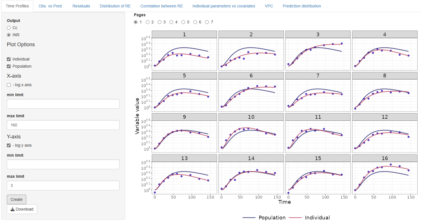
1. Time Profiles
The Time Profiles tab provides tools for visually evaluating how well the model fits the observed data over time, both at the population level and the individual level, for the selected output type.
The available output types are determined by the DVIDs (Dependent Variable Identifiers) specified in the Model section.
Plot Configuration Options
You can customize the plot using the following options:
-
Fit type to display: Choose whether to show the population predictions, individual predictions, or both on the plot
-
Axis settings:
- Manually adjust the x- and y-axis limits
- Enable or disable logarithmic scaling for either axis
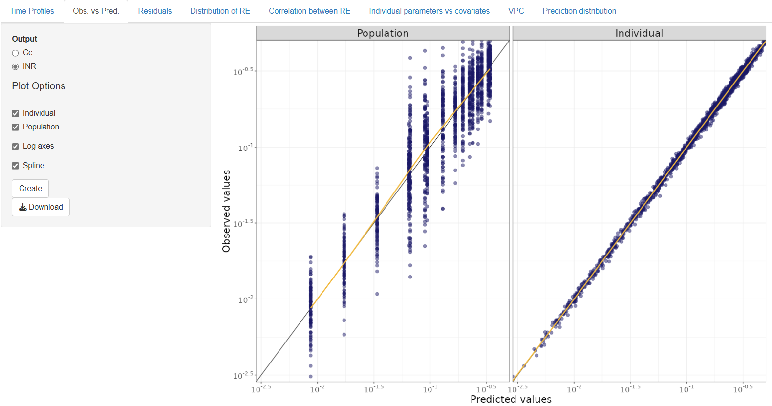
2. Observed vs. Predicted
The Observed vs. Predicted tab allows you to assess how well the model predicts the observed data by comparing predicted values against actual observations. This comparison can be made at both the individual and population levels.
The available outputs correspond to the DVIDs selected in the Model section.
Plot Configuration Options
You can customize the plot using the following settings:
- Prediction Type: Choose to display Individual predictions, Population predictions, or both
- Log Axes: Enable logarithmic scaling on the x- and/or y-axes for better visualization of wide value ranges
- Spline Overlay: Optionally add a spline to the plot to highlight trends or deviations from the ideal fit line
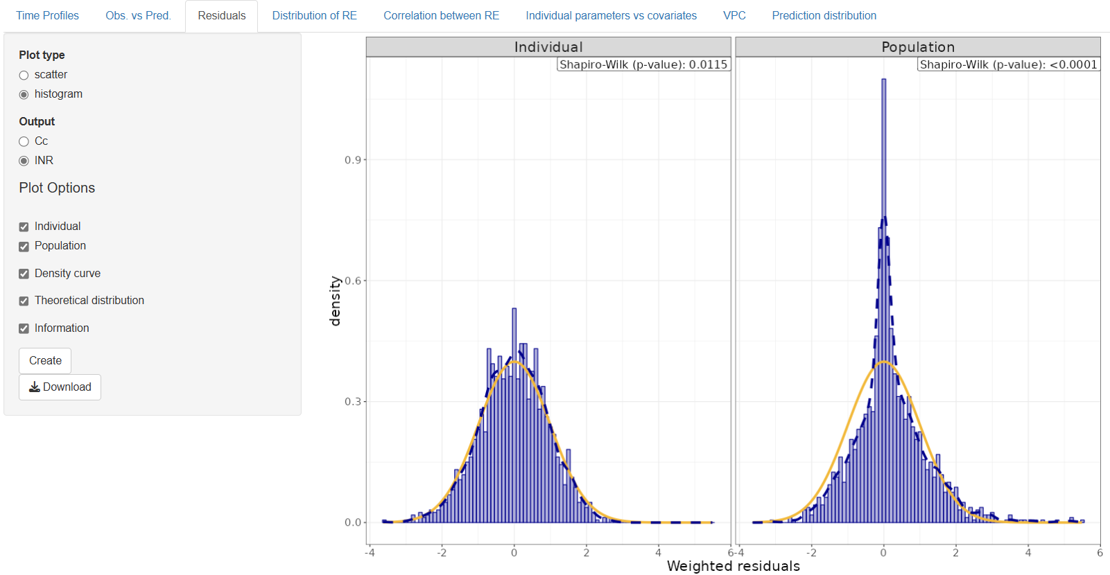
3. Residuals
The Residuals tab provides diagnostic plots to evaluate the distribution and behavior of residuals, helping to detect model misspecification, bias, or heteroscedasticity.
The outputs available for plotting correspond to the DVIDs selected in the Model section. You can choose to visualize individual or population residuals.
Plot Types
This tab includes two types of plots:
3.1 Scatter Plot
This plot displays residuals versus time or predicted values to detect patterns or trends that may indicate issues with model fit.
Configuration options:
- Log scale for time axis – Apply logarithmic transformation to the time axis.
- Log scale for predicted values axis – Enable log scale for the x-axis when plotting residuals vs. predicted values
- Spline – Overlay a spline curve to visualize trends or systematic bias
- Axis limits – Manually define y-axis limits for better control over the plot view
3.2 Histogram
This plot shows the distribution of residuals to assess normality and variability.
Configuration options:
- Density curve – Overlay a smoothed density curve on the histogram
- Theoretical distribution – Compare the residuals to a theoretical normal distribution
- Information – Include a p-value from a statistical test (e.g., Shapiro-Wilk) to assess the normality of residuals
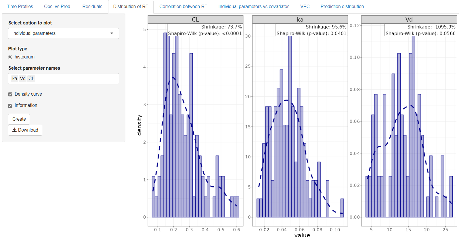
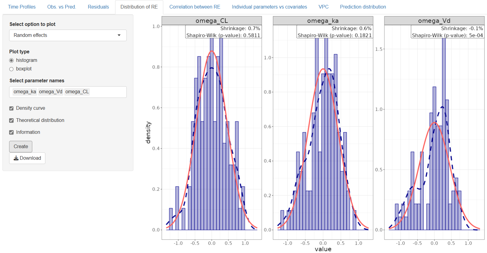
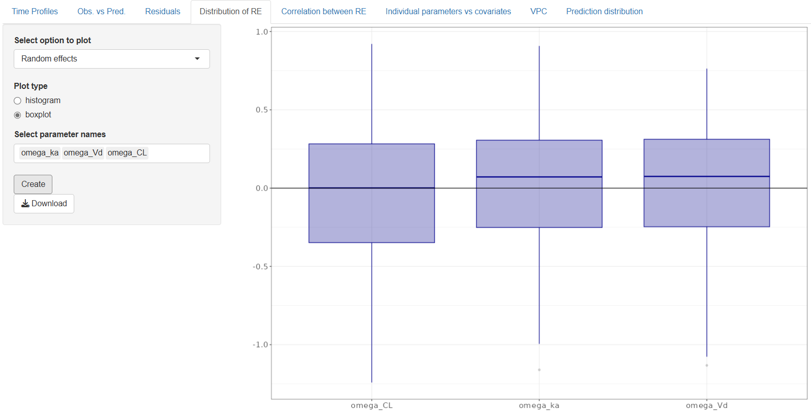
4. Distribution of Random Effects (RE)
The Distribution of Random Effects (RE) tab allows you to explore the variability captured by the model’s random effects and individual parameter estimates. This helps assess the assumption of normality and the behavior of random components in the model.
Begin by selecting the type of output you want to visualize:
4.1 Individual Parameters – Estimated parameter values for each individual.
4.2 Random Effects – Deviations from the population parameters (i.e., the modeled random components).
4.1 Individual Parameters
For Individual Parameters, only histograms are available.
Plot options:
- Select parameter names – This dropdown automatically lists all parameters associated with random effects. You can select all, or a subset, to include in the plot
- Density Curve – Overlay a smooth density curve on the histogram
- Information – Show the p-value from a normality test to assess the distribution
4.2 Random Effects
For Random Effects, you can choose between two plot types:
4.2.1 Histogram Visualizes the distribution of random effects for each selected parameter.
Options include:
- Select parameter names – A list of available omega terms (random effects) is automatically populated
- Density Curve – Add a smooth density overlay
- Theoretical distribution – Compare the empirical distribution with a standard normal distribution
- Information – Include p-value results of a normality test (e.g., Shapiro-Wilk)
4.2.2 Boxplot Displays the spread and central tendency of selected random effects using boxplots.
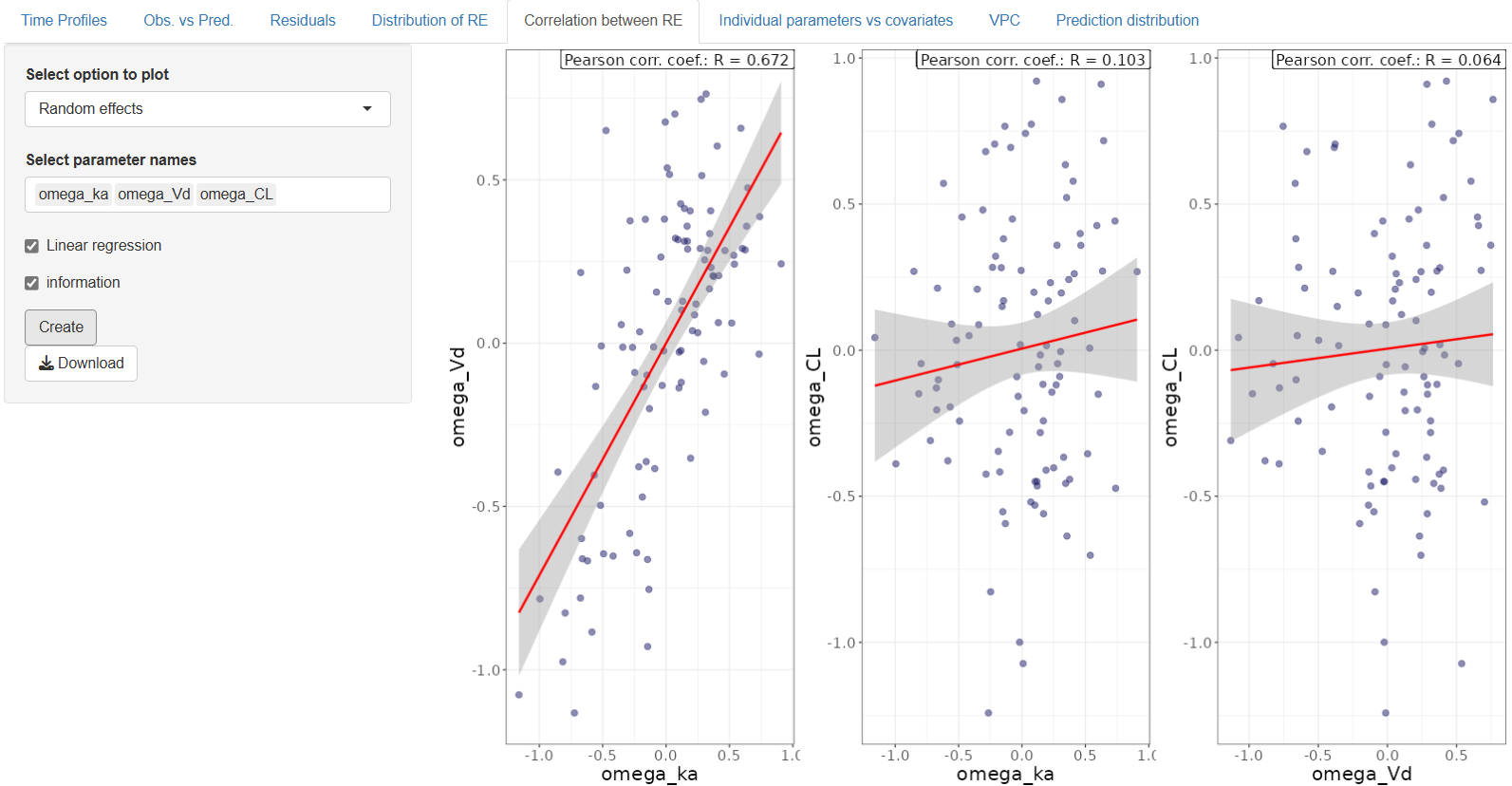
5. Correlation Between RE
The Correlation Between RE tab allows you to explore pairwise relationships between individual parameter estimates or random effects, helping to identify potential correlations or dependencies that might inform model refinement or covariate modeling.
Start by selecting the type of correlation plot you want to generate:
5.1 Individual Parameters – Scatter plots showing relationships between estimated parameters for each individual.
5.2 Random Effects – Scatter plots of the omega terms (random deviations from the population parameters).
5.1 Individual Parameters
Configuration options:
- Select parameter names – A list of model parameters associated with random effects is automatically populated. Select two or more to include in the plot
- Linear regression – Optionally overlay a regression line to visualize the trend
- Information – Display the Pearson correlation coefficient (r) to quantify the strength and direction of the relationship
5.2 Random Effects
Configuration options are the same as for Individual Parameters:
- Select parameter names – The dropdown provides a list of omega terms for parameters with random effects. Choose the ones you'd like to analyze
- Linear regression – Add a regression line to the scatter plot
- Information – Show the Pearson r value to assess correlation strength
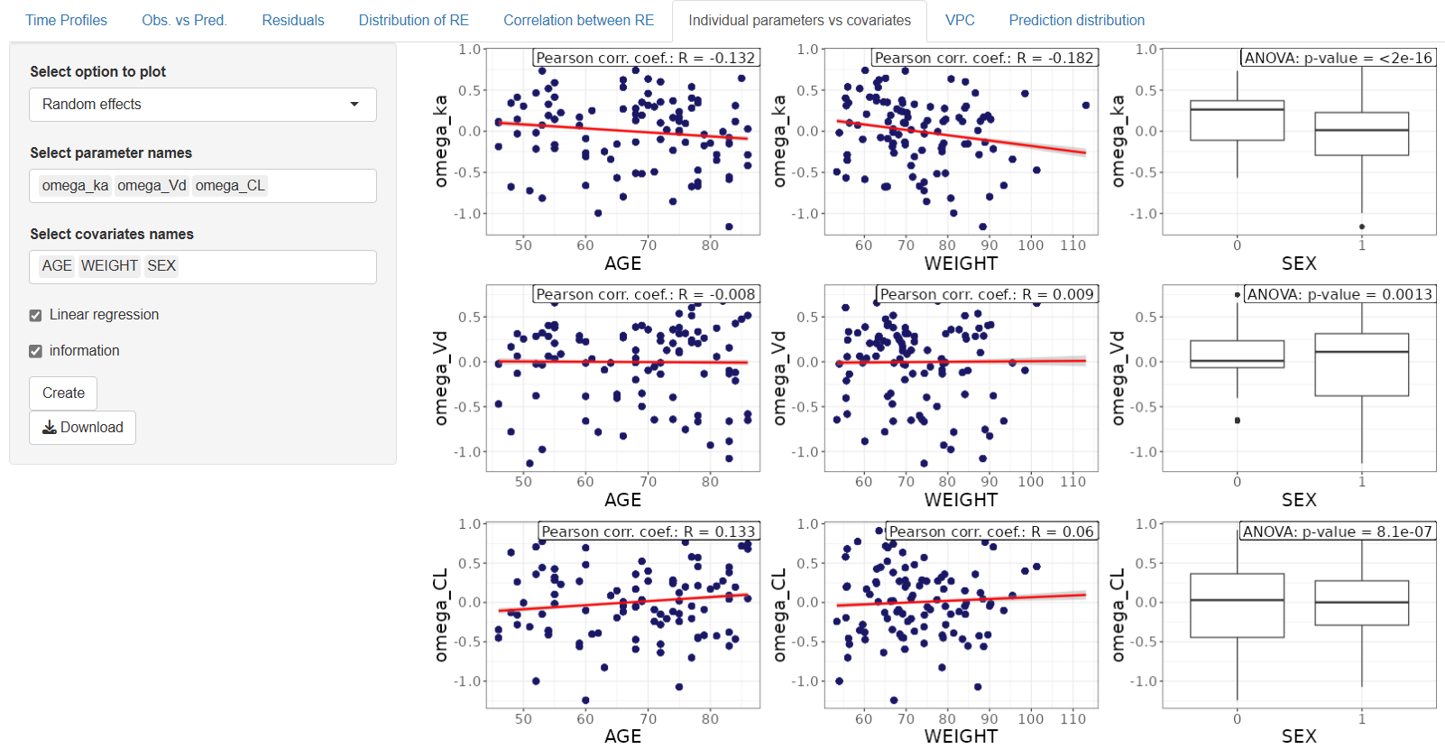
6. Individual parameters vs. covariates
The Individual Parameters vs. Covariates tab enables exploration of potential relationships between individual parameter estimates or random effects and covariates in the dataset. This analysis is useful for identifying covariate effects that could be included in future model refinements.
Start by choosing the type of output to visualize:
Individual Parameters – Displays estimated parameter values per individual against selected covariates.
Random Effects – Shows the corresponding omega values plotted against covariates.
6.1 Individual Parameters
Configuration options:
- Select parameter names – Choose one or more individual parameters associated with random effects from the automatically populated list.
- Select covariates names – Choose the covariate (column from your dataset) to plot against the selected parameters.
- Linear regression – Optionally overlay a linear regression line to visualize potential trends.
- Information – Display the Pearson correlation coefficient (r) to quantify the relationship with continuous covariates or p-value in case of categorical covariates.
6.2 Random Effects
Configuration is identical to the Individual Parameters option, with one difference:
Select Parameter Names – This dropdown lists omega terms corresponding to the random effects.
You can still:
- Select a covariate,
- Add a linear regression line,
- And show the Pearson correlation coefficient or p-value.
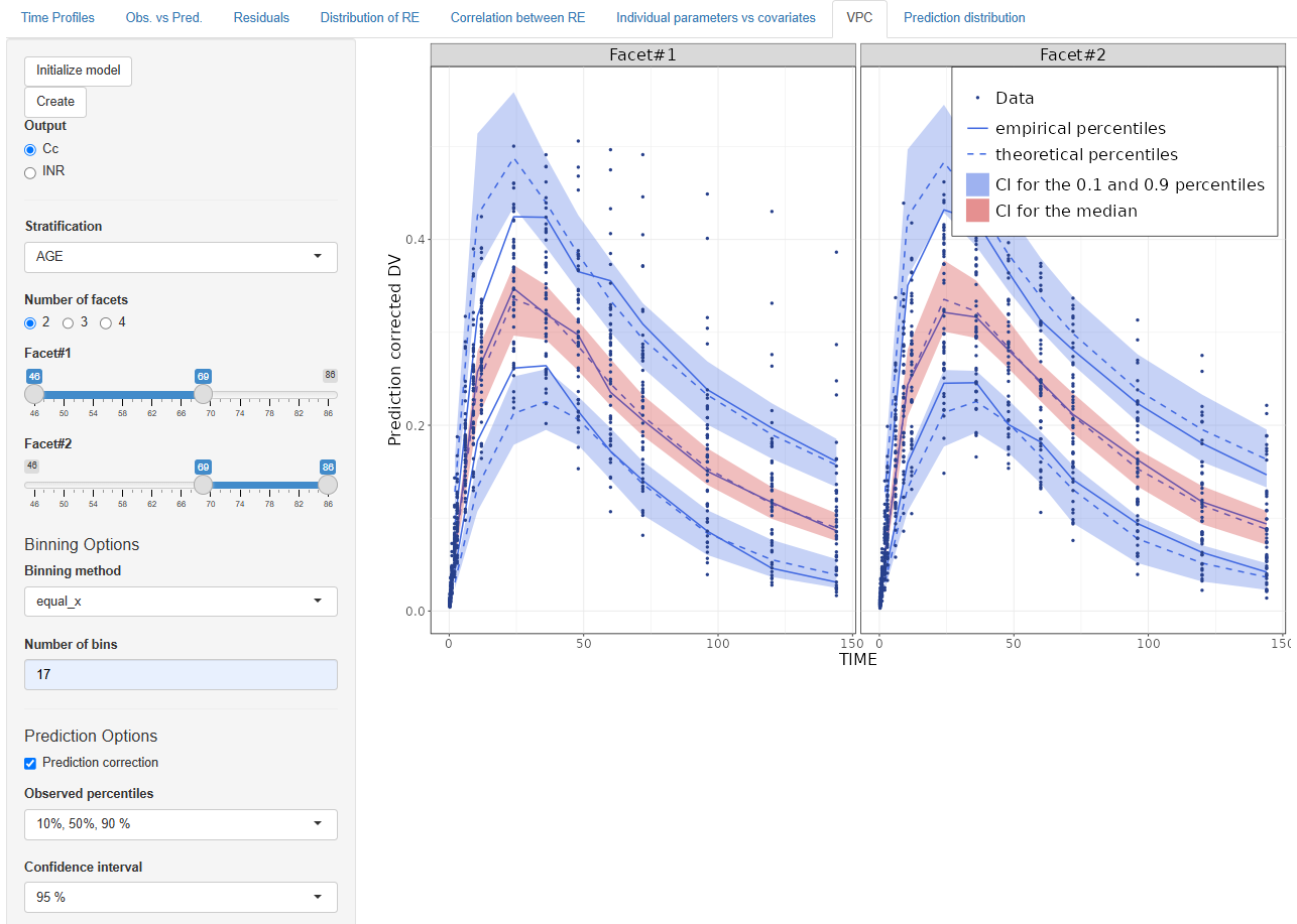
7. VPC (Visual Predictive Check)
The Visual Predictive Check (VPC) tab provides powerful graphical diagnostics to evaluate how well the model predicts the distribution of observed data. It helps detect model misspecifications, assess variability, and ensure predictive performance across different covariate groups.
Getting Started
First, click the  button to load the prediction results from the fitted model.
Configuration Options
- Select Output Choose the output variable you wish to analyze. Available options depend on the DVIDs defined in the Model section.
Stratification Options
- Stratification Column
Select a dataset column for stratification:
- If a categorical column is chosen, separate facets will be created for each category level.
- If a continuous column is selected, you can specify:
- The number of facets (choose between 2 and 4)
- The ranges to define each facet
Binning Options
-
Binning Method – Choose how the data will be binned along the x-axis:
- kmeans – Data-driven binning that clusters points based on similarity
- ntile – Splits the data into equal-sized groups based on percentiles
- equal_x – Divides the x-axis into equally spaced intervals
-
Number of Bins – Select how many bins to display in the VPC plot
Prediction Options
-
Observed Percentiles – Choose which percentiles of observed data to display:
- 10%, 50%, 90%
- 5%, 50%, 95%
-
Confidence Interval (CI) – Select the confidence interval for the prediction bands:
- 50%, 90%, 95%, or 99%
-
Prediction Correction – Enable this option if needed to correct for time-dependent variability in predictions
Display Options
Customize which visual elements to include in the plot:
- Add Legend – Adds a description for all visual elements in the plot
- Add Observed Data – Overlay observed data points
- Theoretical Percentiles Median – Display the model's predicted median
- Theoretical Percentiles CI – Display the model's confidence intervals around the theoretical percentiles
- Empirical Percentiles – Show observed percentiles based on the data
- Interpolation – Smooths the lines connecting the points across bins
Plot Options
- Axis Labels – Customize the names of the x-axis and y-axis
- Log Scale for Y-axis – Optionally apply a logarithmic scale to the Y-axis for better visualization of wide-ranging values
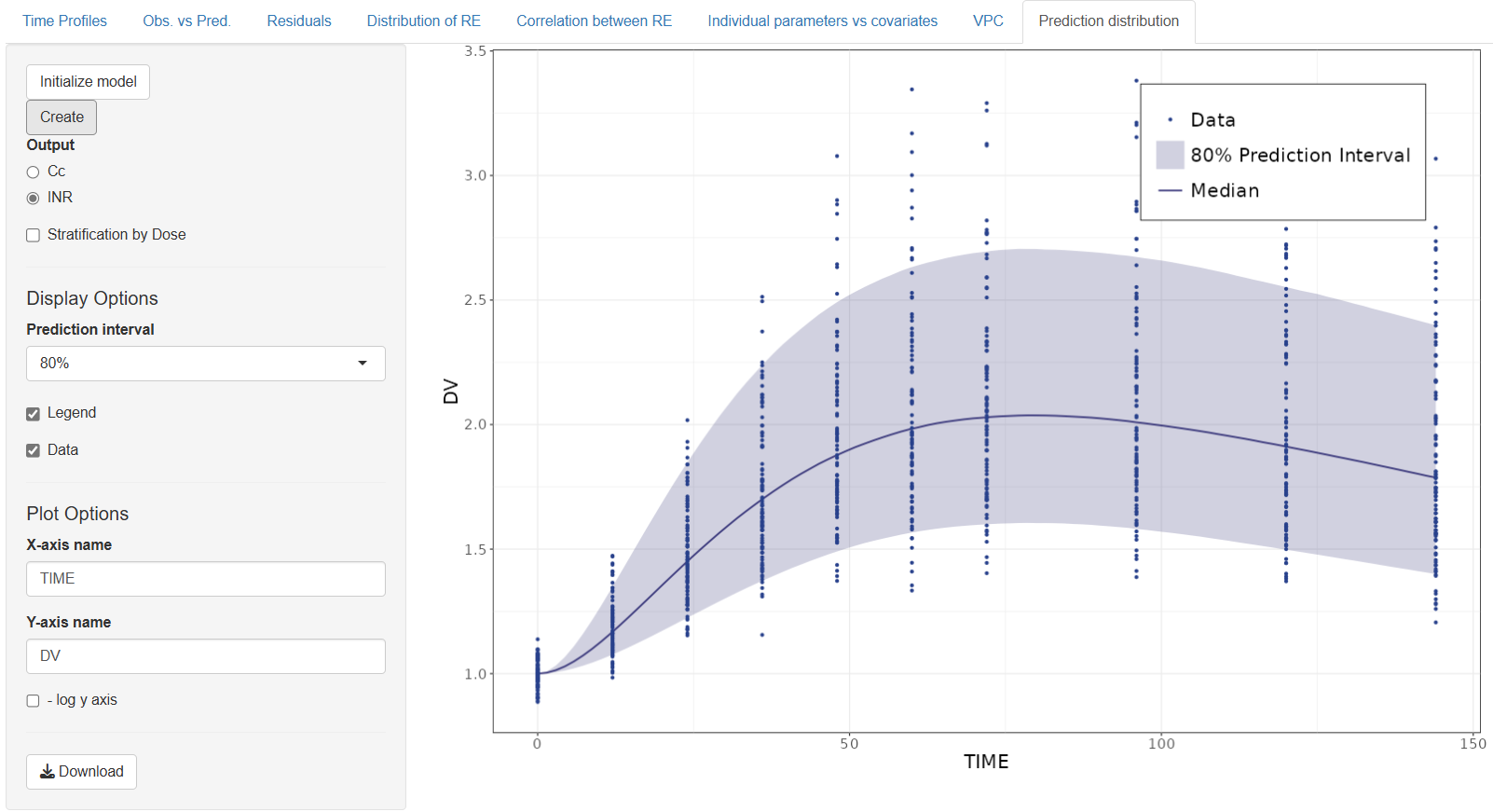
8. Prediction distribution
The Prediction distribution tab allows you to visualize the distribution of model predictions and assess how well they reflect the observed data across the selected output. This helps evaluate the spread and central tendency of predictions, and can be especially useful when exploring variability or stratification.
Getting Started
To begin, click the button. This step loads the prediction results from the fitted model into the tab.
Configuration Options
-
Select Output – Choose the output variable you wish to analyze. The available options are determined by the DVIDs selected in the Model section
-
Stratification by Dose – If the dataset contains a
DOSEcolumn, you can enable this option to generate separate prediction distributions for each dose group
Display Options:
-
Prediction Interval – Select the confidence interval to display around the predictions. Available options include: 50%, 80%, 90%, 95%
-
Legend – Include a legend for clarity when comparing multiple groups or overlays
-
Data – Overlay the observed data on top of the prediction distribution
-
Axis Labels – You can customize the x-axis and y-axis names to better describe your data and outputs
After completing the graphical evaluation in the GoF plots section, if the diagnostic plots indicate a satisfactory model fit—without major bias, trends, or significant outliers—you can confidently proceed to the next steps. These include exploring covariate effects in the Covariate Search section or using the model for predictive purposes in the Simulations section.